
Yasumasa Morimura “Dialogue with Myself 1,” 2001
on Timorous Beasties, “Glasgow Toile ” printed linen, 2004.
Last fall, the Museum of Fine Arts, Boston opened the new Linde Family Wing for Contemporary Art. We went with the kids, in a fit of “let’s get them some culture.”

Turns out one of them had a serious fever by the time we got home. But anyway . . .
I was thrilled to turn a corner to see an entire wall sheathed in Timorous Beasties’ “Glasgow Toile.” I knew that the Scottish designers, Alistair McAuley and Paul Simmons, were talented guys, but I hadn’t realized they had reached such sophisticated levels of recognition. Turns out, their work is also at the V&A in London and the Cooper Hewitt in New York.

Detail
I have been meaning to look into how the “Glasgow Toile” fit into the larger exhibition as a whole, as well as the relationship between it and the Yasumasa Morimura painting that hangs on it.
(Yasumasa Morimura, by the way, is a Japanese painter who borrows images from historical artists, ranging from Edouard Manet to Rembrandt to Cindy Sherman, and inserts his own face and body into them. I just read the article in New York Magazine about an African American superstar artist working in Japan who has a similar schtick, but I shan’t digress any further.)
Although many of the works in the gallery have been moved around since my visit, including the Morimura, the fabric is still there, and will be through the fall. What’s on it today? Interestingly enough, Cindy Sherman’s Untitled #282, in which she portrays herself as Medusa.

My own simulation: The Cindy Sherman photo that hangs on the wall of “Glasgow Toile” at the MFA.
This morning, I talked wtih Edward Saywell, Chair Linde Family Wing, Head of Department of Contemporary Art & MFA Programs. He was charming and informative, with an appealing British accent. Although he doesn’t know the TB designers personally, he went to college in Scotland at the time they first set up shop in 1990, and has always been a great fan.
He told me that the theme of the gallery is “Quote Copy Update,” so all of the works in the space are about artists reacting to or emulating prior works of art, sometimes breaking traditions. Some look to the past to create something fresh with new technologies. Saywell says, “The Timorous Beasties ‘Glasgow Toile’ fits beautifully in that context. They looked at the old toiles of pre-Revolutionary France, and effectively created a toile for the 21st century.”
Like Morimura’s work, which is based on Frida Kahlo’s self-portraits, Sherman also looks back into history for inspiration. Saywell points out what now seems obvious: Sherman’s work looks back to the Old Masters. Making it even more fun, he told me that it was photographed for Harper’s Bazaar. He says, “She looks like a sexy centerfold, but has cast herself as Medusa.”
Seywell explains that they wanted to show the Timorous Beasties fabric as something that belongs in the museum in its own right, but they also wanted to get across the idea that since it is commercially available , one is likely to have something hanging on it in a domestic setting. He says, “We could have just displayed the roll of it. . . but we wanted to underline the drama and the excitement of the fabric by covering the entire wall.”
Why am I blogging about this today? One, Timorous Beasties has been on my brain. I just ordered a few samples of their papers—“Butterflies” and “Thistle”—for a design project I’m working on.

Top: Butterflies | Bottom: Thistle and Thistle detail
Two, I was asked to write a blog post about a London store I’d like to visit as part of the launch of the new Shopikon London site and app. Shopikon is a very well-done shopping guide (I know, having written a number over the years myself!), with summaries and photos of the best stores in Barcelona, London, New York, and Vienna (Paris and Berlin to follow).

Timorous Beasties, 46 Amwell Street, London
Obviously, Timorous Beasties is my top choice of London shop. As if I don’t want to get my eyes on this stuff already, Shopikon further lures me in with: “Part showroom and part art gallery, you could spend hours gazing through the collection.” Yes, please.

Designers Alistair McAuley and Paul Simmons

The papers are hand-screened and printed. I would love to have them do a “Deconstruction” column for Design Milk. We did one with Brooklyn wallpaper darling Flavor Paper that was a lot of fun.

London-based design blogger (maybe we’ll meet!) Katie Treggiden of Confessions of a Design Geek sent me these images of Timorous Beasties “Thistles” concrete tiles that she spotted at Clerkenwell Design Week. They would be fantastic in a powder room, or in a kitchen with gray-grouted subway tile, installed behind a stainless steel range. These would be especially satisfying to experience IRL (in real life).
* I N T E R I O R S *
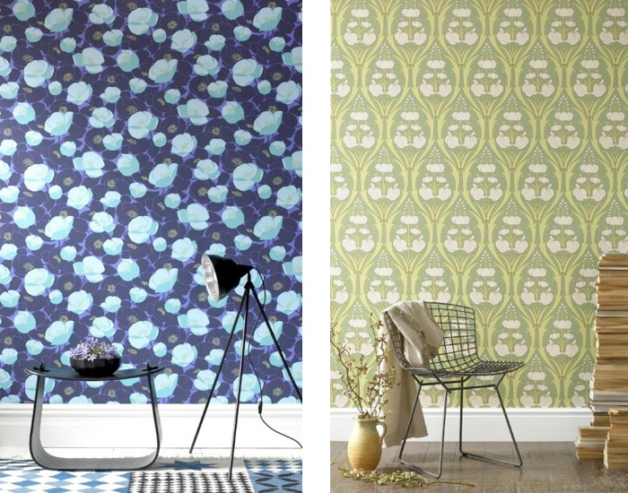
If you’ve made it through this somewhat text heavy post, you deserve a visual treat: Interiors with Timorous Beasties wallcoverings.

New York interior designer Fawn Galli paired Timorous Beasties “Butterfly Hand-Print” on the wall with Mod Green Pod “Butterfly Jubillee” on the chair.

Stefan Boublil, co-director of New York interior/graphic design company The Apartment, chose Timorous Beasties Euro Damask for his five-year-old son Zoel’s loft bedroom. (via Little Big Magazine)

A living room done in “Edinburgh Toile” featured in Living Etc.

A horizontal application of “McGegan Rose” featured in House to Home. Love that velvet sofa.

It’s Carrie and Mr. Big in Sex & The City, looking miserable in front of their Timorous Beasties damask.
– – –
This post could go on forever, but I’ll save an in-depth look at Shopikon for another day. If the folks there love this post, I may just get to report back to you from London.


 via Mi Casa Es Su Casa


 Follow StyleCarrot on Twitter

