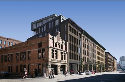
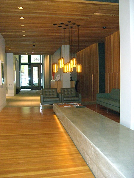
This spring, Jessica Danforth of Kortenhaus Communications (love her!) brought me on a whirlwind tour of four different apartments at FP3 in Fort Point Channel, followed by lunch at Barbara Lynch’s Sportello. (Delicious, and really well-designed.) The neighborhood is industrial and artsy, and the building, designed by David Hacin, reflects those influences. The lobby even even includes an exhibition gallery. In addition to three model apartments (I just handed in an article for Stuff on the studio unit designed by John Stefanon, which I’ll blog about once it’s published), Jessica got permission to show me a privately owned two-bedroom designed by Andrew Terrat of Terrat Elms.
FP3 in Fort Point Channel, Boston
FP3 Lobby
This condo is owned by a couple who lived in the Boston suburbs, but decided to move into the city when their daughter left for college. They hired Andrew Terrat of Terrat Elms to design the entire interior, and they are beyond thrilled. Who can blame them? Not only is Andrew darling, the space is spectacular.
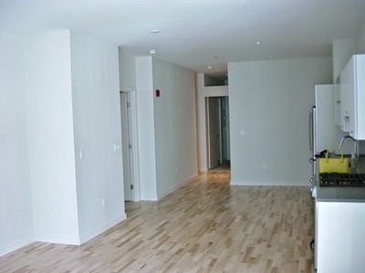
Here is the unit when first they purchased it.
Condo, Before
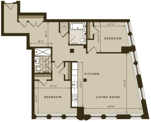
The unit isn’t especially large, but it’s well laid out, with a self contained entry with roomy closets, an open kitchen, and a private master bedroom suite.
Floor Plan
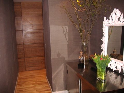
Andrew relocated the closets in order to incorporate a console. He chose a stainless steel piece that you might find in a lab. He added a textured wall covering and wood panels.
Entry
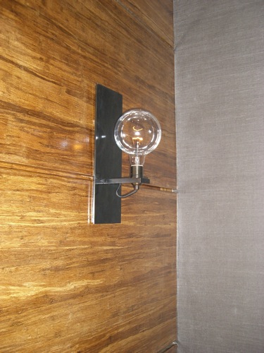
The fixture has an industrial edge, echoing the feel of the neighborhood.
Detail, Entry Light Fixture
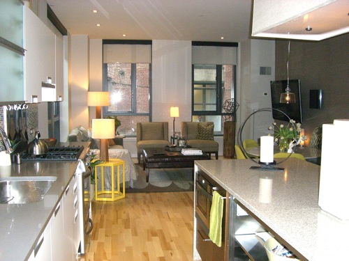
Turning the corner, you enter the main living space, with an open kitchen and the living/dining area beyond. It’s done in neutrals, with yellow and chartreuse accents.
Main Living Area
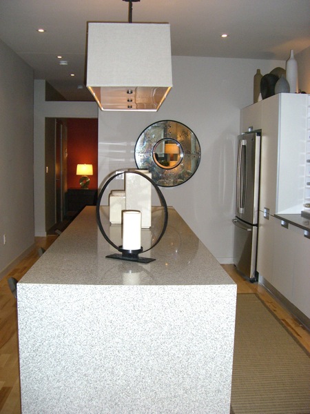
Looking from the living room, back towards the entry. That room is the second bedroom, where their daughter stays when she’s home from school. The kitchen island is wrapped in stone, a hot look right now. I like the effect, but hate to think how much extra money all that stone costs.
•
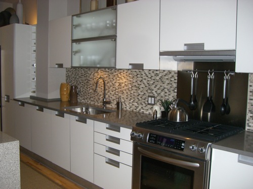
Andrew replaced the cabinetry and finishes. I love the the mini subway tile back splash against the white cabinetry, and appreciate how the gray tones accentuate the stainless steel counter top and hardware. (I don’t remember the manufacturers; must email Andrew.)
Kitchen
•
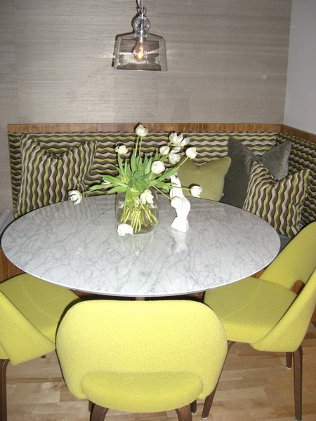
Pop, pop, pop! Bright and jagged upholstery really defines the space. Love the clear pendant – very industrial goes glam – and of course, the Saarinen tulip table.
Dining Area
•
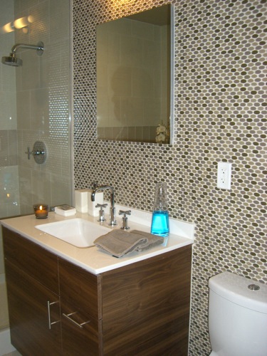
Terrat produces an effect with the tile in the bathroom that’s similar to that in the kitchen. The homeowner told me that Andrew even added the blue mouthwash. Like most designers, every time he visits he fusses and moves stuff around.
•
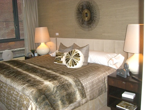
A comfortable but glamorous retreat.
Master Bedroom
• • •
For a peek at Boston Magazine‘s Concept Home at FP3 see Erin’s post on Elements of Style.


 Follow StyleCarrot on Twitter

I need to get the BF to buy a place here, I am in LOVE!