Earlier this year interior designer Tricia McDonagh emailed me about a project she had been working on with “This Old House.” To help celebrate its 30th anniversary season, they wanted to help the community where it got its start. The show’s crew worked alongside affordable housing nonprofit Nuestra Comunidad to to renovate a vacant, foreclosed house in Roxbury. Tricia furnished the interiors in her flawless, clean and elegant style.
 The refinished façade of the 1870s Second Empire house.
It was an absolute wreck. Have a look at the “before“pictures. The two units will be sold separately, at an affordable price. The original shingles were replaced with fiber cement siding, and the dilapidated slate roofing (which was salvaged) was replaced with recycled rubber architectural shingles.
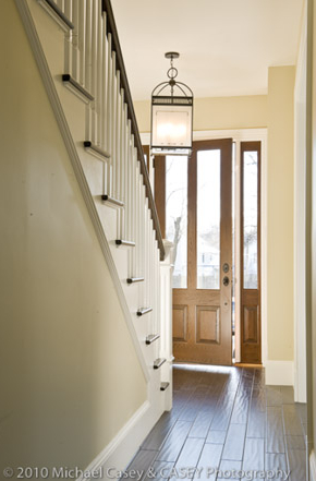 The crew restored the hand-carved wood banister and newel post in the entryway.
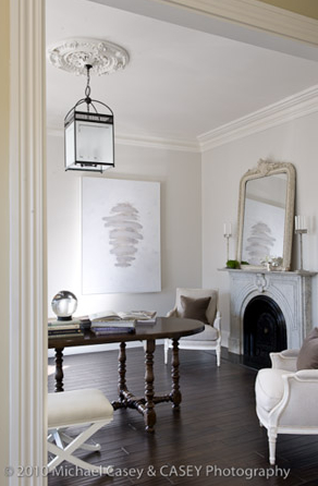 These plaster ceiling medallions throughout the house were either be restored or replicated.
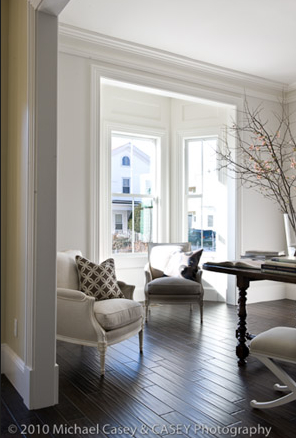 The rooms all have Tricia’s spare, sophisticated touches, like muslin covered furnishings.
 The artwork over the sofa, which looks like a tie dye scarf, is actually beaded porcelain on rice paper by Dharma Strasser MacColl from Walker Contemporary in Boston.
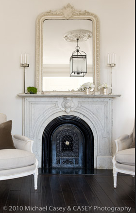 The crew was able to salvage the original marble fireplace surround. They removed it for cleaning and repairs, then reinstalled it.
 It’s absolutely gorgeous. I love the subtle color from the silver cups and plant.
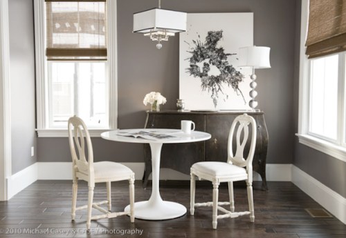 The dark walls make the room look rich and cozy. Love how the white shapes of the furniture pop against it too.
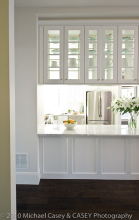 A gleaming white kitchen. The original kitchens were on the second floor; the new ones are in the center of the units’ first floors.
 Love the nailhead detail on the bed and muslin upholstery.
The old millwork of the window casings and panels were replaced with replicas featuring the same dimensions and profiles. There were ugly dropped ceilings that were removed. Now the rooms have an airy, lofty feel.
– – – –
All photos by CASEY Photography.
[tweetmeme source=”StyleCarrot” only_single=false]


 Follow StyleCarrot on Twitter
