When the editor of Stuff asked me to come up with a theme for a home design-dedicated issue, I immediately said, “Color.” Unfortunately, the whole theme devoted to interiors idea was ditched, but I was able to salvage some of my work by putting together a page with local designers’ colors of the moment in “New Hues: Boston designers reveal their top color picks for fall“. If you decide to try one, I’d love to see it. Or, perhaps you can reveal specific paint colors you’ve had luck with. I’ll tell mine (tomorrow) if you tell yours. Meanwhile, here are the designers’ picks.
 Annsley McAleer, Annsley Interiors, Boston
Her style: Traditional but fresh, using upbeat colors and patterns
Her color pick: Green Blue by Farrow & Ball
“I loved this color so much in my guest bedroom that I used it in my daughter’s bedroom, too. It is an intense color imbued with a sense of calm. It looks great with a strong white trim and other blue accents.”
 Andrew Terrat, Terrat Elms Interior Design, Boston
His style: Tailored but not too serious
His color pick: Curry by C2 Paint
“This color is bold and vibrant, but also very warm and cozy, making it the perfect shade for a family room.”
 Erin Gates, Element Interiors, Jamaica Plain
Her style: A mix of modern and traditional, new and old, high and low
Her color pick: Manchester Tan by Benjamin Moore Historical Colors
“A good neutral is hard to find. This one is fantastic and works anywhere. It is neither too deep nor too light. It reads cool if paired with cooler colors and warm if paired with warmer colors.”
 Eric Roseff, Eric Roseff Designs, Boston
His style: Clean and crisp with a graphic sensibility
His color pick: Mahogany by Farrow & Ball
“I’ve used this in a small powder room in a high gloss. The color is rich and sumptuous. The lacquer finish opens up the small space by allowing for wonderful reflections.”
 Julieann Covino, Jace Interiors, Cambridge
Her style: Affordable design that incorporates pieces you already own
Her color pick: Brilliant Sea by Behr
“This is my new favorite color. A little goes a long way. I would use this as a pop of color on the frame of a mirror (that I will hopefully find at Brimfield this week!)”

Rachel Reider, Rachel Reider Interiors, West Roxbury
Her style: Engaging interiors in a transitional style
Her color pick: Bordeaux Red by Benjamin Moore
“Try this eggplant shade in a dining room to infuse a cozy feeling. The warm tone would create the perfect atmosphere for a dinner party.”

Urit Chaimovitz, Urit Chaimovitz Design, Watertown
Her style: Classic but fun, with an eye towards the preppy
Her color pick: Bang! by C2 Paint
“Recently, I did a house in which we were able to hide a playhouse for the children under the basement stairs. I used this color for the door, which has a star cutout. It’s very ‘Nantucket red,’ inspired by the fact that that’s where this family spends their summers.”

Kathie Chrisicos, Chrisicos Interiors, Boston
Her style: A sophisticated mix of scales, colors, and styles
Her color pick: Flint by Benjamin Moore Affinity Colors
“I love this deep, dark, rich charcoal from Benjamin Moore’s new eco-friendly line. I’ve used it on a fireplace feature wall as well as at a kitchen desk alcove.”

Shellie Donovan, Shellie Donovan Interiors, Boston
Her style: Multi-textured with a whimsical punch of red, lime, or blue
Her color pick: Elephant’s Breath by Farrow & Ball
“I love Elephant’s Breath not only for its neutral color, but because I love clients’ reaction to its name. The gray really changes in each application, depending on the light. I’ve used it in powder rooms and back splashes, but would use it anywhere.”

Kristen Rivoli, Kristen Rivoli Interior Design, Winchester
Her style: Light, airy, and livable
Her color pick: Glazed Carrot by California Paints
“This is a very versatile color. It is sophisticated when paired with gray, playful when paired with pink or yellow, and vibrant when paired with white. When I use it on walls, I like to paint the doors and frames with it too, sometimes a shade darker or lighter than the wall color. It’s a trick that makes a small room look larger.”
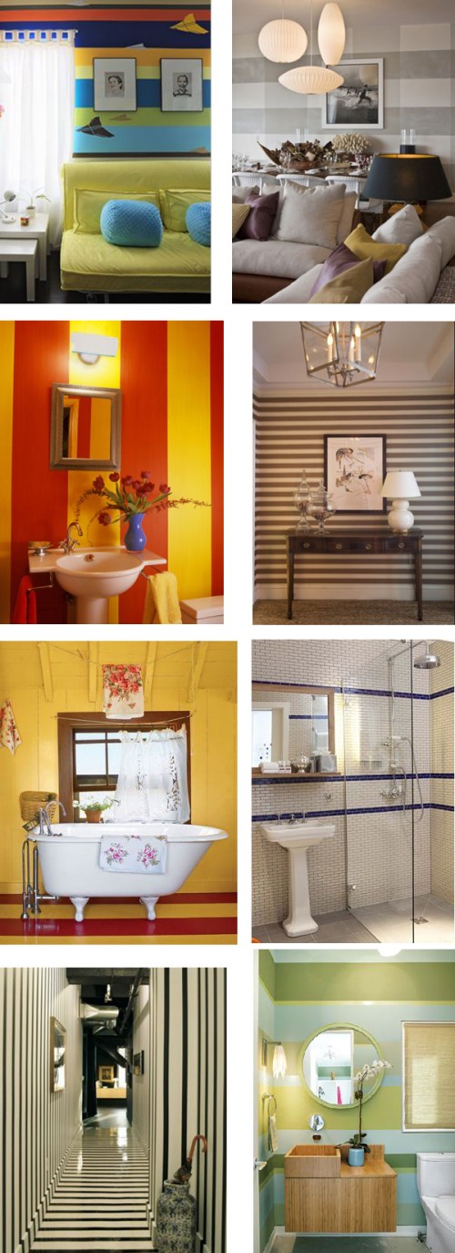
 Kathryn Ireland in House Beautiful; Furbish Design; Jonathan Berger in House Beautiful; Domino; Pappas Miron; Elle Decor
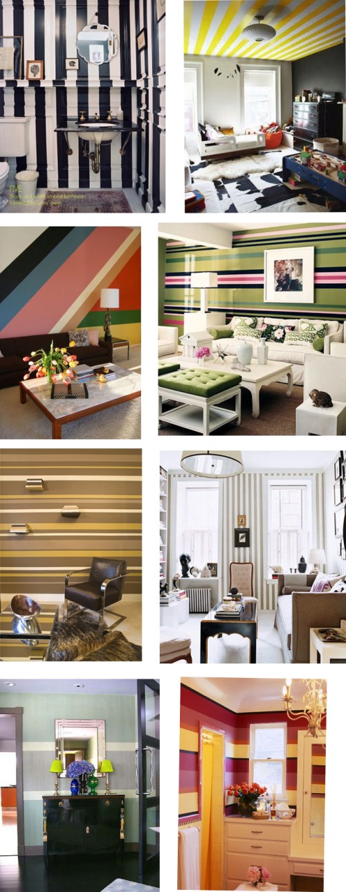
 Moises Esquenaz; Sara Gilbane; House Beautiful; Jeffrey Bilhuber; Milnaric, Hentry & Zervudachi; John Wiley in House Beautiful
 Photographer Ngoc Minh Ngo in House Beautiful; Amanda Nisbet; Maxime de la Falaise; House Beautiful; Todd Romano; Simon Upton’s in Elle Decor
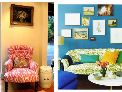 “Absolutely Beautiful Things”; Domino
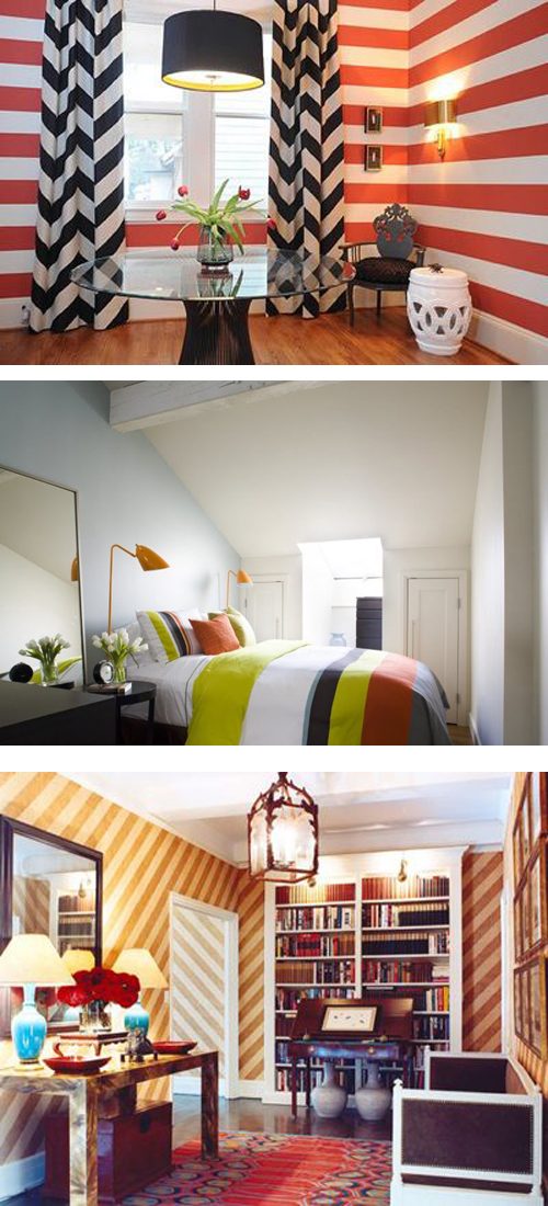
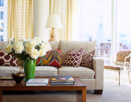 Eric Cohler in House Beautiful
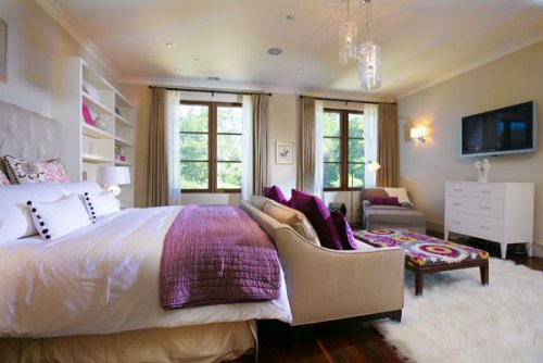 Susie Sarlo of Beau Monde Interior Design
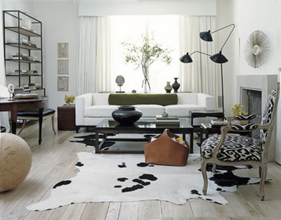 Betsy Brown in House Beautiful














 Follow StyleCarrot on Twitter
