Design Diary: Modern Tudor Renovation By Hacin + Associates

On Sunday the Boston Globe Magazine published a new larger, format magazine. The issue included an array of lifestyle pieces, including a 10-page home decor piece, “Tudor Inspired,” that I wrote about a modern Tudor renovation. Boston-based architecture and design firm Hacin + Associates, led by David Hacin, transformed a 1932 Tudor Revival in Newton, Mass., into a modern family home.

Owned by two city guys who moved from the South End with their young daughter, this modern Tudor renovation is one of my all time favorite projects. It has an open, airy interior with sleek finishes that are juxtaposed against original details, and contemporary but comfortable furnishings. Classic patterns are applied in non-traditional ways, and masculine elements mingle with feminine infusions.

I spent a morning last month talking about the project with principal David Hacin, architect Eduardo Serrate, and interior designer Jennifer Clapp to learn all about this perfectly put together home. Here are the photographs along with design background and details. If there’s anything I’ve left out that you’re curious about, just let me know.

hacin-living-room-with-family

Photo by Trent Bell

The living room is the main gathering place for the couple and their daughter. The limestone fireplace, original to the house, was the deal maker. One of the homeowners says, “When we saw it, we felt an instant emotional attachment.” Serrate added an architectural detail above the fireplace, to extend its presence to the ceiling. The curved windows flanking the fireplace are also original.

Serrate specified sleek wood panelling on one side of the room, while Clapp used a large expanse of an open weave drapery, made by local workroom Lori Designs Custom Drapery, on the other. The home is replete with such juxtapositions: dark versus light, solid versus soft, masculine versus feminine.

hacin-living-room-window

Photo by Trent Bell

The black and white hand knotted carpet from Boston rug showroom Landry & Arcari is new, but evokes an antique look. Its textural striations are a recurring motif throughout the home. Contrast stitch on the grey linen sofa adds a hand-done feel, as do the the collection of hand embroidered pillows. (Note the swirly leafy pattern of the pillows and fireplace; you’ll see similar ones later.)

The home’s overall color palette was informed by traditional Tudor architecture. The style’s graphic elements, such as the tarred half timber latticework commonly found on exteriors and interior lime-washed walls inspired and guided them. “You don’t immediately perceive its influence,” says Serrate, “what you see is our interpretation.” Clapp adds, “We started with a Tudor house, so we wanted to honor its history rather than ignore it.”

hacin-living-room-fireplace

Photo by Michael Stavaridis

The Minotti “Prince” chair has a modern silhouette but traditional plaid upholstery. The hand-tufted leather DePadova Pouf Capitonné is from Boston furniture store Showroom.

hacin-butterfly-art

Photo by Emily Neumann/Hacin + Associates

The butterfly shadowboxes that flank the fireplace were made by Evolution in New York City .They’re inspired by traditional English curiosity cabinets. The homeowners and Clapp selected each individual butterfly.

hacin-living-room-accent-wall

Photo by Michael Stavaridis

Serrate covered one wall in the living room in walnut, choosing to construct the look with multiple panels and very visible seams, rather than an unbroken expanse of walnut.

hacin-entry-hall

Photo by Michael Stavaridis

The foyer does double duty as the home’s gracious gateway and makeshift Thanksgiving dining room—the homeowners seat 20 around four tables. While its large footprint didn’t change, openings to adjacent rooms were added and widened to facilitate flow and draw in natural light.

artistic-tile-hone-limestone-smoke

The limestone tile-clad accent wall (Artistic Tile “Smoke”), which wraps into the kitchen for continuity, refers back to the fireplace in the living room. Clapp says, “Broad gestures like these allow for a big impact without gutting the interior.” The flooring is original quarter-sawn white oak.

hacin-entry-stairway-2

Photo by Michael Stavaridis

The Viccarbe “Davos” bench by Jeffrey Bernett is also from Showroom. Clapp drew a template and guide for the upholsterer to show where they wanted the fade of the custom fabric to fall on the piece. The striated effect is similar to that of the living room carpet.

hacin-entry-rail-detail

Photo by Emily Neumann/Hacin + Associates

The tread of  the redesigned stairway is made from blocks of white oak. The blackened steel rail has exposed joinery, such as the rivets at the bottom of the balusters. The handrail is also white oak. The effect is very solid and artisan-made.

The concept of visible craftsmanship, from exposed hardware to quilting and tufting, is evident in every room of this modern Tudor renovation. Clapp says,  “We reinforced this idea, which is a predominant feature in traditional English Tudor architecture, by showing off how things are built, formed, or sewn together.”

hacin-contemporary-kitchen

Photo by Michael Stavaridis

A defined palette permeates the home. Limestone tile wraps into the kitchen, where custom walnut cabinetry echoes the walnut paneled wall in the living room. The dark grey pieces at the top bring in a graphic element and helps to separate the monolithic shapes from the ceiling so the cabinetry feels more like furniture.

A modern Tudor renovation calls for a large kitchen with a smooth flow. About the layout Serrate says, “The center island takes precedence, allowing the chef to move in a triangular pattern, unbothered by those eating or working at table or window seat.”

hacin-contemporary-kitchen-island

Photo by Michael Stavaridis

The walnut canopy over the island provides a place to tuck recessed lighting, as well as ductwork for the hood. It also helps to create a more intimate scale, breaking up the room’s vertical elements. The Mutina ceramic floor tiles by Patricia Urquiola have a sandy texture. The kitchen opens onto the family room.

hacin-dining-room

Photo by Michael Stavaridis

The dining room, which opens off the living room, features wood panelling in the exact style of the original (but painted white), which Serrate had recreated after having to rip out the existing panels due to asbestos. Originally the roomI was a library, with a small entry that Serrate widened, stretching it to five feet, and retaining the shape and details.

william-morris-thistle-wallpaper

For the ceiling Clapp chose a traditional wallpaper print, William Morris “Thistle”  in Mulberry. (Designed by John Henry Dearle it is one of only five machine-printed wallpapers produced by Morris & Co. in the early 20th century.) . It provides a subtle and unexpected splash of color and visual texture. Scroll back up and note how the leafy pattern echoes the fireplace carvings.

hacin-dining-rom-facing-shelves

Photo by Michael Stavaridis

Clapp says, “We knew from the beginning that we wanted to use pattern as another element that was simultaneously  traditional and modern, but in a playful way, since the homeowners didn’t want the house to feel too serious.” Thus the consistent use of fun wallpaper. (You’ll see more soon.)

The Poliform “Flute” pedestal table by Roberto Barbieri purchased from Showroom is white lacquer over wood. The Moooi “Random Light” by Bertjan Pot (available online at Wayfair) is formed from resin drained yarn that is randomly coiled around an inflatable mold to create a translucent 3D fabric. Its open weave echoes the weave of the living room drapery.

hacin-dining-room-chair

Photo by Emily Neumann/Hacin + Associates

The BD Barcelona “Showtime Chair” by Jaime Hayon, purchased at contemporary design showroom Casa Design Boston in SoWa, is highly customizable. These sport amethyst accents, from the leather armrests to the thread used to quilt the cushions, to the exposed exterior bolts.

hacin-family-room

Photo by Michael Stavaridis

The family room, which sits between the dining room and kitchen, is the most feminine room in the house. It’s also the most contemporary interpretation of the overall design concept, from the colors, textures, and silhouettes to jaunty set of the Moroso “Redondo” sofa and chairs by Patricia Urquiola. Clapp says, “This house is not just about drama, there’s a lot of comedy in it.”

The carpet, like that in the living room, is charcoal with a nubby, handcrafted vibe. The De La Espada “Lily” tables by Tokyo-based design studio Leif.designpark, are walnut with white Corian tops. The floor lamps are Flos “Glo-Ball” lamps by Jasper Morrison (available online at Lumens).

hacin-playroom

Photo by Trent Bell

Redoing the playroom wasn’t initially part of the plan, but the folks at Hacin were so excited about designing a playroom that they did it as a surprise for the homeowners. Of course, it was greenlighted.

The couple’s old Ligne Roset “Togo” sofa by Michael Ducaroy makes for comfy seating. Clapp added a Dare Studio “Wire” table by Sean Dare and created a fun geometric pattern with Flor carpet tiles.  On the opposite polka dot wallpapered wall, inexpensive white lacquer cabinets provide toy storage.

DETAIL10_HurvitzPlayroom

Photo by Emily Neumann/Hacin + Associates

Child-friendly caged scones by Schoolhouse Electric & Supply Co. line a pin board made from Homasote fiber board painted white, where superhero drawings (along with robots and pigeons) get tacked up.

hacin-girls-bedroom

Photo by Trent Bell

It was important to the homeowners that their daughter’s room be a place she wants to spend time. She chose the aqua felt-upholstered Blu Dot “Dodu” bed herself (available online at AllModern).  In fact, “aqua” was one of her first words. Clapp says, “We wanted a few things clash in a playful way, like the faded floral wallpaper and braided patchwork rug. The Serena & Lily “Ellie” side table in ceramic with a semi-translucent white glaze holds a stack of picture books.  A simple white blackout roller shade virtually disappears when it’s down or up.

designers-guild-mehsama-wallpaper

Clapp chose Designers Guild “Mehsama” wallpaper, a dramatically scaled floral bouquet painted in monotone shades, as the backdrop for the girl’s bedroom.

hacin-kids-bath

Photo by Emily Neumann/Hacin + Associates

The homeowners found this soft-serve ice cream photo, which hangs in their daughter’s bathroom, online.

mutina-pico-tile-red-dot

Mutino “Pico” tile by Ronan & Erwan Bouroullec in red dot lines the girl’s bathroom.

hacin-dressing-room-island

Photo by Michael Stavaridis

A small bedroom became the master closet-cum-office. The homeowners didn’t initially feel like they needed a separate dressing room, but it didn’t feel right to just add a couple of small closets to the master bedroom. When the designers pointed out that their daughter could do arts and crafts on the center island, they were sold.

hacin-dressing-room-desk

Photo by Michael Stavaridis

The black and white “Toile” wallpaper by Tracey Kendall is a tribute to the black and white Tudor color scheme. The dense pattern of cypress trees in a landscape is a modern reinterpretation of traditional British toile, but with a slightly off kilter, dense repeat.

The Gubi 93 chair by Boris Berlin and Poul Christiansen of Komplot Design has a black metal swivel base and is fully upholstered in purple. Serrate says, “Their daughter has such a presence in this house.”

hacin-dressing-room-cabinetry

Photo by Michael Stavaridis

Since this is more of a dressing room than a walk-in closet (not to mention an office!) the clothing couldn’t be exposed. Cabinetry with walnut accents mirror the walnut used downstairs and Mockett leather pulls are another nod to hand-craftsmanship.

hacin-master-bedroom

Photo by Michael Stavaridis

The master bedroom is tailored and highly tactile, with cerused oak nightstands and nubby rug. A trio of low hanging pendants are set against laser-cut wool drapes, which echo the drapery panel in the living room. Tweed fabric wallpaper evokes men’s suiting. The homeowners are searching for just the right black and white photograph to hang.

layers-vineyard-large-by-hella-jongerius

The circular forms embroidered on the bench upholstery—Maharam “Layers Vineyard Large” by Hella Jongerius—exhibits a breakdown in form, referring to the integrity (and in this case, studied imperfection) of craftsmanship throughout the house.

hacin-master-bathroom

Photo by Michael Stavaridis

The floating vanity is made from a slab of stone that looks like wood, sourced locally at Cumar Marble & Granite. Notice the matching strip at the top of the wall too. The large format marble floor tiles are from Stone Source. A Greek key border runs inside the shower.

hacin-guest-room

Photo by Michael Stavaridis

The airy guest room is set apart from the main rooms, behind the kitchen. Erica Wakerly “Fan” wallpaper in grey and white adds just the right amount of background pattern for the simplest white bedding. A family photo the homeowners already had but didn’t know what to do with hangs above the bed while handmade copper sconces hang on each side.

hacin-gray-guest-bathroom

Photo by Michael Stavaridis

The powder room is also done in grey and white, with hand-glazed tiles and Flavor Paper “Secret Garden” wallpaper by Dan Funderburgh, featuring broken wine glasses, snakes, geese, acorns, locks, and other oddities.

D E S I G N   T E A M

Principal: David Hacin  |  Project Manager: Eduardo Serrate
Senior Interior Designer: Jennifer Clapp as  |  Interior Designer: Katelyn Miersma
General Contractor: Sleeping Dog Properties

F L O O R   P L A N

hacin-floor-plan-main-floor


hacin-floor-plan-key

•          •         •

boston-globe-magazine-feb-8-2015

See the full story about this modern Tudor renovation.
Boston Globe Magazine
   February 8, 2015

Design Diary: Victorian Townhouse by Evolve Residential

Earlier this summer, Boston designer Tom Egan of Evolve Residential sent me photos of his business partner Josh Linder’s 609-square foot, parlor-level condominium in a 19th century Victorian townhouse in the South End. We had hoped to feature it in the Boston Globe Magazine’s upcoming “New England Traditional” home issue, but alas, Josh sold it and moved out. But, lucky me (and you), I can feature it here. It’s amazing, and of course, Josh and Tom did all the design work. Here’s the grand tour:

evolve-living-room

The bones of the 145 year-old condo were beautiful and retained all of the traditional elements one associates with 19th century Boston homes: high ceilings, bay windows, crown moldings, and paneled doors. Yet it had been turned into a hodgepodge mess over the years. In addition to restoring the historic details, they tweaked the layout to suit 21st century living (an-suite bathroom, Poggenpohl kitchen).  The paint colors, fabrics, and furniture are a dynamic mix of contemporary and traditional. The living room is painted in seven shades of gray!

The sofa was custom made to follow the lines of the bay window, and is upholstered in a plush strié velvet. The walnut barrel chairs are by Flexform from local furniture store, ShowroomThe target painting is by Michael Hoffman, represented by nearby gallery, Jules Place.

evolve-living-room-candlesticks

The antique petite neoclassical Biedermier walnut chest of drawers is gorgous. They found a fabulous pair of French Baroque style mirrors from the 1940s; one’s in the living room, the other in the dining area. I asked about the funny little men on the chest. They answered, ” These little cuties are an antique pair of porcelain white monkeys from antique vendor in Los Angeles.”

evolve-dining-area

To the left of the fireplace they designed a custom banquette to function as a dining area and work space. Brass Irwin Feld “stiletto” ottomans upholstered plush pleated velvet are an unexpected contrast to the Saarinen pedestal table, and a feminine counterpoint to the black tufted leather banquette. To the right is the master bedroom. I love the tall, panelled door, which is painted in Benjamin Moore’s “Polo Blue.”

evolve-banquette-detail

A nice closeup of the other French Baroque style mirror. Look in the mirror for a glimpse of the kitchen.

evolve-entry

Check out the table (on legs!) in the entry. Tom says, “It’s our absolute favorite piece in the entire residence!”  It is a 1940s polished metal German prosthetic style skeleton leg table with a thick Lucite top. Whoa. The Osborne & Little “Trifad” wallpaper composed of metallic interlocking Chinese keys is one of my favorites. The floors are dyed black and finished with an ultra-matte polyurethane.

evolve-gray-bedroom

In the master bedrooom, the walls are covered in a grey textured fabric which has been paper-backed and applied like wallpaper. They did not reveal where that funky chandelier is from . . . Love the ikat pillows and thick drapery.

evolve-dressing-room

Here’s Josh’s closet. Jealous?

evolve-closet-detail

Hi shirts and suits match the decor : )

evolve-kitchen-sink

The chocolate-colored kitchen has grasscloth walls. Tom says, “It adds a beautiful texture with a subtle iridescence from the various colored grass strands running throughout the paper.”  As to its practicality, he notes that covering the grasscloth with a thin coat of matte polyurethane creates a wipe-able surface. Good to know.

evolve-kitchen-glass-door-fridge

The cabinetry is Poggenphol. I love how it’s slotted under the eaves. A table lamp makes it so cozy. What’s above the fridge?  A built-in Miele espresso machine!

evolve-outdoor-space

There’s also a lovely little deck.

evolve-south-end-towhouse

Photos by Sean Litchfield

Design Diary: Jeff Osborne’s South End Loft

I’ve been meaning to highlight interior designer Jeff Osborne’s South End condo for a while now. I originally wrote about it, “Living With Less, for the Boston Globe Sunday Magazine.  Why now? I have just hired Jeff and his partner, interior designer Amanda Hark, to renovate the main floor of our Boston condo. Their newly created firm is called Hark + Osborne ). I am so excited.

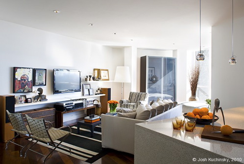
Jeff’s Boston loft isn’t large, but he makes great use of the space. And  he has an amazing eye, mixing old and new, high and low. He had to do some serious editing to make it work. He gave all his old furniture to his brother in order to be able to get the look he wanted. The overall aesthetic is clean and modern and very tailored, but there are plenty of vintage pieces for character and texture.

Photo by Josh Kuchinsky

In the main living space, the television blends right in with the art. The ebony, bamboo-topped coffee table by Gervasoni from Showroom in Boston has simple lines, with an Asian feel. The rug is Italian, made from linen and wool. The sofa, upholstered in linen, is Flexform, from Showroom. Showoroom owner Doug Gates is his close friend.

Photo by Josh Kuchinsky

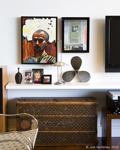
The vintage Louis Vuitton trunk was a gift from Osborne’s parents. The painting of man on left is a self-portrait by Cyrille Conan from a local Boston art gallery. The smaller piece on the right was painted by his grandfather. It’s a cottage on Ballston Beach on Cape Cod, that has since washed away. Underneath, on the white lacquer Poliform shelf, is a whaling-ship propeller that he found at a Boston antiques show.
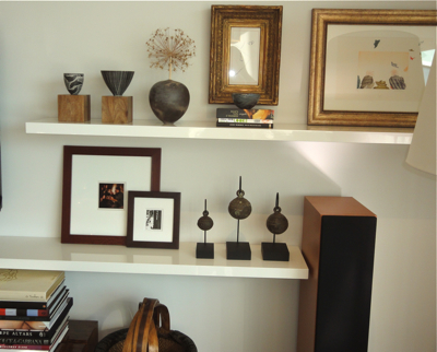

The smaller ceramic bowl on the far left is by Tim Christiansen, purchased from The Society of Arts & Crafts on Newbury Street. (Christiansen and Osoborne went to boarding school together.) The larger one is from Norway from his parents, who collect ceramics and art.  “They have fantastic taste,” he says, “They downplay it, but it’s been a huge influence on my work.” Both bowls sit on wood blocks from West Elm.

The artwork is hard to see here. The vertical is a drawing of a nose that he bought when he studied abroad in Florence; it’s a local contemporary artist but in an antique French frame that he bought it from a store called Flair. Next to it is a print from Paris of hats flying off people’s heads by Charlotte Reine.

On the bottom shelf are Chinese bronze animal bells from Intarwut in Cambridge.
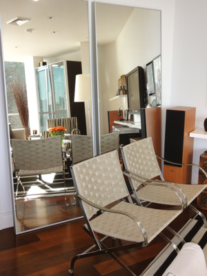
Two aluminum frame full-length mirrors from IKEA are propped up behind the Flexform stainless steel and rope folding chairs.
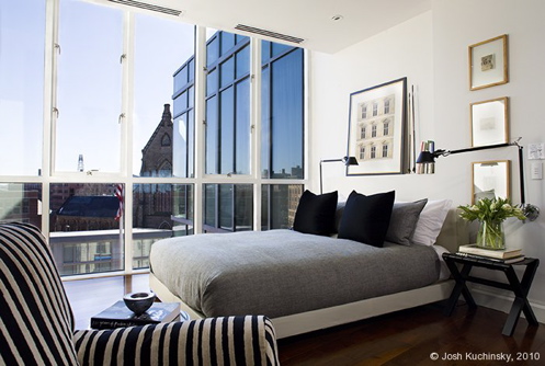
Photo by Josh Kuchinsky

The bed is beyond the main living space, in a south-facing, floor-ceiling-windowed nook. The bed (high) is upholstered in white leather and covered in gray houndstooth linens. The nightstands (low) are from West Elm. The industrial-style lamps are from Casa Design in SoWa. The chair in the foreground, upholstered in striped chenille, is Flexform.
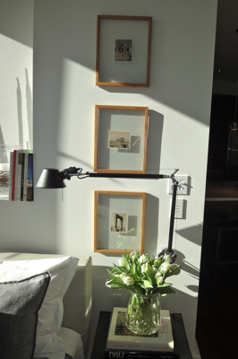
A trio of postcards depicting Greek ruins were discovered in a junk shop in Provincetown.

Photo by  Josh Kuchinsky

The kitchen is standard issue from the building. The wrapped countertop is bisque-colored speckled Caesarstone, the appliances are Viking, and the cabinetry Wenge wood. Osborne added the three silvery pendant light fixtures from Casa Design over the bar. And note the Alessi juicer next to the bowl of oranges.

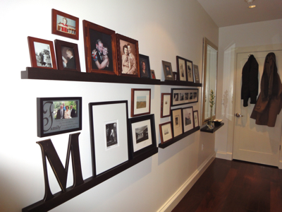
The entry is lined with family photos and artwork.