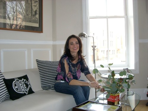
I visited stylist Kara Butterfield at her small but perfectly styled South End apartment in April. You can read the interview, “A Local Design Diva Spills Her Styling Secrets” in Stuff Magazine. (Kara has since moved into a more spacious loft, and I’m eagerly awaiting a peek. Kara, are you reading this?!)
Kara hails from Australia, where she studied theater and film production design and worked in set design, which led her to styling homes for magazines in Sydney. She still styles photo shoots today, in Boston, but also does a lot of design work for people’s homes. She’s recently teamed up with Lindsay Bentis of Thread Art & Design. Lindsay is a trained artist turned interior designer, and together they are a whirlwind design team. Kara also teaches style clinics through her business Make Ready, offering design advice on such topics as “Bookshelf and Mantle Display” and “Dinnerware and Décor.”
You can read the article to find out Kara’s favorite trends, must-have items and secret shopping sources. Here I wanted to share an aspect of our conversation that I found particularly interesting, that didn’t make it into the magazine. And, of course, plenty of extra photographs.
Magazine photos of interiors look so gorgeous. Is it possible to live in a space that’s been styled for a photograph?
No, it’s not. That’s why editors aren’t all using stylists now – they want to get a sense of how people actually live. The trend is very relaxed and comfortable; ease of living.
There is an art to photo styling that is different from interior design or decorating; you see things in frames. When you look through the camera lens you see a contained area. In real life there is the issue peripheral vision, which you don’t have in a photo still. There is also the issue of depth of field. You need to modify the tableau for a photograph. You create a composition and adjust it to fit in the frame it will go in, taking into account what will be in the background, foreground, etc.
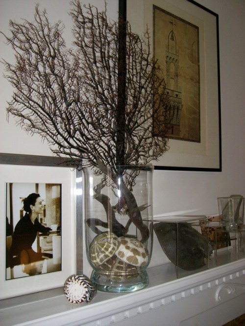
The still life on the mantle would work, but if I were to shoot the coffee table you’d have to adjust the composition to look normal. If a vase and books are too close, it will look like they’re touching in the photo. And you need to think about shapes more. I’d want a plant to come across with a particular shape, so I will have move it around to achieve that.
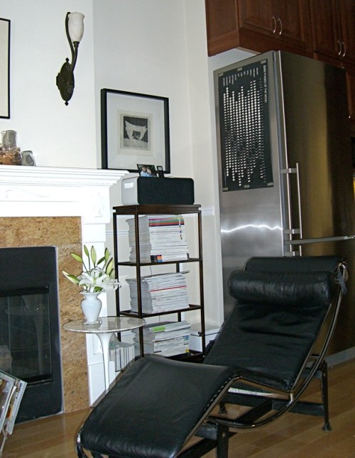
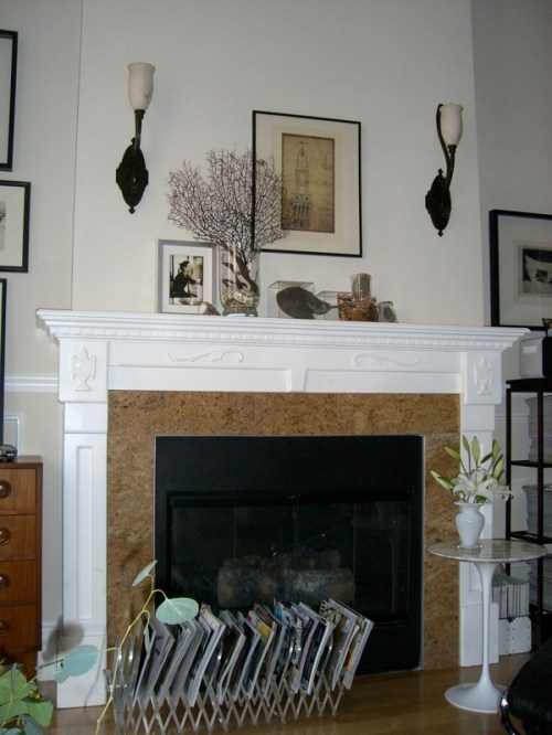 The fireplace is the focal point of Kara’s living room. When I asked her about common mistakes people make when they’re decorating she said, “Not creating a focal point in the room. You want to limit the focal point to one major feature in the room.” Also, don’t be afraid to experiment. “A focal point can be easily changed by repositioning furniture and forming smaller areas in a larger room.”
Kara’s artfully arranged mantle includes a fab piece of black fan coral and mollusks she purchased through Pam Levine at Surf-N-Turf. But don’t expect it to look this way on the next visit. Kara says, “I change it around all the time.”
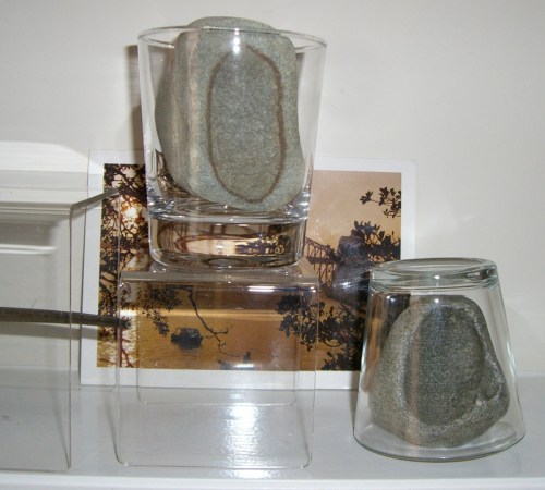
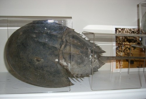 The horseshoe crab was a boyfriend’s find on a beach in New Haven, Connecticut. He’s displayed under clear plastic stands from, get this, Staples. There’s a fresh idea for all those stolen (excuse me, “borrowed”) office supplies.
Kara picked up the rocks on a Rhode Island beach. They’re under plain old bar glasses. She says, “If you put anything in a glass, or behind glass it celebrates it, gives it meaning, like a picture in a frame.” Other uses for rocks: “You could write someone’s name on them for a place card.”
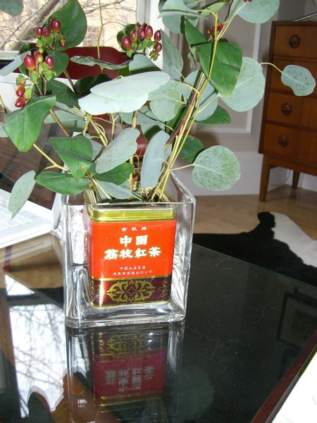 The plant has been re-potted in a lychee tea tin that’s been placed inside a simple, square, glass florist vase. Kara tells me, “I have this thing at the moment, of putting things inside other things, I am doing that quite a bit.” She loves using recycled containers.
The tin is from Asian market Super 88, one of Kara’s secret sources. Kara reveals that the market has “Great modern ceramic pieces and basics that you can mix with classic white dinnerware, or bowls you can put your jewelry in.
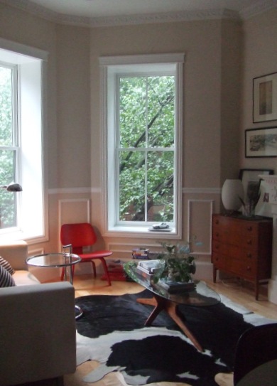
The living room mixes vintage finds, reproductions, and economical pieces for a pulled together feel. Kara’s a big fan of IKEA for basics, which is where her sofa is from. Like many designers, Kara finds that blending low priced pieces with high end ones elevates the whole look. She loves discovering new pieces at IKEA stores around the world. She got a water decanter for the bed side that she’s never seen here, in Australia. And she says that some of textiles are different as well as the gadgets.
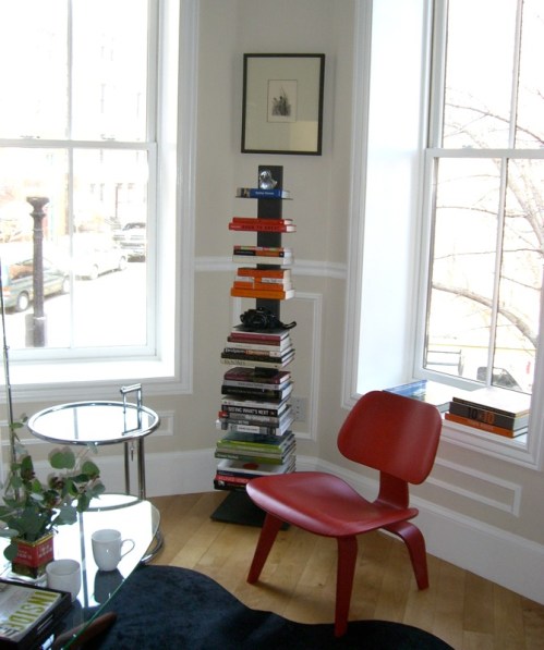 The red Eames chair is from Design Within Reach, as is the Sappien bookshelf. She says, “I was only getting one chair, so I thought it should be splashy. It was the first piece I purchased in Boston, and I know it will be the piece I take with me wherever I go.”
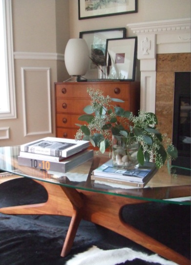 The coffee table is from Reside in Cambridge. Shop owner Pamela Watts curates a beautiful collection of mid-century modern finds. Kara prefers quality over quantity, and strives to keep her environment uncluttered. She admits, “Stylists are known for being pack rats, with lots of stuff and props. My partner is an architect whose style is more minimal, so I have to be mindful of not having shelves of tchokes. We always have our own opinions about beauty and design.
Her advice? Make a conscious effort to un-clutter so you can discover the gems.”Filter to find the aha piece that will make your room complete.” And edit! If you bring something new in, take something else out of the mix.
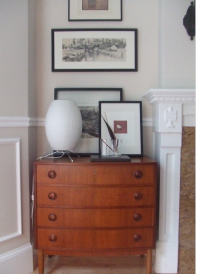
The chest is a Scandinavian design from Machine Age in South Boston, of which Kara says, “It’s a stunning store. It’s filled with twentieth century and mid-century vintage classics in a meticulous layout.” There’s also a Le Corbusier lounge her partner purchased there.
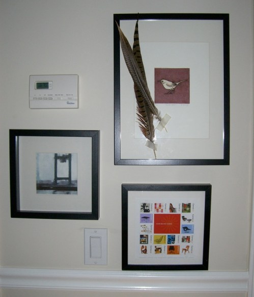 “Art,” says Kara, “is the souvenir I collect when I travel.” She also makes her own. The bottom pieces is a framed sheet of postage stamps.
Other tips: “People often hang artwork too high, so it doesn’t connect to the furniture or the accessories placed on the furnishings. The general rule is to hang pictures at eye level, but I tend to place them slightly higher, usually about two- or three-inches. I have found that this adds more drama to the room. Hanging works at this level makes your eye look slightly higher, which helps make the ceiling appear taller and the room more airy.”
Also, Kara pleads, “Art should be displayed in groupings. And, it’s more visually pleasing if the frames have a consistent theme, like a similar color.” A pet peeve? A zillion framed family photos scattered all over the house.
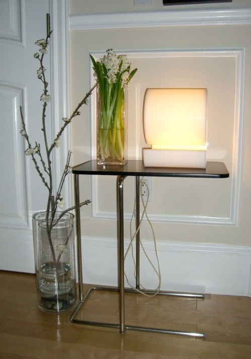 Kara’s obsession? Lighting. “Why do I have a thing for lighting? Maybe because I had fluorescent lighting in my room growing up, and at school. It’s brutal and invasive. I would never turn it on. When my mother told my sister and I we could get new lamps, y sister chose like that. I waited until I found the perfect one.
“These days, she says, “I have many more lights than I need. It’s good to have a combination of task, table, and standing lights. Neena’s Lighting is like a jewelry store for me.”
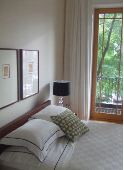 Kara’s bed is dressed with crisp linens. The tall windows are wonderful. The windows are bare. She finds that many people dont’ let sufficient natural light in. (This shot is from her website. She said she’d kill me if I posted the ones I took of her “messy” bedroom when I visited.)
Some parting words, “We can go overboard with obsessions and wish lists. But I think we can be very happy with the things that we already live with it.”


 Follow StyleCarrot on Twitter
