Design Diary: Boston Pied-a-Terre by Ana Donohue

I wrote about this the 1,600-square-foot, contemporary Back Bay condo, decorated by Boston area interior designer Ana Donohue, for New England Home in the article “Urban Oasis.”  Boston photographer Michael J. Lee took all the photos.

The homeowners, who live in Bermuda, purchased the two-bedroom as a pied-a-terre so they’d have somewhere to stay while visiting their two daughters, who attend boarding school in New England. Ana was recommended by a friend, and worked with the wife to create a contemporary home-away-from-home that has a similar feel to the family’s Bermuda residence.

ana-donohue-livingroom

The walls were already this deep charcoal, and since there’s tons of light, they decided to leave it. Plus, dark walls would provide a dramatic backdrop for the light-colored B&B Italia Charles sofa by Antonio Citterio and Cassina LC2 armchairs, purchased at Montage.  The mirrored cocktail table is from The Morson Collection. Newton-based art consultant Jacqueline Becker chose artwork throughout.

ana-donohue-dining

The floors, however, were a different story. Stained a rich walnut, the homeowner wanted them lightened. The contractor thought they were crazy, but embarked on a long bleaching process that left the floors a lovely, creamy shade of white. Everyone loves them.

ana-donohue-vinette

Donohue chose a silvery rug from nearby Landry & Arcari to keep to a uniform palette. The homeowner told me, ““I didn’t want a Persian rug, or a busy print; it would make too much of a statement.” She also preferred to leave the windows bare. Donohue added color and pattern with Missoni throw pillows. Donohue chose a pair of alabaster-topped turned walnut  Jonathan Adler Buenos Aires side tables in different sizes.

ana-donohue-diningclose

In the dining area, Donohue used a classic white marble Saarinen dining table and Saarinen Executive dining chairs. A Foscarini Caboche Suspension Lamp designed by Patricia Urquiola hangs above, casting an amber glow.

ana-donohue-office

A Jonathan Adler Bond desk is in front of a window; the Lucite legs makes the burled mappa wood top appear to float. Behind it, barely visible, is an Kartell Mademoiselle chair, also with Lucite legs.

ana-donohue-master

The upholstered bed in the master bedroom is from DWR and the sleek dresser from Italian Design in Brookline. Bedding from Bloomingdale’s.

ana-donohue-bathroom

Stacked horizontal tile in robin’s egg blue is from Ann Sacks, and the contemporary walnut vanity and faucet from Billie Brenner in the Boston Design Center.

ana-donohue-girlroom

The girls wanted fun colors in their bedroom. Ana found a brightly colored wire side table and bedding at Home Goods. The Jonathan Adler zebra rug in orange adds pattern.

Photography by Michael J. Lee

*          *         *

Shop modern & contemporary furniture at DWR >

Design Diary: Color Theory Brings a Suburban House to Life

Boston-based interior designers Brad Dufton and Kendra Amin-Dufton, the husband and wife duo behind Color Theory (of Apartment Therapy Small Cool fame in 2009), recently finished a top-to-bottom project on a house in Winchester, which I wrote about for the Boston Globe Magazine. The story, “Against the Gray,” details the process of and relationship between the designers and clients on their journey in creating a color-filled home. Note that Color Theory did it entirely from retail sources, so if you’re interested, re-creating the look is within easy reach.

Living Room Designed By Color Theory

 Photo by Michael J. Lee

Funnily enough, although the clients wanted color, Brad went with gray paint throughout the house. It makes a great backdrop for the saturated furnishings. Above, in the formal living room, he used a relatively dark shade, Benjamin Moore “Rock Gray.”  Brad says, “Formal spaces benefit from darker colors; it decompresses your energy, makes you want to stay longer for conversation.” This is one of three rooms in the house that he tags as moody.

Indian rug from Mohr & McPherson in Boston;  “Fillmore” sofa from Thrive; barley twist chairs from Zimman’s near Boston, upholstered in “Prospect” ikat by Thom Filicia for Kravet; starburst mirror from Zimman’s; coffee table from Horchow.

Farmily Room Designed By Color Theory

The family room, above and below, is huge. The walls are a lighter gray, Benjamin Moore “Wales Gray.” (By the way, Brad started out as a professional painter; he swears by and only uses Benjamin Moore, preferring its Regal Select line with a matte finish.) They used a three-dimensional, dried black lava stone tile for the fireplace surround. He calls the handmade, Brazilian chevron cowhide rug, from PureRugs, a “god-like” material, saying, “Everything and anything washes out of it.” Chairs from Circle Furniture; trio of acrylic tables from Wayfair.

Farmily Room Designed By Color Theory

A 14-foot-long Flexform sofa from Showroom in Boston dominates the main portion of the family room. Thomas H. Little Upholstery in Southboro, MA crafted the round ottomans and throw pillows. As for the juju hat installation, the client, who is from Congo, had the orange one. Brad and Kendra asked her to bring back “as many as she could carry” went she went to Africa to visit her mom. They admit they had no idea what they’d do with them all, but in a fit of inspiration, they clustered them on the wall

Sunroom Designed By Color Theory

Photo by Michael J. Lee

The sunroom boasts an amazing collection of indoor/outdoor pieces by Paolo Lenti from Montage in Boston. The sofa is actually three individual chairs that can be moved around (or dragged out to the deck). They originally purchased the ensemble for the basement playroom, but in an Aha! moment, Kendra realized they’d be perfect for the sunroom. The indoor/outdoor rug was a steal for $150 at RugsUSA, a welcome addition after the splurge on furniture. Continuing the high/low mix, there’s also a “Martini” side table from West Elm and a trio of cage pendants from CB2.

Lighting Designed by Color Theory

In the stairwell, nine brass and stainless steel pendants with rope cords and Thomas Edison filament bulbs by Lunabella, purchased at Zimman’s. We hear the electrician was none too pleased to have to hang them all.

Lighting Designed by Color Theory

Bedroom Designed by Color Theory
Photo by Michael J. Lee

The master bedroom is done in a glamorous scheme of black and magenta, with Benjamin Moore “Rock Gray” on the walls. The bed, which the clients first saw in an apartment they rented in Paris, is B&B Italia by Max Aalto, purchased from  Montage in Boston. It’s black-stained wood, with a gray tweed upholstered headboard and platform. The ottoman is West Elm and the ikat rug from Wayfair.  The Horchow fainting chaise came in gray velvet, but Brad and Kendra had it reupholstered in a magenta fabric by Iman for Kravet that they’d had their eyes on for years.

Boudoir Designed By Color Theory
 Photo by Michael J. Lee

The client was hot for a vanity. Brad and Kendra couldn’t find one they loved, so they pieced together its components using the Jonathan Adler “Channing” console, an inexpensive acrylic chair, curvy “Cattaneo” mirror from Horchow, and chrome sconces with black shades from Lamps Plus. I love the Senegalese storage basket from Serena & Lily, presumably used as a hamper.

Bathroom Designed By Color Theory

The master bath is done with a 3D tile on the floor, inspired by Manhattan bathrooms of the 1920s, and staggered oversize marble tiles on the wall. The egg-shaped tub was a splurge, and caused a bit of a ruckus with the plumber, but they finally got it right.

color-theory-nursery-michael-lee
 Photo by Michael J. Lee

The client, pictured here, is expecting a baby. Luckily, they were able to use all the pieces from her now two-year-old’s nursery from their prior home to create a new gender-neutral nursery. The walls are a grayish blue, Benjamin Moore “Sterling.”  The chartreuse lacquer dresser is the “Latitude” from CB2, the sleeper sofa from Room & Board, and the crib is Stokke. The stuffed animals are from Africa and the animal photographs purchased online from The Animal Print Shop, finished in frames by Room & Board. The chevron rug was created from FLOR carpet tiles. The cuckoo clocks over the crib were Brad & Kendra’s (you may recognize them from their living room), purchased a while back for 99 cents each at Urban Outfitters.

Guest Room Designed By Color Theory

The guest room, above and below, is done in the punchy black and white “Feather Fan” wallpaper by Cole & Son. “Wood Tiled” whitewashed dresser from West Elm; assorted carpet tiles by FLOR.

Guest Room Designed By Color Theory

“Window” headboard from West Elm and “English Garden” comforter set from Target.

Color Theory Girls Bedroom Boho

Finally, the daughter’s bedroom is done with a hippie chic, boho bibe, in a slight departure from the rest of the house. Brad says, “I want her to feel like she is carried to a far away land when she steps in.”

*  *   *   *

Shop Serena & Lily for beautiful kids’ rooms. 

Serena & Lily Girls Bedrooms

Shop stylish sofas at Dwell Studio

Design Diary: Asian Infusion

This duplex condo in a 19th century townhouse in Boston’s South End neighborhood is the home of restaurateur Matt Burns, a partner in The Aquitaine Group (Aquitaine, Gaslight, Union Bar & Grille). I visited to write  “The Italian Job” for the Boston Globe Sunday Magazine. The interiors were designed by Meichi Peng, whose well-balanced work is flawless.

Meichi mixed Asian art and objects (some of which Burns already had, some of which Meichi found) with his existing contemporary contemporary Italian sofa and cane back chairs that he had purchased at Showroom in Boston.  Burns says, “I love modern Italian furniture, but when used exclusively, there’s not much personality.”

The coffee table, which Peng describes as “very sculptural,” is a new piece imported from South Asia that bridges the new furnishings with the antique elements. The floor lamp in the living room and pendant over the Saarinen dining table (a piece Burns plans to replace) are both by Anta, from Casa in the South End.
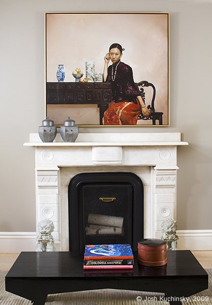
The large oil painting that hangs over the fireplace is by Chinese-born photo-realist painter Yingzhao Liu, from Newbury Fine Arts.

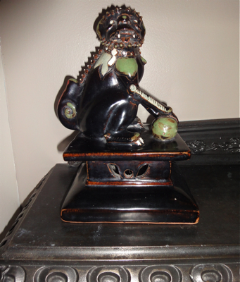
Peng punctuated the rooms with decorative Chinese antiques, such as the Qing Dynasty lions that guard the living room’s hearth, the 19th century lacquered food storage vessel on the table, and the mid-18th century Chinese pewter wedding containers on the marble mantle.
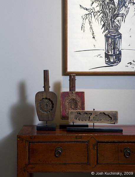
A pair of Japanese-style ink drawings (above and below) done by Rod House, a family friend, hang over Asian style chests which flank the fireplace.

All three decorative pieces are early 19th century rice cake molds that Peng found on a shopping trip to Taiwan. They would have been used in holiday ceremonies. They are in the shapes of a turtle, currency, and fish all of which symbolize longevity and prosperity. Today, such items are made from aluminum casings.
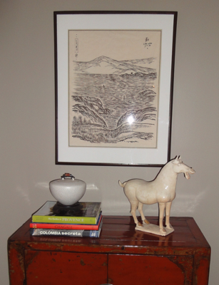
The Asian side table and cabinet are both from Danish Country, an antiques shop on Charles Street in Beacon Hill. The ink drawing depicts a Japan-ized coastal scene of Marblehead, Massachusetts.
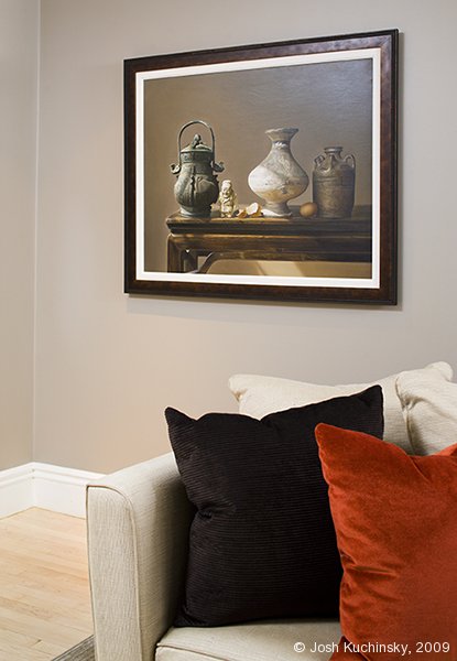
A second oil painting by Yingzhao Liu, this one a still life, hangs behind the sofa, on the wall opposite the fireplace.

The throw pillows, both chosen by Peng, add warmth and texture to the room. The solid chocolate ribbed fabric is Glant, and the shimmery russet velvet, which takes color cues from the painting over the mantle, is Bergamo.

The walls are painted in Benjamin Moore’s Iron Gate — a gray-toned taupe that serves as a unifying background. “The statement here is the art,” Peng says. “We just tied it all together.”
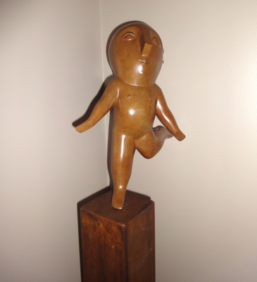
A funny little sculpture in the living room.
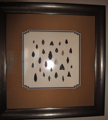
Burns purchased these pre-Columbian (c. 1400) Bolivian arrowheads in Columbia. When he returned, he had them authenticated by a scholar in Cambridge and then framed.
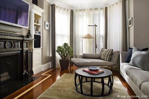
The den is also done with a mix of Italian and Asian pieces. Peng re-decorated this room from top to bottom, choosing a Victor sofa and Happy chaise, both by Flexform from Showroom, and a Maxalto coffee table by B&B Italia from Montage in Boston.

The distinctive cast iron fireplace is original to the home, and one of Burns’ favorite features. He also loves the whimsical and “kind of evil” monkeys, found by Peng in Florence, which sit on the mantle. The silk rug is from Steven King at the Boston Design Center.
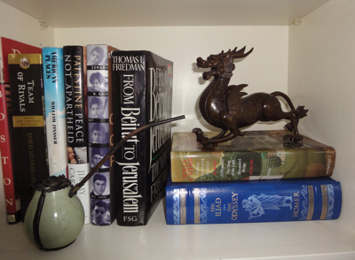
Burns’ Chinese artifacts include a dragon carving (above) and three imperfect Tang Dynasty pots (below), all of which he purchased from Asian Collections in Brookline, Massachusetts.
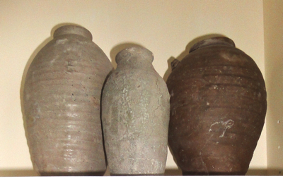
Burns says that apparently these pots, which he was told are Tang Dynasty, were found in a building found on a construction site in China, and were probably rejects, meant to be thrown out.
Detail of the evil-looking monkeys that sit on the mantle in the den.
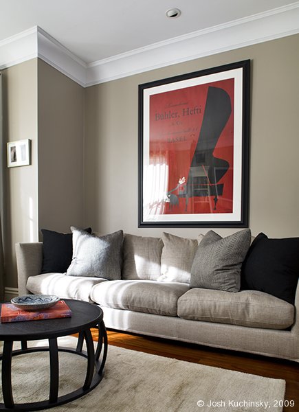
The original art poster, bought at International Poster Gallery on Newbury Street,  is a piece that Burns had already. He says, “It doesn’t really have a place other than the color works well.”  He thinks it’s Swiss, from 1920s – 40s.

The embroidered tapestry fabric artwork over the bed is from Judith Dowling in Beacon Hill.  He had been looking for a long time and pestering Peng for something to go over the bed when he discovered this in the back room of the antique shop.

Photographs (as indicated) by Josh Kuchinsky.

[tweetmeme source=”StyleCarrot” only_single=false]