Photo by Marni Elyse Katz/StyleCarrot
Spending the weekend on Martha’s Vineyard, where it’s still all about Jaws.
| style art decor |
Photo by Marni Elyse Katz/StyleCarrot
Spending the weekend on Martha’s Vineyard, where it’s still all about Jaws.
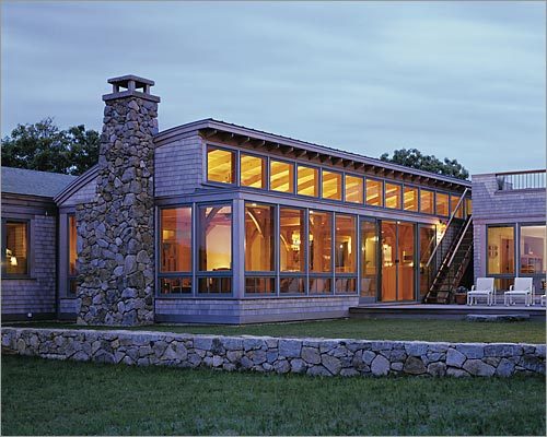
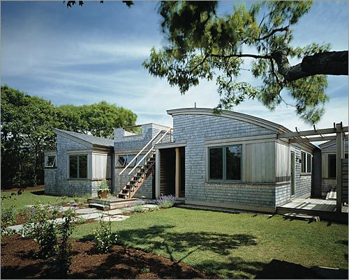
Hutker Architects coined a term for the style of home they’ve been busily building on Martha’s Vineyard for the past 25 years: “new regional vernacular.” Peter Cappuccino, lead architect on this project explains it as using traditional forms and familiar materials but applying them in new ways, while designing to suit a modern lifestyle.
Anne and Peter’s Vineyard home is a perfect example. I wrote about it in an article called “Vineyard Dreams” for the Cape & Islands issue of The Boston Globe Magazine on Sunday, July 20. I hope you will click through to read the story, as well as scroll down here for additional photos and notes.
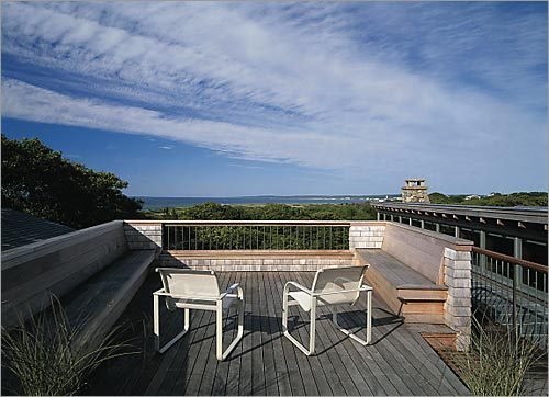
There are both water and wooded views from the steeply sloping site. Here, the deck, which connects the public spaces of the living room, kitchen, and screened porch, looks north. Here, the master bedroom deck has an amazing view towards Nantucket Sound. From the corner, one can see the steamship ferry come and go from Wood’s Hole.
All the rooms enjoy what Cappuccino called “single width volumes,” meaning every room has at least three exposures. One ascends the stairs, enters through a single story space with a standing seam metal roof. To the right a two story space houses the kids rooms downstairs and guest suite, with a private stair. The two-story volume in the middle towards the back holds the master suite upstairs, also with private stair, and kitchen below. There’s also a family room behind that. The long room jutting into the foreground on the left is a double living room and dining room with cathedral ceiling. Decks and a screened porch run along the other side.
Courtney Fadness, who recently moved on from Hutker, designed the home’s interiors using a high/low approach, using fun graphic pieces. The Standishes, who have three college aged kids, wanted the home to feel cozy, but with plenty of pattern and splashes of color. Fadness says, “Since it’s nestled in the trees, rather than on the beach, we could play with a more saturated palette than if we had been tied to ocean hues.”
A custom diamond pattern sisal by Merida is the base layer that runs the length of the huge room. A Moroccan-inspired dhurrie by Madeline Weinrib defines the seating area above. The sofa is a custom piece by Vioski, upholstered in a linen blend by Romo. It has a notch cut out on the back for a console table, so when you approach from dining room, you see shelves on that side. Fadnes says, “It feels more inviting, and its sculptural silhouette looks beautiful from all angles.”
Martini side tables in red by West Elm provide pops of color and the Madison & Grow “Elizabeth” wallpaper in “Peacock on Shimmer” adds an additional graphic element and a subtle touch of teal. The Danish modern chairs with blue velvet upholstery are from 1st Dibs. The colorful glass lamp is by Tracy Glover.
The dining room, which precedes the double living room space, is dominated by a live edge wood table with a steel insert and base that the couple found on 1st Dibs, along with a statement chandelier. The wood slat and metal chairs are outdoor pieces from Terrain, and the upholstered chairs add heft and height.
The Currey & Company “Bayside” chandelier is wrought iron hand-wrapped in abaca rope; a nod to the beach. She says, “The not too serious interpretation of a traditional form adds feminine curves; it’s a nice juxtaposition to the more modern and masculine table. It also helps fill the volume of the space, without feeling heavy or obstructing views.”
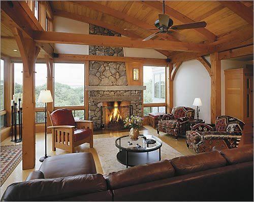
The wall on either side of the fireplace is painted teal, a color pulled from the Madison & Grow wallpaper across the room. The chairs have a nice back, so can be oriented towards the first or the second seating areas. Metallic gold dot pillow from Anthropologie.
Deeper into the space, pushing out towards the view, is the living room’s second seating area. The sofa and armchairs are Baker Furniture, upholstered in linen by Romo and a nubby brown fabric. and The assortment of reclaimed wood coffee tables are from Anthropologie, and the arc lamp from CB2.
The screened porch has sturdy teak sofas with indoor/outdoor cushions.
The kitchen is on smaller side, with a focus on the more practical aspects, The countertop is Caesarstone and the the backsplash of stove is a river rock –painted cabinetry, tom Dixon pendants, the backsplash over the stove is a river rock, bringing outside elements in. The cabinetry have painted frames with frosted resin insets and the light pendants are Tom Dixon. The palette reflects the monochromatic contrast of white on dark found in several other places in the house. The flooring in the entry and kitchen is budget- and user-friendly cork.
“Ribbed” by Ferm Living wallpaper in the powder room again shows the play of light and dark, and also brings in organic shapes. The sink looks like hammered metal but is actually porcelain. The homeowners found the mirror. A limestone counter sits atop a bamboo vanity that’s the same color as the bamboo floor. The Kohler single handle faucet is brushed nickel.
The kids hang in the casual family room, located behind the kitchen, to watch television.
Anne likens the experience of her airy master bedroom to sleeping in a treehouse. All the walls, as well as the cathedral ceiling, are painted pale blue, as it were a continuation of the horizon. Graphic rug by Dwell Studio.
The reclaimed wood bed and the reclaimed pine plank nightstands are from the Sundance Catalog. The large table lamps from Horchow boast striations that resemble layers of sand.
The upper deck outside the master bedroom is perched above the screened porch.
The guest room is outfitted with a wood-tiled West Elm nightstand and Thomas Paul botanical pillows.
The girls bedroom has bedding by John Robshaw.
Photography by Ken Richardson
[show_shopthepost_widget id=”170892″]