Design Diary: Color Theory Brings a Suburban House to Life

Boston-based interior designers Brad Dufton and Kendra Amin-Dufton, the husband and wife duo behind Color Theory (of Apartment Therapy Small Cool fame in 2009), recently finished a top-to-bottom project on a house in Winchester, which I wrote about for the Boston Globe Magazine. The story, “Against the Gray,” details the process of and relationship between the designers and clients on their journey in creating a color-filled home. Note that Color Theory did it entirely from retail sources, so if you’re interested, re-creating the look is within easy reach.

Living Room Designed By Color Theory

 Photo by Michael J. Lee

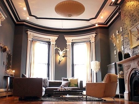
Funnily enough, although the clients wanted color, Brad went with gray paint throughout the house. It makes a great backdrop for the saturated furnishings. Above, in the formal living room, he used a relatively dark shade, Benjamin Moore “Rock Gray.”  Brad says, “Formal spaces benefit from darker colors; it decompresses your energy, makes you want to stay longer for conversation.” This is one of three rooms in the house that he tags as moody.

Indian rug from Mohr & McPherson in Boston;  “Fillmore” sofa from Thrive; barley twist chairs from Zimman’s near Boston, upholstered in “Prospect” ikat by Thom Filicia for Kravet; starburst mirror from Zimman’s; coffee table from Horchow.

Farmily Room Designed By Color Theory

The family room, above and below, is huge. The walls are a lighter gray, Benjamin Moore “Wales Gray.” (By the way, Brad started out as a professional painter; he swears by and only uses Benjamin Moore, preferring its Regal Select line with a matte finish.) They used a three-dimensional, dried black lava stone tile for the fireplace surround. He calls the handmade, Brazilian chevron cowhide rug, from PureRugs, a “god-like” material, saying, “Everything and anything washes out of it.” Chairs from Circle Furniture; trio of acrylic tables from Wayfair.

Farmily Room Designed By Color Theory

A 14-foot-long Flexform sofa from Showroom in Boston dominates the main portion of the family room. Thomas H. Little Upholstery in Southboro, MA crafted the round ottomans and throw pillows. As for the juju hat installation, the client, who is from Congo, had the orange one. Brad and Kendra asked her to bring back “as many as she could carry” went she went to Africa to visit her mom. They admit they had no idea what they’d do with them all, but in a fit of inspiration, they clustered them on the wall

Sunroom Designed By Color Theory

Photo by Michael J. Lee

The sunroom boasts an amazing collection of indoor/outdoor pieces by Paolo Lenti from Montage in Boston. The sofa is actually three individual chairs that can be moved around (or dragged out to the deck). They originally purchased the ensemble for the basement playroom, but in an Aha! moment, Kendra realized they’d be perfect for the sunroom. The indoor/outdoor rug was a steal for $150 at RugsUSA, a welcome addition after the splurge on furniture. Continuing the high/low mix, there’s also a “Martini” side table from West Elm and a trio of cage pendants from CB2.

Lighting Designed by Color Theory

In the stairwell, nine brass and stainless steel pendants with rope cords and Thomas Edison filament bulbs by Lunabella, purchased at Zimman’s. We hear the electrician was none too pleased to have to hang them all.

Lighting Designed by Color Theory

Bedroom Designed by Color Theory
Photo by Michael J. Lee

The master bedroom is done in a glamorous scheme of black and magenta, with Benjamin Moore “Rock Gray” on the walls. The bed, which the clients first saw in an apartment they rented in Paris, is B&B Italia by Max Aalto, purchased from  Montage in Boston. It’s black-stained wood, with a gray tweed upholstered headboard and platform. The ottoman is West Elm and the ikat rug from Wayfair.  The Horchow fainting chaise came in gray velvet, but Brad and Kendra had it reupholstered in a magenta fabric by Iman for Kravet that they’d had their eyes on for years.

Boudoir Designed By Color Theory
 Photo by Michael J. Lee

The client was hot for a vanity. Brad and Kendra couldn’t find one they loved, so they pieced together its components using the Jonathan Adler “Channing” console, an inexpensive acrylic chair, curvy “Cattaneo” mirror from Horchow, and chrome sconces with black shades from Lamps Plus. I love the Senegalese storage basket from Serena & Lily, presumably used as a hamper.

Bathroom Designed By Color Theory

The master bath is done with a 3D tile on the floor, inspired by Manhattan bathrooms of the 1920s, and staggered oversize marble tiles on the wall. The egg-shaped tub was a splurge, and caused a bit of a ruckus with the plumber, but they finally got it right.

color-theory-nursery-michael-lee
 Photo by Michael J. Lee

The client, pictured here, is expecting a baby. Luckily, they were able to use all the pieces from her now two-year-old’s nursery from their prior home to create a new gender-neutral nursery. The walls are a grayish blue, Benjamin Moore “Sterling.”  The chartreuse lacquer dresser is the “Latitude” from CB2, the sleeper sofa from Room & Board, and the crib is Stokke. The stuffed animals are from Africa and the animal photographs purchased online from The Animal Print Shop, finished in frames by Room & Board. The chevron rug was created from FLOR carpet tiles. The cuckoo clocks over the crib were Brad & Kendra’s (you may recognize them from their living room), purchased a while back for 99 cents each at Urban Outfitters.

Guest Room Designed By Color Theory

The guest room, above and below, is done in the punchy black and white “Feather Fan” wallpaper by Cole & Son. “Wood Tiled” whitewashed dresser from West Elm; assorted carpet tiles by FLOR.

Guest Room Designed By Color Theory

“Window” headboard from West Elm and “English Garden” comforter set from Target.

Color Theory Girls Bedroom Boho

Finally, the daughter’s bedroom is done with a hippie chic, boho bibe, in a slight departure from the rest of the house. Brad says, “I want her to feel like she is carried to a far away land when she steps in.”

*  *   *   *

Shop Serena & Lily for beautiful kids’ rooms. 

Serena & Lily Girls Bedrooms

Shop stylish sofas at Dwell Studio

Designer Spotlight: David Hicks

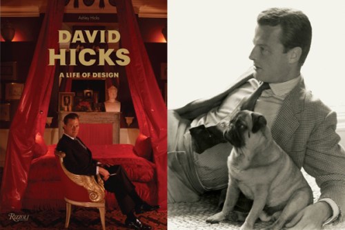
I recently worked with Ashley Hicks, designer and son of legendary designer David Hicks, on an article for eBay’s new lifestyle site, The Inside Source, “Ashley Hicks on His Father, David,” to promote his new book, David Hicks: A Life of Design. The book is worth an actual read, rather than a simple flip to look at the pretty pictures.
What struck me most, besides Hicks’ incredibly privileged, glam lifestyle, was how many of his design innovations endured. A number of features seen in his room throughout the ’60s and ’70s, are au courant today.

Left: David Hicks at home, Albany, London (Derry Moore)
Right: David Hicks, summer 1958 with his pug, Algy (David Hicks Archive)

= = =

CHANDELIERS and ORNATE MIRRORS IN THE BATHROOM

Left: David Hicks  (David Hicks Archive)    |      Right: Vogue

= = =

SHEEPSKIN THROW RUGS BESIDE THE BEDLeft: David Hicks (photo by Norman McGrath) |  Right: Robin Pelissier

= = =

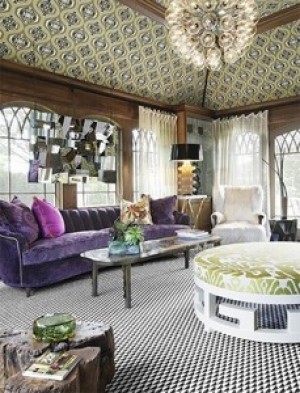
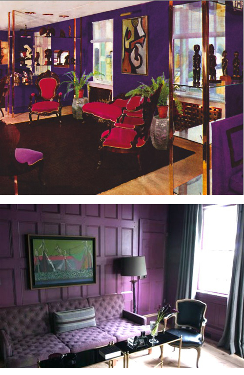
DEEP PURPLE PARLORS

Top: David Hicks (photo by Norman McGrath)

Bottom: Steven Gambrel

= = =

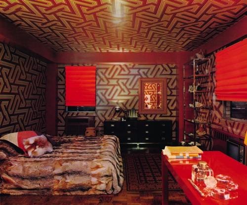
FUR THROWS  and  GEOMETRIC PATTERNS

David Hicks (photo by Norman McGrath)

Left: Jeff Andrews Design    |    Right: Color Theory

= = =

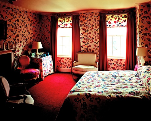
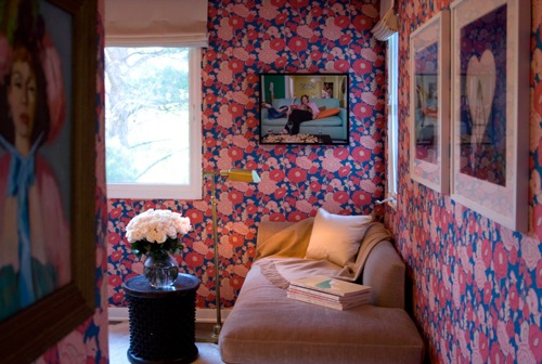
OVERSIZE FLORAL WALLPAPERDavid Hicks (David Hicks Archive)

M. Design

= = =

ZEBRA SKIN RUGS IN THE LIBRARY

Left: David Hicks  (David Hicks Archive)
Right: Alessandra Branca, Architectural Digest

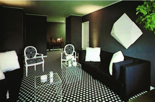
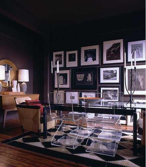
LUCITE FURNITURE WITH BLACK WALLS

David Hicks (photo by John T. Hill)

Spruce Design & Decor

= = =

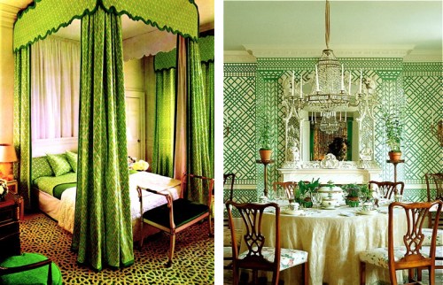
TRELLIS PATTERNS IN KELLY GREEN

Left: David Hicks (photo by Norman McGrath) Right: Mark Hampton

= = =