Design Diary: Boston Design Home’s Net Zero Energy House

Sunday is the last day to see Boston Magazine’s Design Home. This year, Design Home is a net-zero energy house, built, owned, and soon to be lived in, by real people. Homeowners Natalie and Tom Treat, along with Ridgeview Construction and National Grid, collaborated with Design Home to promote awareness of energy efficient design and raise money for Boston Children’s Hospital. (Tickets are $25, all of which goes to Boston Children’s Hospital.)

treat-exterior

The 2,400-square foot, single-family home in Salisbury, Massachusetts is a brand new modular construction designed by BrightBuilt Home. It features energy efficient building techniques and systems, as well as eco-friendly finishes and furnishings, all from local sources, overseen by architectural and interior designer Lisa Sivan Wasserman.

It’s the last weekend to take the tour and see the whole thing in person. Here’s a preview of some of the spaces, along with decor details you won’t find anywhere else. (I wrote all the copy for the Design House again this year, so I’ve got plenty of extra scoop. If you’re more interested in the energy efficiency aspect, let me know, as I’ve got a lot of information on that as well, and can direct you to the experts.)

treat-entry-straight-on

In the entry, gray slate tile bridges the exterior and interior and requires minimum maintenance. Sunlight streams through the cut in the family room wall. The elephant mahogany console table on curvilinear steel base, is by Ray Bachand of 60nobscot, and the vintage rug is from Landry & Arcari, which provided the rugs in every room.  The Walsingham Gallery in Newburyport provided the artwork throughout the house, often done by local artists depicting local subjects. This seascape in oil is by Robert Bolster.

treat-entry-side

To the right, the reclaimed antique wood bench with sleek acrylic legs is also from 60nobscot. Low VOC paint from Benjamin Moore was used throughout.

treat-lr-side-table

Lynn Dayton of Dayton Home, a home furnishings shop in Wellesley, decorated the family room. Dayton was inspired by natural woods, minerals, grasses and stone. She used natural linen on the windows to reflect the commitment to organic. Plus, they allow for privacy but also light and heat.  (Dayton supplied the fabrics for the window treatments, which were sewn by Adorna, a local to the trade custom workroom.)  Sofa is by Wesley Hall and glass table lamp Arteriors Home.

treat-sunroom

The sunroom was an add-on that will make the Treats feel like they’re in the New Hampshire woods, right in their backyard. Low maintenance indoor/outdoor furniture from Yankee Fireplace. I love the unfinished beadboard cathedral ceiling.

treat-upstairs-hall

The upstairs palette is much lighter, and the vibe more relaxed. A vegetable-dyed, hand-spun wool rug in seafoam green with a terracotta lotus tree pattern from Landry & Arcari provides soft color on the floor. The reclaimed wood flooring throughout was supplied by Jewett Farms + Co. Upstairs they used wide planks of live sawn old growth white oak. The landscape paintings, Darlou Gams‘ diptych “Morning” and “Breezing Marsh,” reinforce the dreamy feel, and a pair of vintage rattan stools found on eBay add texture.

treat-kids-bed

The child’s bedroom, designed by Emily Lacouture of NOW Interiors, a design studio and retail shop in Acton, is playful and sophisticated. The patchwork quilt with animal spine pattern is handmade by a RISD-trained artist Meg Callahan. The stump side table is locally made chainsaw art by Vermont craftsman Barre Pinske and the wooly llama foot stool is by Eli Parker. The life size baby giraffe sculpture by Ocean Sole is made out of flip flops retrieved and recycled from the beaches of Kenya.

treat-kids-dresser-2

On the other side of the room, an abstract cityscape by Boston artist Beatrice Dauge-Kaufman and an on-trend polished copper spotlight sits on a glossy black console.

treat-guest-room

LaCouture also decorated the guest room, in which she used a hand-painted 1960s vintage folding screen from France as a headboard. The reclaimed wood bench at the foot of the bed is an nice juxtaposition to the smooth pale wood Fan chair by Tom Dixon, which is a contemporary take on the classic Windsor chair. That chunky, handknit throw is delicious.

treat-mbr-bench

The master bedroom palette is soft and soothing. Kerry Vaughan of Red Bird Trading Company in Newburyport decorated the room, using a statement making, Phillip Jeffries Driftwood grasscloth-covered four-poster bed by Lee Industries as its centerpiece. A diamond quilted linen coverlet and white linens keeps the palette perfectly pared down, while a locally made linen throw with velvet backing, mohair and velvet throw pillows, and lamp shades custom made in Maine from marbleized paper add a touch of texture and color. The nailhead trim bench, covered in cotton velvet is also Lee Industries. The room is grounded by a wool and silk rib rug in a lustrous gray from Landry & Arcari.

treat-mbr-desk

A narrow grasscloth covered console table doubles as a vanity, accessorized with a swirly distressed wood mirror.

treat-guest-bath

The children’s room and guest room share the spa-like blue and white bathroom that opens off the upstairs hall. The space saving vanity is from Peabody Supply Company; its bottom drawer and storage shelf supplement the narrow linen closet next to the shower. Accessories fromNOW Interiors, such as the rattan mirror and aqua striped Turkish towel reinforce the bath’s coastal vibe. Both this and the master bath feature radiant flooring, an energy saving alternative to baseboard heaters.

treat-loft

Kerry Vaughan of Red Bird Trading conjured an artist’s atelier as inspiration. The décor, like that elsewhere in the home, draws from natural elements and sticks to the spirit of using locally made and reworked pieces. An extra long sectional by Lee Industries is upholstered in heavily textured, oyster white Belgian linen, and sits on an overdyed Turkish rug. Above is an industrial style raw brass light fixture.

treat-loft-daybed

Under the eaves is a recycled cot from Maine, covered in cowhide.

treat-loft-desk

Another area features a drafting table.

treat-exterior-solar-panels

Coastal Windows & Exteriors provided the home’s triple pane argon windows, which reduce solar gain from the sun in summer and prevent heat from escaping in winter. The 27 Sunbug Solar panels on the roof will generate at least as much power as the home uses each year. The Treats expect to have saved enough on energy bills to compensate for the cost of their panels within four to five years. An electric circuit monitor by PowerWise will gather data about how much electric the home’s lighting, appliances, etc. consumes, so they can analyze where to cut back and where waste might be occurring.

Michael J. Lee Photography

•             •            •

S H O P  the P O S T

[show_shopthepost_widget id=”302828″]

Design Diary: Leather District Loft by Michael Ferzoco

Michael Ferzoco of Eleven Interiors has made a bit of a specialty sprucing up living spaces for single men. That’s not to say he doesn’t deal in couple, families, and women—he does—but recently I’ve written about a couple of so-called bachelor pads” that he’s designed.

This one, which appeared as “All That Glitters” in Boston Home (photography by Michael J. Lee) is owned by a doctor who moved to Boston from Richmond, Virginia, where he lived in a four-level Italianate row house. When he relocated, he decided to seriously downsize, purchasing a 994-square-foot loft in Boston’s Leather District for him and his two large dogs. He now lives there with one mix breed beagle named Daisy.

After living there 13 years, he consulted interior designer Michael Ferzoco about upgrading his furnishings and re-imagining his kitchen. While he still loved the “gritty” feel of the neighborhood, he wanted a more luxurious living experience once he stepped inside. He says, “I wanted a place that felt like a very comfortable—but chic—hotel suite.” Ferzoco infused grandeur into the small space.

michael-ferzoco-loft-living-room

Ferzoco left the four large windows bare, so the space is bright all day. He helped the homeowner “vigilantly edit” his belongings. They kept the pair of mid-century modern leather-and-wood armchairs that the homeowner purchased at a yard sale in Texas. They also kept the large mirrored Scandinavian armoire from the 1800s, which the homeowner had purchased from close friends. Ferzoco steered him to replace his sofa with two new Minoti “Hamilton” sofas from The Morson Collection in Boston, which the homeowner had been admiring for a while.

michael-ferzoco-loft-dining-room-

The mirrored console from Horchow pre-dates Ferzoco. The homeowner purchased years ago in what he calls “a two martini moment,” on the advice of a friend. He couldn’t believe how large it was when it showed up. It definitely adds a spot of glam.

Suspended track lighting by Bruch highlights artwork by local artist Sand T. Kalloch. Ferzoco says, “I’m not into recessed lighting; it makes the ceiling look like Swiss cheese.”

The homeowner says, “I  lean toward clean lines, but I also have an affinity for older things with classicism,” so they kept the clawfoot Baker dining table and chairs, which he purchased after finishing his residency. The chairs are upholstered in gray gabardine.

michael-ferzoco-loft-kitchen

The emerald green and gold Bisazza mosaic tile backsplash goes all the way up to the ceiling. Chilmark Architectural Millwork made the glossy white lacquer cabinetry. The countertops are Caesarstone in Arctic White. The LEM Piston stools are from DWR.

The homeowner found the mid-century Austrian J.T. Kalmar chandelier, made from thick panels of textural crystal, in a consignment shop in Germany on a side trip from Russia.

michael-ferzoco-loft-LR-bar

The homeowner already had the chartreuse Emma Gardner rug. The marble-topped Minotti cocktail table was purchased along with the Minotti sofas from The Morson Collection when they went on sale. The mobile-like  “Crescendo Chandelier” by Tech Lighting suffuses light across the room.

michael-ferzoco-loft-bar

The glass brick wall behind the sofa is pre-existing, dividing the entry from the living space. Contemporary artwork makes for a fun backdrop for the bottles.

michael-ferzoco-loft-bedroom

The homeowner purchased the cowhide when he lived in Texas. He bought the “L’Instant Tattinger” print on eBay. The wavy maple screen is by Knoll.

michael-ferzoco-loft-artwork

The framed red silk tapestry from the early 1900s is a family heirloom.

michael-ferzoco-loft-bathroom-vanity

Master bathroom.

michael-ferzoco-loft-bathtub

The homeowner had the leather tiles in oxblood from Ann Sacks installed shortly after purchasing the loft, to give the place some character. He says, “I figured the room has no light anyway, so why not embrace the dark richness?”

Photography by Michael J. Lee

•             •           •

Shop the Look

[show_shopthepost_widget id=”98924″]

Design Diary: Boston Magazine’s Design Home 2013

Over the summer I worked on a big project that is now up and running— Boston magazine’s Design Home 2013. No, I didn’t decorate any rooms; I wrote the copy for the accompanying brochure, describing the furnishings and decor throughout the space. This year’s home is an expansive condo in The Concordia, a newly developed building right on the water on the North Shore, in Swampscott, Mass.

Design Home is open through Oct. 7. I hope those of you who are local will consider taking drive to see it, since all ticket proceeds ($25/person) benefit Boston Children’s Hospital. (Click here to purchase tickets. 

The 3,600+ square foot unit, done in ocean hues, is furnished with pieces from local businesses, including Landry & Arcari, Lucia Lighting, Didrik’s, Surroundings, Zimman’s, and others. Here’s a taste of what you’ll see, photographed by the ever present (and talented!) Michael J. Lee.

boston-design-home-entry

Entry
Custom bench by 60nobscot; crystal fixture from Lucia Lighting.

boston-design-home-kitchen

Kitchen
Wood Mode cabinetry by Family Kitchens; backsplash by Tile by Design.

boston-design-home-tabletop

Dining Room
Place setting from Didriks.

boston-design-home-deck

Deck
Barlow Tyrie outdoor furniture from Didriks.

boston-design-home-mbr

Master Bedroom
Barley twist bed and custom paisley bedding from Zimman’s.
Hand-knotted Turkmen rug from Landry & Arcari.

boston-design-home-sitting-area

Sitting Area

boston-design-home-dressing-room

Ladies Dressing Room
Cabinetry by California Closets; clothing from Irresistibles.

boston-design-home-sleeping-nook

Sleeping Nook
Trundle bed by Family Kitchens.

boston-design-home-guest-suite

Guest Suite
Furnishings, bedding, and accessories from Surroundings.

boston-design-home-coast

Coastal View

All photographs by  Michael J. Lee

*          *          *

Design Diary: Kate Patterson’s Brookline Home

I just got back from a gathering at the home of Brookline-based interior designer Kate Patterson. The house is absolutely stunning; Kate has incredible talent. We met last week via email as I was trying to organize a mini school bus. Turns out her son just started 7th grade with mine. It also turns out that she hosted the breakfast for the Fall 2013 issue of Boston Home magazine, since her house is featured.

The house, which is on a city street across from a park—with a distant view of the Prudential and Hancock buildings, dates from the turn-of-the-century, and was a complete mess when they bought it. Kate and her husband hired architecture firm Warner + Cunningham to help with the plans, CW Design for the custom cabinetry in the kitchen and master bath, the Remodeling Company to gut the place, and Faith Michaels of Faithful Flowers for landscaping. Obviously, she decorated it herself.

I want to move in. Probably the best I can hope for is an invite back. The first 7 images of Kate’s home are from the magazine, photographed by Trent Bell. Then, my Instagram snapshots from this morning.

kate-patterson-shaw-living-room

kate-patterson-shaw-dining-room

kate-patterson-shaw-kitchen

kate-patterson-shaw-entry

kate-patterson-shaw-mbr

kate-patterson-shaw-master-bath

kate-patterson-shaw-pool

Above photos by Trent Bell

*     *     *

E N T R Y 

IMG_7738

IMG_7741

P O W D E R   R O O M

IMG_7732

IMG_7736

L I B R A R Y

IMG_7673

IMG_7676

D I N I N G   R O O M 

IMG_7708

IMG_7710

M A I N    S T A I R W A Y

IMG_7689

K I T C H E N

IMG_7700

IMG_7702

IMG_7695

L I V I N G    R O O M 

IMG_7684

IMG_7722 IMG_7720 IMG_7718

P A T I O

IMG_7756

IMG_7749

IMG_7792

IMG_7774

IMG_7769

*    *    *

 Shop Serena & Lily for fall decor – 150+ new items!serena-lily-banner-fall-2013


Design Diary: Sleek Cabin on Squam Lake by Tom Murdough

Last fall I wrote about a beautiful lake house in New Hampshire designed by Boston-based architect Tom Murdough for his extended family. The article, “Doing Wright,” appeared in the Fall 2011 issue of Boston Home Magazine. A blog post is long overdue; summer is the perfect time for it.

It’s a guest house just through the woods from his parent’s modernist home on Squam Lake, where Murdough and his three brothers spent their boyhood summers. The design is meant to immerse the family in the woods and help them engage with the surroundings. The transitions between indoors and out are seamless, with sliding doors opening to decks flush with the floors, expanses of glass,  and wood ceilings that run straight through on either side of the windows.

Murdough talks about various “stations” within the compound—the guest house and main house, each with multiple decks, a boat house, two docks on the lake , tennis court, and sport court—connected by paths. He says of the overall site plan, “Conceptually the idea is to encourage movement between the points.”

The house, as seen from the lake. The standing seam copper roof gleams in the sunlight.

People on decks from each house can see each other – or stand back for privacy. The kink creates a cozy area. Lounge chairs from Didriks.

Walls of glass put nature front and center, but do so quietly, because instead of clear cutting, most trees were left standing in order to offer a veiled, almost mysterious, view of the lake. The wood ceilings that run from the interior out to the exterior create a pavilion-like effect when the sliders are open.

Murdough designed the coffee table using a three planks of walnut cut from a single, larger piece, so the grains match up.  The  custom lounge is by Andy McSheffrey of Wood Design New Hampshire.

The floors and built-ins are American black walnut and the walls and ceiling are western red cedar.  George Nakashima chairs from Addo Novo.

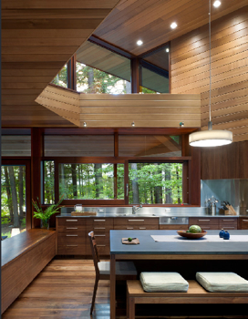
A stainless steel backsplash and counter set off the walnut kitchen cabinets. The tabletop is Pietra Bedonia. The built-in bench that divides the living room and kitchen provides storage for rainy day games and extra seating.  Vibia ‘Duplo’ pendant from Chimera.

The family eats all its meals at the kitchen island. The stair support is constructed from is powder coated steel; the treads and handrail are walnut.

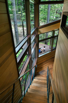
The narrow staircase with cable handrails is reminiscent of a ship’s gangway. Murdough says, “Descending, it’s a moment of quiet, before the openness of the main living space unfurls.”

One of two master suites.  Minka Aire ‘Flyte’ ceiling fan in brushed nickel with tiger maple blades.

The expanse of mirror extends the view.

The enclosed built-in desk nook is a tiny sanctuary. The offset window offers a framed view of a slice of the treetop canopy.

The house has lots of corner windows. Murdough says, “I like to break the corners of the building so you’re not looking through a conventional picture frame window.”

The kids’ bunk room. In addition to the bunk beds, there are three singles and a trundle.

Architectural details are minimized, mimicking boat construction, for a streamlined, tidy appearance.

You can see a camp influence here.

The ramp is the main entry. It provides a gentle transition from the wooded path from the main house, as well as the parking area, into the kitchen. You can’t actually drive a car up to the house; you’ve got to walk through the woods to get there.

A breezeway, that can closed off with barn doors, cuts though the house. A master suite is off one side, partitioned off from the rest of the house.

The boat house on the lake is also a play space for the kids on rainy days.

P H O T O S  BY  C H U CK  C H O I