Foodie Friday: Menton by Barbara Lynch

Photo: Justin Ide

Boston chef and restaurateur Barbara Lynch‘s new Fort Point restaurant Menton (rhymes with Vuitton), opened on Saturday. Yesterday her publicist sent along some official interior photos. (You can see the artsier shots on photographer Justin Ide‘s  blog.)

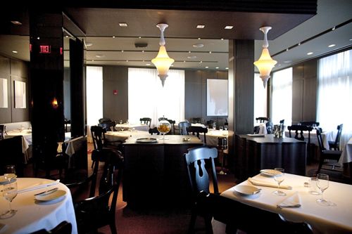
As fitting for a high-end, special occasion spot (she’s hoping diners will wear jackets), the décor, designed by Cheryl and Jeffrey Katz, is subdued. Looks like the entry has some nice details, and the Moroccan style lighting in the dining room keep it from coming off as dull.

It’s named for a small French village near the Italian border, and according to the press kit, “The cuisine is a marriage of refined French technique and soulful Italian cooking.”  There are two menu formats: a 4-course prix fixe menu for $95 and a 7-course chef’s tasting menu for $145. Pricey.

Photo: Justin Ide

The palette is composed of earthy greens, grays, and browns, with accents of silver, bright white, and black.  A Murano glass chandelier hangs above a silver leather reception desk. Iranian carpets cover the floor of the lounge.

Photo: Justin Ide

The main dining room features Italian wood veneer-clad walls, traditional black slat back chairs, glittering banquettes, and natural linen and white cotton table cloths

Photo: Justin Ide

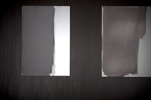
The main dining room features paintings by Matt McClune, an artist and onetime bartender at Lynch’s No.9 Park, who is now based in the Burgundy region of France.


Photo: Justin Ide

Painter Matt McClune, who has a BFA from Mass Art, is represented locally by the Howard Yezerski Gallery at 460 Harrison.
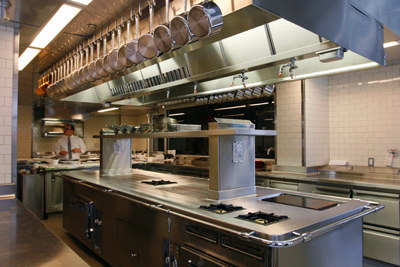

Photo via Grubb Street Boston

The kitchen has marble mosaic floors and a stainless steel Molteni cooking suite, imported from France. Apparently it was a huge deal to get it into the space, since it’s all one piece.

There’s a view of the kitchen from the chef’s table, a glass-fronted room at the back of the kitchen. The space includes a silver banquette runs the entire length of the room, Philipe Starck ghost chairs, a faux-bois floor, malachite wallpaper, and stark graphite drawings of trees and flora by Dean Brown. Nineteenth-century reproduction French garden mural wallpaper covers the hallway leading to the private dining room. I wish I had a pictures!

Photo: Justin Ide


M E N T O N

354 Congress Street
Boston, Massachusetts

617.737.0099

•  •  •

Read my interview with Lynch on her new cookbook Stir: Mixing It Up in the Italian Tradition on eBay’s new style site The Inside Source, where Lynch names her must-haves for every kitchen.


Site Spotlight: The Inside Source

Last week, eBay launched a new lifestyle site, The Inside Source. It’s genius really. A blog-style  format with interviews on the latest pop culture, art, fashion, beauty, décor, “green” chic, and hi-tech gadgets, all concluding with links to similar finds currently available for sale on eBay. My friend, and Store Adore co-founder, Meredith Barnett is the editor, so it’s a sure thing. I’ll be contributing two articles each week, so I hope you’ll check it out. Here’s a run-down of my contribution – what’s live now, and a preview of what’s to come:


Interview with Boston  chef Barbara Lynch on her new cookbook Stir.

Food_Collage-530x300

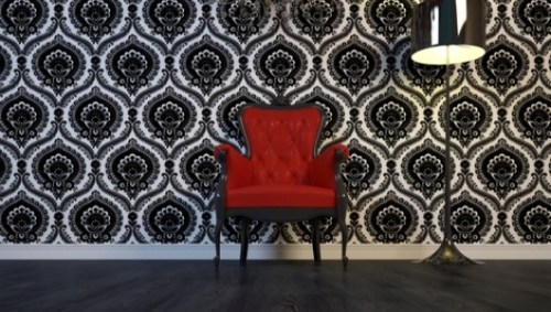
Boston interior designer Kristine Mullaney creates a glam boudoir.

redchair-530x300

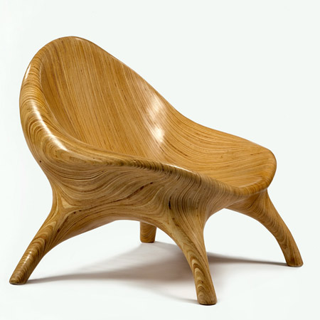
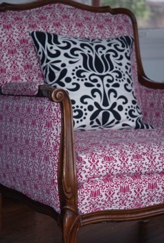
London-based antiques expert Judith Miller enthuses on her favorite chairs.

stack-laminated plywood chair by Julia Krantz


STAY TUNED FOR:

An interview with Jonathan Adler.

Picture 1

Mod Green Pod designer Nancy Mims finds vintage pieces to reupholster.

phpThumb_generated_thumbnailjpg

Kelly Wearstler, Gossip Girl (maybe), and others . . .

See you at The Inside Source!

Design Diary: Andrew Terrat at FP3

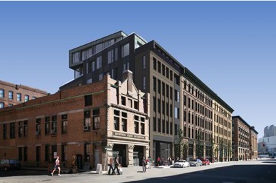
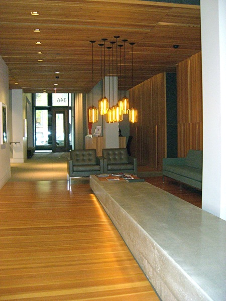
This spring, Jessica Danforth of Kortenhaus Communications (love her!) brought me on a whirlwind tour of four different apartments at FP3 in Fort Point Channel, followed by lunch at Barbara Lynch’s Sportello. (Delicious, and really well-designed.) The neighborhood is industrial and artsy, and the building, designed by David Hacin, reflects those influences. The lobby even even includes an exhibition gallery. In addition to three model apartments (I just handed in an article for Stuff on the studio unit designed by John Stefanon, which I’ll blog about once it’s published), Jessica got permission to show me a privately owned two-bedroom designed by Andrew Terrat of Terrat Elms.

FP3 in Fort Point Channel, Boston

fp3 exterior

FP3 Lobby

lobby

This condo is owned by a couple who lived in the Boston suburbs, but decided to move into the city when their daughter left for college. They hired Andrew Terrat of Terrat Elms to design the entire interior, and they are beyond thrilled. Who can blame them? Not only is Andrew darling, the space is spectacular.

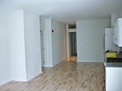
Here is the unit when first they purchased it.

Condo, Before

before

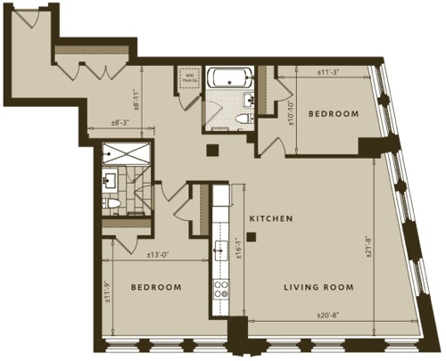
The unit isn’t especially large, but it’s well laid out, with a self contained entry with roomy closets, an open kitchen, and a private master bedroom suite.

Floor Plan

floor plan

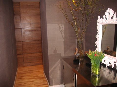
Andrew relocated the closets in order to incorporate a console. He chose a stainless steel piece that you might find in a lab. He added a textured wall covering and wood panels.

Entry

Hallway2

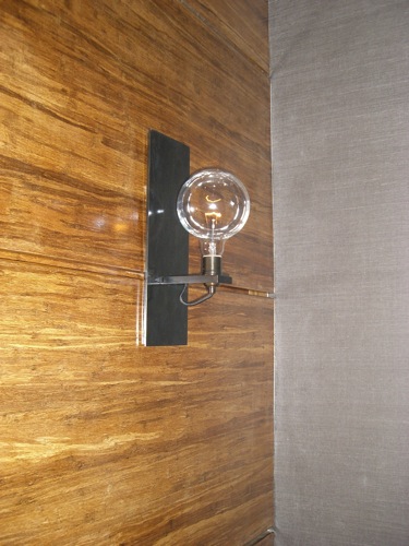
The fixture has an industrial edge, echoing the feel of the neighborhood.

Detail, Entry Light Fixture

entry

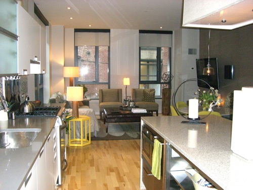
Turning the corner, you enter the main living space, with an open kitchen and the living/dining area beyond. It’s done in neutrals, with yellow and chartreuse accents.

Main Living Area

entire

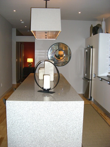
Looking from the living room, back towards the entry. That room is the second bedroom, where their daughter stays when she’s home from school. The kitchen island is wrapped in stone, a hot look right now. I like the effect, but hate to think how much extra money all that stone costs.

island


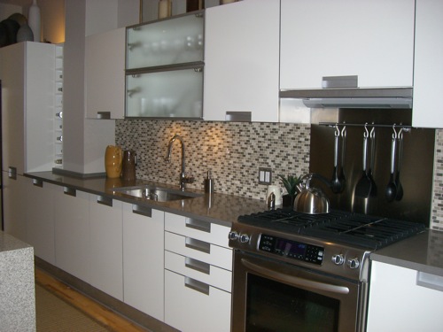
Andrew replaced the cabinetry and finishes. I love the the mini subway tile back splash against the white cabinetry, and appreciate how the gray tones accentuate the stainless steel counter top and hardware. (I don’t remember the manufacturers; must email Andrew.)

Kitchen

kitchen

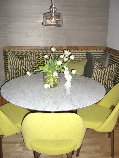
Pop, pop, pop! Bright and jagged upholstery really defines the space. Love the clear pendant – very industrial goes glam – and of course, the Saarinen tulip table.


Dining Area

dr

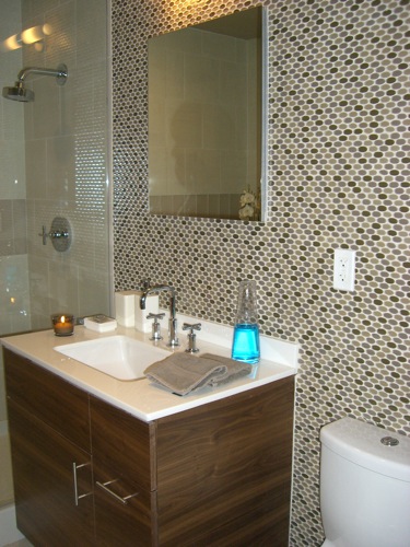
Terrat produces an effect with the tile in the bathroom that’s similar to that in the kitchen. The homeowner told me that Andrew even added the blue mouthwash. Like most designers, every time he visits he fusses and moves stuff around.

Bathroom
bathroom

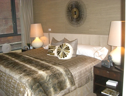
A comfortable but glamorous retreat.

Master Bedroom

mbr

• • •

For a peek at Boston Magazine‘s Concept Home at FP3 see Erin’s post on Elements of Style.