Category Archives: Rooms

Fine Print: Suzanne Kasler Inspired Interiors

Cover Photo: Simon Watson

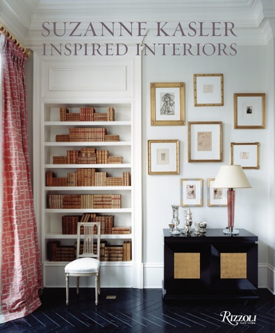
Another beautiful book that has been sitting on my shelf since early winter is Suzanne Kasler: Inspired Interiors (Rizzoli, 2009). Suzanne is an Atlanta-based designer who made the coveted House Beautiful “Top 100 Designers” list back in 2005, and has been going strong ever since, having been published in Elle Decor, House Beautiful, Southern Accents, Veranda, Traditional Home, and Architectural Digest. (The links click through to her stories, so take a peek.)  Here are images from her book, which was published by Rizzloli  in November, along with caption info and commentary.

Photo: Gia Trovan for Southern Accents

White walls set off deliberate touches of blue in this entryway that also doubles as a dining area. Hard to tell here, but the chandelier is adorned with seashells, the rooms only truly beach-y touch. The collection of blue glass is vintage. I love the turquoise bench upholstery; wonder if it’s velvet?

•  •  •
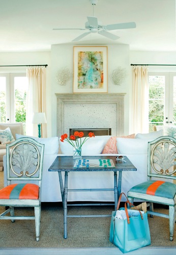
Photo: Erica George Dines Photography

This is the living room of Suzanne’s own beach house. Everything – the walls, ceiling, and floor – is painted in Benjamin Moore’s White Dove. (That’s the color in my house too!)  The French flea market chairs are upholstered in indestructible orange and aqua ultrasuede. The fireplace surround is made of poured stone embedded with seashells. The coral sconces are beach-y but still sophisticated.

•  •  •
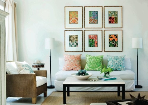
Photo: Erica George Dines Photographay

Another room in Suzanne’s beach house. The artworks are vintage batick prints she found at a flea market, framed in bamboo and hung in a tight grid. The pillow colors echo colors found in the prints. The limestone and iron coffee table and the floor lamps provide strong but simple shapes in black and white. The little round table is a kitschy seashell covered piece from a local shop.

•  •  •
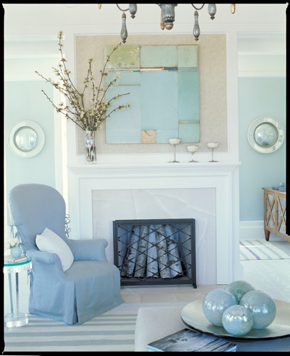
Photo: Gia Trovan for Southern Accents

The floors and fireplace wall in this beach house are painted a cool, slean white, while the rest of the deocr is done in various shades of soothing blue. The walls in the sitting room beyond are sky blue; the slipcover on the chair is almost a French blue; the rug is striped in other blues. The blue balls are iridescent blown glass. The painting is by Dusty Griffith. Overall, a very watery space.

•  •  •

Photo: William Waldron

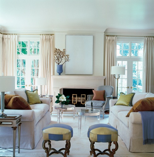
You might not realize it, but there is a lot of white in this living room. The round acrylic tables are by Nancy Corzine (whose new book I wrote about yesterday). The stools are Russian, found in Paris and uphostered in two different fabrics to create a striped effect. These stools inspired the Anastasia bench in Suzanne’s furniture line for Hickory Chair.

•  •  •
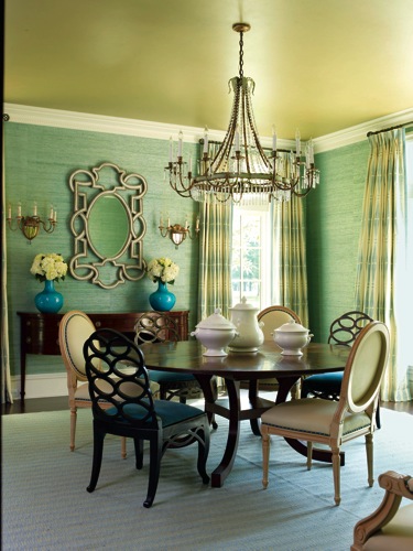
Photo: Erica George Dines Photography

I love the mix of greens and turquoise in this room, whose colors are rich without being heavy. The swirly chairs wor well mixed with the simpler Louix XVI-style ones.

•  •  •

Photo: Tria Giovan

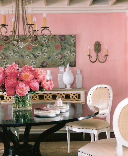
The peony pink color of the accent wall in this dining room is Glidden Checkberry. Kasler points out that this color has depth – you can see many different shades it in – red and pink and ochre and white. The Louis XVI -style chairs are upholstered in raffia with nail heads. I love the interlocking swirls on the front face of the console, which echo the curves of the chandelier and sconces . And the peonies, so luscious.

•  •  •
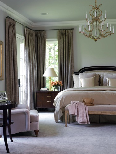
Photo: Erica George Dines Photography

An elegant bedroom in neutral tones with a rosy hue.

All photographs courtesy of  Suzanne Kasler: Inspired Interiors, Rizzoli, 2009

[tweetmeme source=”StyleCarrot” only_single=false]

_   _   _

CARROT CURRENCY:    bedroom furniture chest of drawers

1 Comment

Filed under . REGULAR FEATURES, Designer Spotlight, Fine Print, Rooms

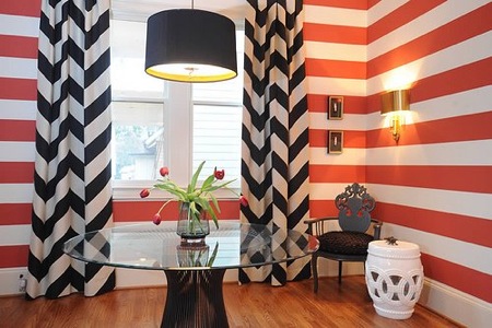
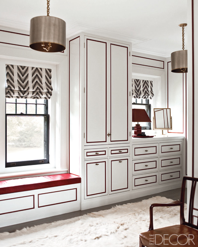
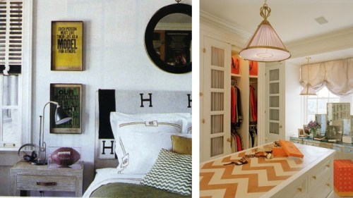
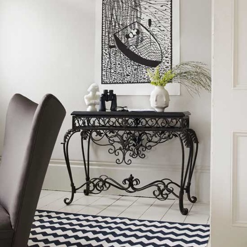
Montage: 31 Chevron-Adorned Interiors

The cover of this month’s Elle Decor motivated me to put together a chevron montage. It’s funny, because the chevron in this photo is just one element of a room loaded with pictures, yet its boldness pushed it to the forefront of my mind.

I love the pure graphic punch of the flat weave zigzag rugs, even though I probably wouldn’t make such a statement in my house. I think I’d find myself distracted, staring at it until I got that dizzying effect where your eyes go all funny. (Procrastinating is simply a way of life when you work from home.) But I love the way they look in photographs.

When I was about thirteen, I made my father paint a zigzag motif in my bedroom. I got the idea from a sitcom called “Too Close For Comfort,” (anyone remember that?) in which one of the daughter’s room had this funky stripe painted around her room. I simply had to have that look. I took liberties with the colors though. My walls were repainted a bright, clear sky blue. The stripe, a sort of zigzag/vee shape on the feature wall, was navy blue. The pièce de resistance was the white comforter with crisp, multicolored rainbow, compliments of Caldor. The rainbow, cloud, sun ceramic mobile from my best friend Marcia completed the look. Dated, yes, but for a teeny bopper, pretty pulled together.

Photos: Anne Coyle and Nate Berkus in Elle Decor; unidentified; Domino; Nina Freudenberger in Lonny; Mary McDonald; Marie Claire Maison; Living Etc.; Craig Spencer; Anne Coyle Interiors; Cookie; 315 Thomas blog via Made by Girl; Mlinaric, Henry & Zervudachi; Anne Coyle Interiors; Australian Vogue Living; Real Living Michelle Adams; Wendy Blount; Ashe + Leandro; TurquoiseLA; Terrat Elms; M. Design; Kyle Timothy Home; Belinda George Architects; Color Theory; Steven Gambrel in Elle Decor; Angie Hranowsky; House Beautiful via The Goods; Elle Decor; Tory Burch’s closet in Vogue; Living Etc.; Australian Vogue Living; Sabbe Interiors.

3 Comments

Filed under . REGULAR FEATURES, Montage, Rooms

Designer Spotlight: Lauren Nelson

I don’t usually do odes to one designer, but the other night at dinner with David Harris of ducduc, Lauren from The Rug Company, and Boston interior designer Annsley McAleer, I met Lauren Nelson, a stylist/interior designer who has newly relocated here from California. She is so nice and talented too, so in the interest in welcoming her to our city, I thought it would be nice to showcase her work. I’m sure we’ll be seeing a lot more of her.

Picture 1

Picture 3

Picture 4

Picture 6

Picture 9

Picture 7

Picture 8

Picture 11

flower

Photos:  Marnie Rose Agency

3 Comments

Filed under . REGULAR FEATURES, Designer Spotlight, Rooms

Design Diary: Fotene Design at the Ritz

With the onslaught of new work, I’ve really fallen behind following up my published pieces with blog posts. Last night, as I was sorting through back issues of local mags and tear sheets, I realized I better get motivated. “A Study in Contrast,” a story about a newly married couple with unique challenges concerning color, ran in the The Boston Globe Magazine this past fall.

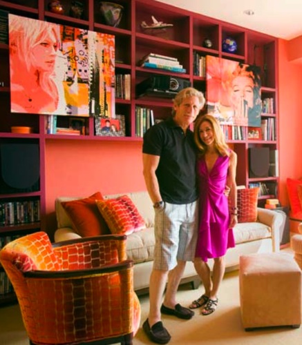
Chrissy and Mitch live in a decent size condo, but spent most of their time in the media room, so wanted to both brighten and warm it up. They asked their friend, Boston interior designer Fotene Demoulas to take on the project. But there was a catch: Mitch is color blind. He can’t really distinguish between browns and greens, and pale shades appear gray. So, they needed colors that were bright and bold, and of course, appealing to his lovely new wife too!

Picture 1Photo by Eric Roth

Jill Diamantis, the lead designer on the project, stayed away from drab, opting for a a scheme of highly saturated color-on-color. The walls are covered in Donghia’s “Maestro Walls” in Paprika, a linen-backed paper that provides good sound absorption. For the existing built in bookshelves Diamandis pulled a deep raspberry color (Benjamin Moore’s Cranberry Cocktail in high gloss) from the two unframed canvases of Brigitte Bardot and Marilyn Monroe that the couple purchased in Paris during the project  The color  is an unexpected pairing with the terra cotta-colored walls. The side chair and accent pillows are done in a pricey Clarence House silk velvet that sort of resembles a jewel-like animal print.

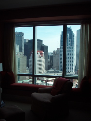
P1010020The view from the media room has changed over the years, from the shimmering water of Boston Harbor to a monochromatic, urban cityscape.

tktkt

Picture 3Photo by Eric Roth

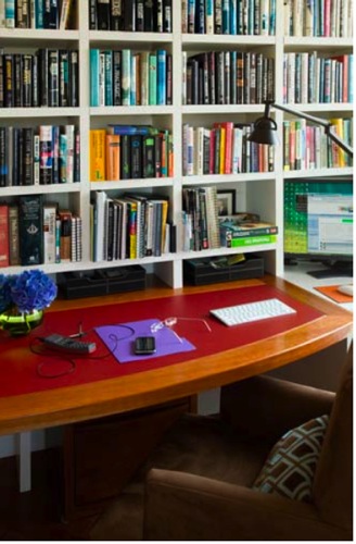
There was a desk in the media room originally, but the designers relocated their “office” to an unused sitting area off the kitchen. The new desk is custom built from pecan wood with a red leather insert. The chairs are brown ultrasuede. Chrissy and Mitch sit here side by side every day, since they both work from home. How cute is that?


Picture 4Photo by Eric Roth

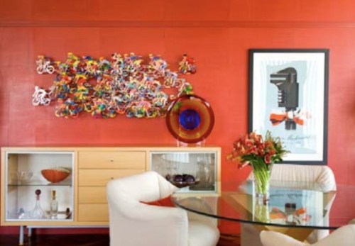
This wall in the living room was painted dark red. The designers upgraded the original painted surface with a hand painted Venetian plaster wall covering by Studio E. So many people wrote in to the Globe inquiring about the wall sculpture – a multi-colored ensemble of bikers purchased in Paris.

Picture 2Photo by Eric Roth

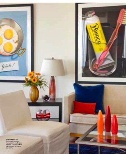
Th posters in the living room also garnered a great source of interest from our readers. They’re from International Poster Company, on Newbury Street in Boston. The vases and bowls are part of Mitch’s collection.

Picture 5Photo by Eric Roth

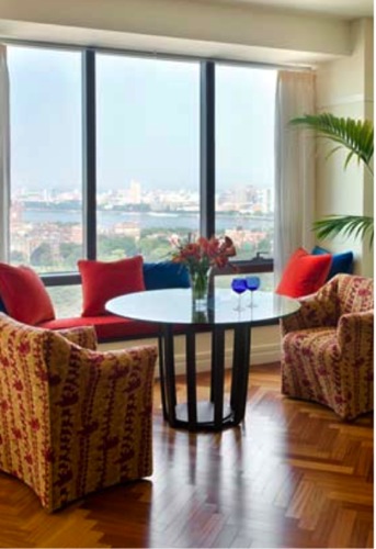
The windows in the living room look across Boston Common and Back Bay to the Charles River, all the way to the Blue Hills. The designers added deep red window seat cushions throughout the condo, done in 100% mohair by John Hutton called “Cocktails Anyone?” in Bloody Mary.

During my research trying to understand color blilndness, I came across this interesting post from the Colour Lovers blog: As Seen By the Color Blind


2 Comments

Filed under . REGULAR FEATURES, Design Diary, Rooms

Design Diary: Jane Austen’s Emma

Romola Garai and Johnny Lee Miller

I never considered myself a Jane Austen fanatic. Until now. As my friend Meredith can attest, I’ve been “mildly obsessed.” PBS is airing a new Masterpiece Classic adaptation of Emma. I was so riveted that I asked WGBH (who knew Masterpiece Classic was produced right here in Boston?) to set up interviews with the so very talented production and costume designers, Stevie Herbert and Rosalind Ebbutt.

Not only did they arrange the chats, they messengered me the complete DVD. (Love the perks. LOVE Mr. Knightly even more. And Hartfield house, well, just wait and see.) Then I turned my fascination into two pieces for The Inside Source: “Emma’s Design Inspiration” and  “Jane Austen Era Fashion.”

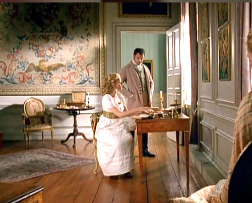
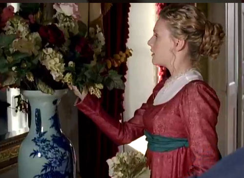
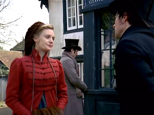
Stevie Herbert and Rosalind Ebbutt were absolutely delightful and full of information on their inspirations and mindset in creating the scenes and styles. I’m not going to retell all their tidbits here (please click through to the articles for that), but will show you snippets of the gorgeous Regency rooms I grabbed from the video online.

3 Comments

Filed under . REGULAR FEATURES, Design Diary, Rooms