This week’s edition of the Boston Globe Sunday Magazine featured “Living Brilliantly”, the piece I wrote about an absolutely beautiful Nantucket house with interiors by Boston über-star designer Frank Roop.
Roop designs much of the furniture he uses, as well as the draperies and lampshades. And, he uses local artisans to do it. Roop explains, “For me, it’s not about going to design center showrooms. I’d rather support local craftsmen. I think I am one of the few designers that stick to that principle of design.” If Roop hasn’t designed it, chances are the piece is vintage or antique. He hardly ever buys anything new. Eco-conscious and chic.
I’ve split this story into two parts. Today you’ll see the first floor rooms; tomorrow, the upstairs.
Photography by Eric Roth – Courtesy of The Boston Globe
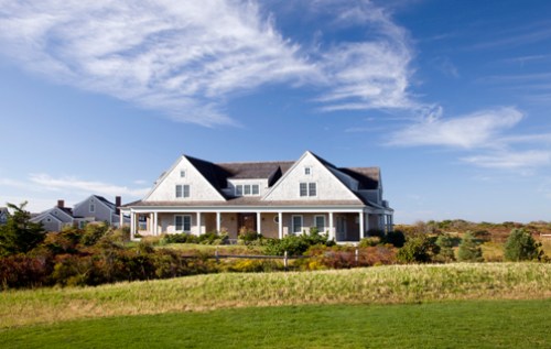
The neoclassic Shingle Style house, located on two acres in the Cisco area of the Island, is owned by a Newton couple with three daughters, ages 18 to 23. It’s 5,000 square feet, with an upside down layout (the bedrooms are on the first floor and the living spaces on the second, to take advantage of the water views). Previously, the family spent their summers in a more cottage-y sort of place that they had purchased about nine years ago, with plans to renovate. But when they were able to buy a little more land next door that had a better view, they decided to commission local architect Nathan McMullen of McMullen and Associates to design a brand new dwelling. (It was built by Kris Perez’s Falkon Building Co.)
Instead of calling in the bulldozers to demolish their old house, they gave it away. The wife told me in a telephone conversation, “Guys came, cut it in half, moved it to the new site around the corner, and put it back together.” Apparently Nantucket requires that you try to do that before tearing down a house. It’s actually a less expensive alternative to demolition, and, more importantly, it helps keep rubbish out of overcrowded landfills. While this family arranged the transfer directly with their neighbor, real estate can also be donated to organizations like Housing Nantucket, which provides affordable housing solutions on the Island.
As for the interior, the homeowners wanted the decor to work with the somewhat formal architecture, but still have it feel like their at the beach. Comfortable, but not too casual. Take the tour; I think you’ll agree that Roop’s approach was a success.
 the entry
The airy entryway, complete with swooping staircase, is anchored by a painted, Swedish neoclassical table, above which hangs a faux bamboo chandelier Roop found in Upstate New York. A tableau of earthy items, both ordinary (pieces of driftwood in a glass vase) and a little glam (a hunk of quartz from Brazil) are arranged on the table with a small succulent. The asymmetrical bamboo bench dates from the Aesthetic Movement of 19th century England. It’s real bamboo, and the husband is less than fond of it. Roop acquired it from an antiques dealer in Connecticut. (Nope, he won’t reveal his sources, I tried!)
Notice the sconce to the left of the pocket door . . . Roop made them as a housewarming surprise for the owners. They’re made from natural coral that’s been lacquered and Tahitian mother of pearl. When the votives are lit, the candlelight reflects off the mother of pearl gorgeously. I wish I had a closeup shot; we can’t see them very well here.
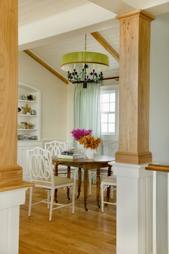
As you can see, the architectural details are pretty traditional, with a plank wood floor, exposed, unpainted beams, and wainscotting halfway up the walls and on the ceiling. The wife told me that they agonized over whether to leave the beams au naturel or to paint them. Her husband won that one. he says, “Guys are all about wood but it looks structural, and good.” She appreciates that it provides some warmth to the cool color palette. The flooring, as well as the posts and beams are Chinese elm reclaimed from palaces in China.
– – –
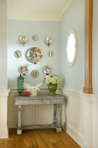 niche off the entry
If you look at the entry photo again, you’ll see a little niche cordoned off by the posts. That niche is what you’re seeing in this shot. The distressed console table is sheathed in old, patinated zinc sheet metal. The green glass jar is vintage Venetian, the white container with the coral branches on it is a matte ceramic pottery mold, and the pot filled with hydrangeas is 1960s vintage. The bull’s eye design is comprised of colonial mirror-back sconces that would have held candles mixed with small mirrors, all found at various antique shops. The shape echoes the round window off to the right, which is actually the house’s only round window.
– – –
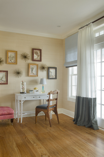 the family room
You can see this half of the family room through the glass pocket doors in the entry. Paired with the white faux bamboo desk is what Roop called a “California chair with free from wood” from the a 1970s. On the wall are framed vintage shell collages done with old paper and calligraphy that the wife found in a Paris flea market. Roop added the anemone wall sculptures to the mix. The drapes are in Roop’s signature style, from multiple fabrics stitched together.
– – –
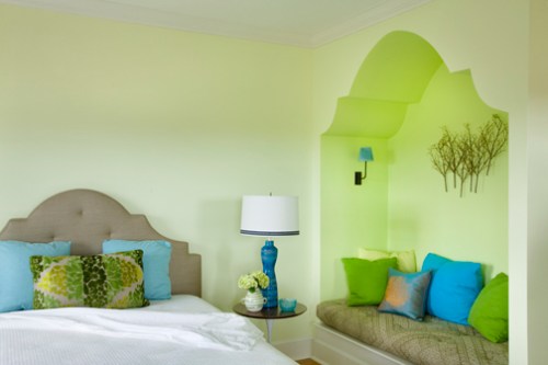 youngest daughter’s bedroom
The homeowners wanted their daughters’ rooms to be reflect their individual personalities, so they were allowed to choose their colors “to a certain degree,” says the mom.
The youngest wanted a lime green bedroom so Roop found a pale shade that the daughter liked and that the mother could live with, and using a more acid bright in the niche. Roop came up with the idea to carve out a reading niche to make use of the dead space in the room. The Moorish shape echoes the silhouette of the custom designed, linen-covered headboard, and adds an ethnic note that’s found throughout the house. The niche cushion is a woven Donghia fabric with a Moroccan pattern and the 1960s metal branch sculpture above is by Jere. The green pillows on the bed are made from a burnout velvet gofrage linen. And, yes, that’s a vintage Saarinen table with a rosewood top. On top sits a 1960s studio pottery lamp with a custom shade white linen shade trimmed with grosgrain ribbon, a Roop signature touch.
The middle daughter’s room is done in corals, with white walls and a headboard and pillows made from orange silk that they brought back from Cambodia, to which Roop added a Moroccan wedding blanket embellished with tiny mirrors. Roop had other items from the couple’s travels framed for the room, including a child’s dress from India, camel decorations, and a pony bridle.
The eldest daugher’s room has ice blue walls, a bright teal cut velvet chaise, and a vintage surfing poster her mom bought at Brimfield years ago, as well as a photograph of her diving with dolphins on her 21st birthday during a family vacation.
—
 master bedroom
I love this room, with its touches of pale and clear seaside color.
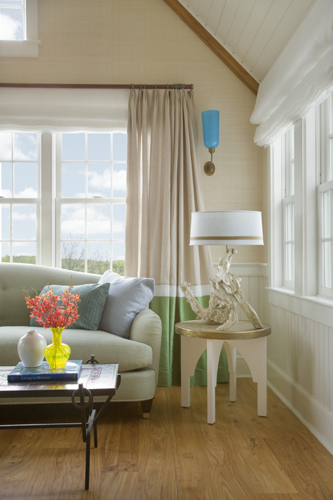
The faux bamboo bed is a piece the homeowners found a while back in Maine. The green porcelain vintage lamp on the far side of the bed looks like strops of bamboo. Roop designed the slipper chair, which is covered in an Anna French gofrage linen velvet. The antique Syrian sidetaable is inlaid with mother-of-pearl, acquired by Roop from one of his Paris resources. He uses them a lot – they’re great for drinks and can be moved around easily.
In the back of the room stands a jardinière planter to which Roop added a concrete vessel and blue glass balls that the homeowner already had. The floor lamp is a faux bamboo Jacque Adnet piece covered in Hermes leather and finished with a custom lampshade constructed from string (another Roop specialty). The Roop-designed sofa is covered in sand-colored linen and the vintage faux bamboo stool is topped with a cushion of silk canvas. Finally, like most of the rugs throughout the house, this one is a natural, no-nonsense sisal.
—
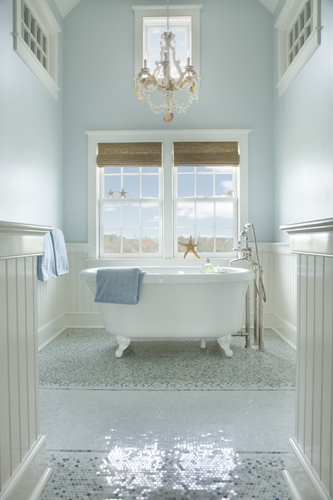 master bath
This dreamy bathroom has the only tub in the house (it’s a Bain Ultra air jet tub). The homeowners had picked out the fixtures before hiring Roop, but Roop chose the tiles and custom-designed the watery palette and pattern. The tiles, which came from Tile Showcase, are all marble and very shimmery, and were designed to look like rugs.
The homeowner chose the shell chandelier from a lighting store in Nantucket. She says this about it, “I wanted something borderline tacky; something I wouldn’t do anywhere else, like over my dining room table. It is kind of kitschy, since it’s made out of shells, but I think it’s perfect for the bathroom.”As for the rattan shades, the windows were originally bare, but they needed a little privacy, and she likes the warmth of the woody accents.
Check back tomorrow to see the upstairs living spaces!
[tweetmeme source=”StyleCarrot” only_single=false]
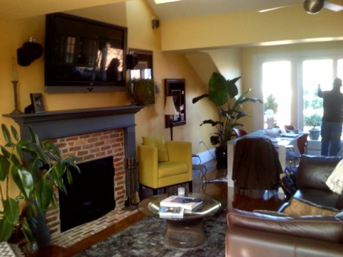
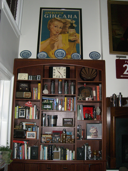 This is the focal point of the main living space, which is two stories high. (The entry is, interestingly, on the second floor mezzanine, which overlooks this space. The two bedrooms are also up there.) The bookshelves were custom built by self-taught millworker Mark Meritt, who also built the glass front kitchen cabinetry that holds the bar glasses.
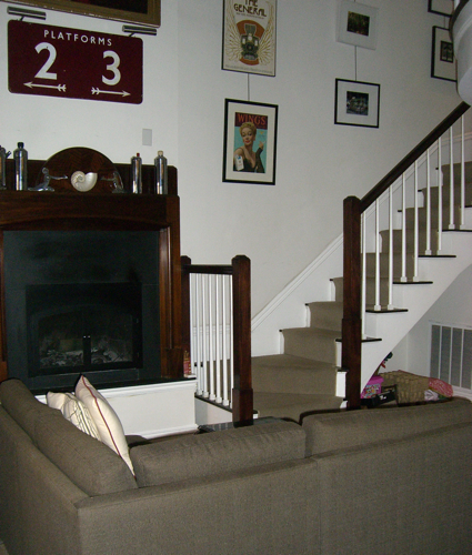 Here’s the fireplace next to the shelving, and the stairs going up to the second floor. There used to be a “Greg Brady firplace made from rocks.” This mantle is from the 20s. He pretty much gutted the condo when he purchased it in ’98 and reworked everything to look old. The London train station sign came from a Topsfield flea market.
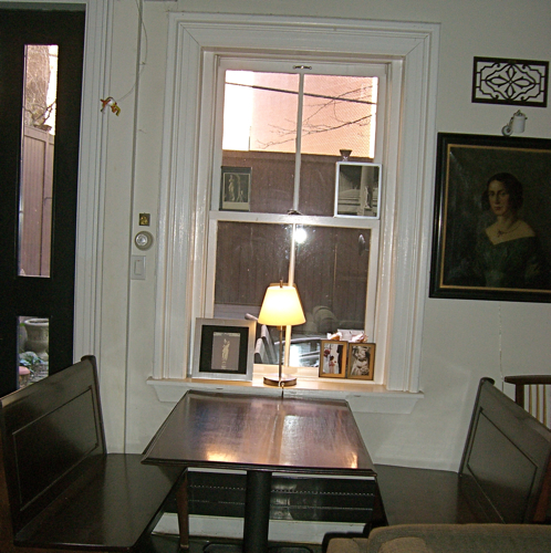 Josh had this booth made for the space by the guy who built the stairs and railing.
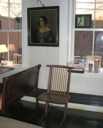 The chair is an authentic, signed George Nakashima handed down from his great aunt. The portriat is a great, great grandmother. Josh has a few ancestral oils because nobody else in his family ever wants them. He says, “I am where the family’s castoffs go.” On mixing such a variety of styles he says, “What happens in small living spaces you put up everything. If I had house, I’d have it all in one room, like a library with leather couches. But I think it’s OK to mix eras; it’s all just stuff that I like.”
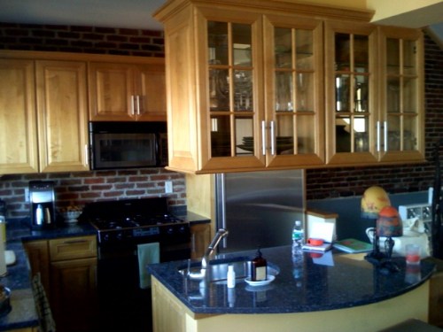
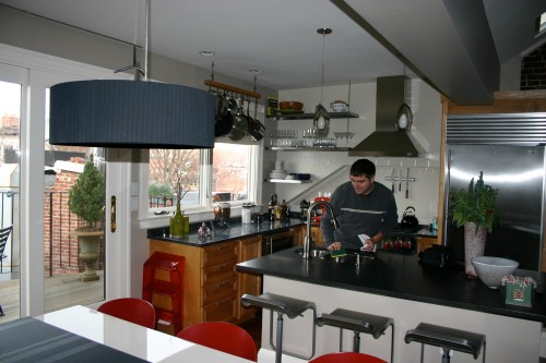
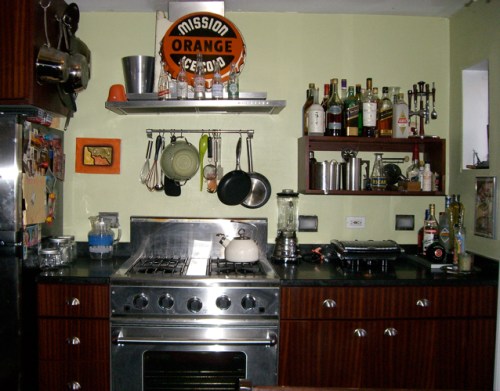 You can tell this kitchen is really used, by the abundance of pots and utensils. It’s a little cluttered and definitely homey, but has a good sense of masculine design.
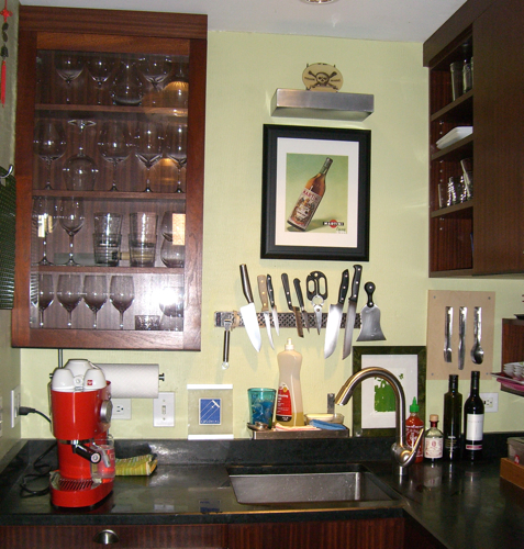
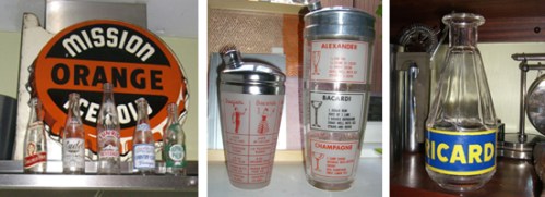 Close-ups of some pieces in Josh’s collection. He found the Ricard bottle on Etsy. Have you seen “Julie and Julia” yet? There’s one in a Parisian restaurant scene. Josh doesn’t do the Ebay thing much. Most of these things came antique stores, including the Cambridge Antique Market.
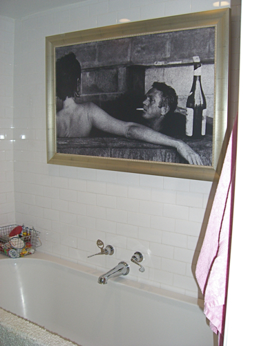 Don’t you love that there’s art hanging in the tub? Josh had the image blown up at Kinko’s on waterproof vinyl, then had it framed.
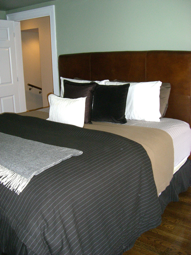
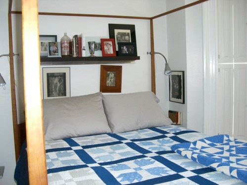 Even the bedroom has vintage bottles sitting among the old black & white family photos. He added the shutters to the windows. The smaller quilt is handmade.
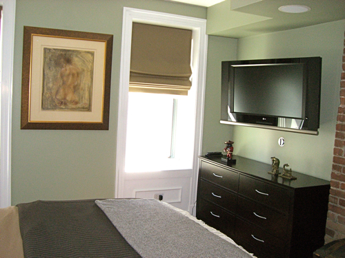
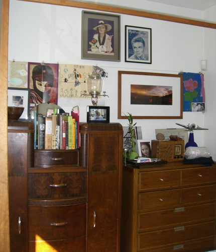 Here are the dressers opposite the bed. The tall one was part of a set of a double bed and vanity dresser but two friends took the other pieces. It has Bakelite pulls. The other dresser is more ’60s early ’70s, from a flea market to which he added new pulls.
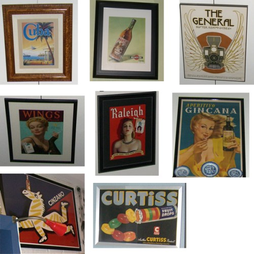 Josh collects vintage posters and magazines, which are scattered throughout the condo. His bar, Silvertone, is similarly adorned. Josh says, “The imagery on the walls are ’20s and ’40s cocktail advertisements, often torn from LIFE magazine. People would bring in photos from that period too. They’d say, ‘I have a great old picture of my father in the ’40s’ so I have them made a copy and we’d put it on the wall. It took about 5 or 6 years before it was finished.”







 Follow StyleCarrot on Twitter
