Design Diary: Teen Blogger Gets a Makeover

I profiled the bedroom makeover of local teen influencer Alexa Curtis in the January 29th issue of the Boston Globe Magazine.

Curtis, who’s 19 and writes the affordable-lifestyle blog A Life in the Fashion Lane, came to her 500-square-foot North End one-bedroom apartment basically empty-handed, save for clothing and photos. Luckily she met designer Jenna-Lyn Croteau at the South End Open Market, who agreed to take on the project for a budget of less than $1,000.

Croteau, who’s 22, is a student at Boston Architectural College and the founder of the furniture restoration and design firm, Recycle Refinish Reuse. (She also assists the fabulously talented Alina Wolhardt of Wolf In Sheep Design, who just designed the new Flour Bakery.)

Jenna created Alexa’s white and gold look with a little money, lots of DIY finesse, and a handful of freebies Alexa was able to score in exchange for exposure on her blog.

Teen Blogger Alexa Curtis' Apartment Makeover - Bedroom

Photo by Samara Vise for the Boston Globe


Alexa loves to display photos of her friends. Jenna clipped Polaroids of Alexa’s travels around Europe, including the Cannes Film Festival, to three rows of linen string above the campaign style nightstand. There are more snapshots tucked into a holder on the other wall, next to four enlarged photos in frames bought on clearance from HomeGoods that Jenna painted white. The Soho cityscape above the bed is from Minted, by Austin-based photographer Kaitlin Rebesco.

Jenna transformed aa 50-cent vase from the Salvation Army with gold spray paint. Croteau made a wall-hung headboard from plywood, foam, and quilted fabric. She even made the covered buttons. She has her own table saw, jigsaw, sander, and drill in her home workshop.

Ethan Allen supplied the bedding and throw pillows. (White bedding was a must since Alexa use the bed as a background for photographing outfits.) The diamond-pattern throw is from Walmart, and the Moroccan-style rug from Wayfair.

The tufted leatherette chair with nailhead trim was a splurge that Jenna found on Craigslist for $100; definitely their biggest purchase. Room & Board provided the black sheepskin pillow. The curtains are from Ikea; the rods were already there when Alexa moved in.

Teen Blogger Alexa Curtis' Apartment Makeover - Work Space

Photo by Samara Vise for the Boston Globe

Jenna set up Alexa’s workspace on the other side of the bedroom. Responding to one of Alexa’s inspiration photos, Jenna made the desk by placing the top of an old trunk on the legs from two stools. A piece of found glass lets Curtis display snapshots underneath.

The Herman Miller fiberglass desk chair was a roadside find that was orange and very scratched up until Alexa primed and spray painted the seat white and the legs gold.

Jenna spotted the sparkly gold @ symbol at T.J.Maxx, which became the starting point for the art wall, which includes a print from Alexa’s dad and a pineapple print from Minted.

Alexa purchased the tall, mirrored chest from Overstock. Jenna revamped the dark metal honeycomb frame of an $8 mirror from the Salvation Army with white paint.

Design Diary: AutoCamp in the Sonoma Redwoods

I love the idea of communing with nature. AutoCamp knows what I mean. Offering Airstream trailer experiences as well as luxury tent accommodations, the California-based company does glamping right. Scoff all you want. You’ll never find me at a campground, but why shouldn’t be able to contemplate the great outdoors on my own terms?

AutoCamp has two locations, one by the beach in Santa Barbara, and this one, by the Russian River, 90 miles north of San Francisco in Sonoma, sold as a modern retreat in the Sonoma redwoods. There are Airstream trailer suites designed by Lauren Geremia of Geremia Design and glamping-worthy tents as well as a mid-century modern clubhouse. You get WiFi, Malin+Goetz bath products, Casper mattresses, Schoolhouse Electric lighting, and pet-friendly options.

I totally want to go to AutoCamp (but I’ll probably leave my cat at home).

autocamp-bath-2

Autocamp-firepit-gathering

Photos by Aubrie Pick courtesy of Autocamp

•            •            •

Foodie Friday: Saltie Girl

Tinned fish is about to become a thing in Boston. Brand new Back Bay restaurant Saltie Girl, brought to you by the local MET Restaurant Group, opened June 1 complete with raw bar and a tinned fish menu. MET Restaurant Group president Kathy Sidell (who by the way is Stephanie of Stephanie’s sister, who knew?) was inspired by tapas bars in Barcelona.

The skinny sliver of a space (just 30 seats, galley style, with four banquettes down one side and the bar down the other) is located adjacent to MET Back Bay (it used to be its private dining room). It’s a much needed addition to the neighborhood, which mostly lacks cooler restaurant concepts.

The Saltie Girl interior is design perfection. And I mean perfection. Even more impressive, Kathy Sidell decorated it herself. She is responsible for all of it: the Moroccan patterned cement tiles for the bar backsplash, the turquoise fish scale tiles that clad the bar itself, the perfect aqua paint color, the rope wrapped columns, the glossy wood banquettes, the copper light pendants, and the travel photos

As for the food, it is also exquisite. Gorgeous and insanely delicious.  Chef Kyle McClelland (a culinary artist) works behind the bar to make the cold offerings, while hot dishes, overseen by MET chef David Daniels, come from the kitchen downstairs. Oysters are shucked barside, obv.

New Back Bay Restaurant Bar Saltie Girl Moroccan Tile

The bar is the restaurant’s focal point, and an on trend thing of beauty. Its back wall is lined with Moroccan patterned cement tiles(#trendalert); glass shelves hold the liquor. See those copper pineapples? (#trendalert)  Exotic drinks for two are served in them. The second time I was there a young couple was sharing one, but it seemed rude to intrude upon their moment for a photo.

New Back Bay Restaurant Saltie Girl Raw Bar

The bar is lined with aqua fish scale tile (#trendalert) by Mercury Mosaics. The first portion of the bar is dominated by a raw bar. Glass canisters hold garnishes and sauces are served in apothecary-like bottles with medicine droppers (#trendalert) .

Boston Bar Saltie Girl Serves Bloody Marys With An Oyster

Bloody Marys are topped with a raw oyster (#trendalert) . The straw is stainless steel (#trendalert) , which I quite appreciated. (I have an unreasonable aversion to black plastic straws.) The clipboard (#trendalert)  lists the raw bar offerings: various oysters, clams, shrimp, king crab, and sea urchin.

Oyster Platter At Boston Raw Bar Saltie Girl

Two young women sitting next to my husband and I at the bar ordered this spread of oysters. I did ask them if I could take a photo. Note the medicine dropper condiment potions.

New Back Bay Restaurant Saltie Girl Banquettes Rope Wrapped Column

Four banquettes line the deep turquoise (I’ll ask Kathy for the exact paint color) wall parallel to the bar. Columns are wrapped in thick rope. Worn copper pendants illuminate marble tabletops.

Travel Photography Boston Restaurant Design Saltie Girl

Kathy told me the name of the photographer who took all these travel shots (his day job is a globe-trotting position for Ralph Lauren), but I cannot recall. I will find out and update.

New Back Bay Restaurant Saltie Girl Raw Bar

The floor is a simple white hex tile with black grout. A dozen industrial style metal stools(#trendalert) are used for bar seating. A handy black pipe means your legs don’t dangle.

Tinned Fish Display At New Boston Restaurant Saltie Girl

Back to the tinned fish(#trendalert). They’re imported from Europe and the packaging is pretty. Options include tuna (for the unadventurous like me), sardines, anchovies, trout, and mackerel.

Tinned Fish Clipboard Menu New Boston Dining Experience Saltie Girl

Time to order. Raw bar and tinned fish on a clipboard. Salads, sandwiches, and hot dishes on a paper placemat, diner style (but definitely not diner prices).

Tinned Fish Served On Slate Slab At Saltie Girl

Obviously we had no choice but to order a tinned fish platter. Lamely, we got tuna, though I understand the mackerel is easy to eat too. Cockles are not for me. The tinned fish is served on a slate slab (#trendalert) with crusty bread, pickled peppers, some sort of delicious jelly, and OH. MY. GOD. The BEST homemade butter I have ever tasted. There went my diet.

Black Salt Grey Salt White Salt Boston Restaurants

And to make everything even better, Chef Kyle (complete with requisite tats (#trendalert))  treated us to a trio of exotic sea salts (#trendalert). A black lava salt (from Hawaii maybe) with a smoky flavor, a grey sea salt, and a white. I’ve probably not mentioned this on the blog before, but butter and salt are basically my two favorite foods.

Tinned Fish Served On Slate Slab At Saltie Girl

As you can see we ate every bit of that tinned tuna fish, jam (#trendalert), and butter. Okay, I got seconds on the butter.

Chef Kyle Serves A Salad At Saltie Girl In Boston

Next,Chef Kyle McClellan serves my husband a salad.

Green Salad At Saltie Girl

Have you ever seen such a pretty green salad?

Stone Crab Toast At Saltie Girl In Boston

Both times I ate at Salti Girl I ordered Stone Crab Toast with burrata and avocado. There is a whole section of toasts (#trendalert) on the menu. At $10 it’s a good deal; very filling. It melts in your mouth and tastes heavenly.

Best Tuna Tartare In Boston

My husband, who is much more disciplined when it comes to sticking to his diet, ordered the tuna tartare. Scrumptious. Those purple flowers are chive blossoms.

Moroccan Tile Backsplash At Saltie Girl Restaurant In Boston

Another shot of the Saltie Girl bar (aka, my husband’s new neighborhood haunt).

Travel Photography Adorns The Wall At This New Boston Restaurant

Some more travel photos above the banquettes. Looks like Capri.

Tinned Fish Packaging At Saltie Girl In Boston

Tinned fish packaging is cute and pretty. That squid looks like a Disney character.

New Back Bay Restaurant Saltie Girl Pop Up Towel With Check

At the end of the meal, there is this Japanesque presentation — a wood block with water and a compressed cloth.

New Back Bay Restaurant Saltie Girl Pop Up Towel With Check

Voila. It rises. Pull it apart and wipe your hands.

New Back Bay Restaurant Saltie Girl Canned Fish Tin

The bill and an empty tin. A mermaid is the Saltie Girl mascot. There’s a carved one mounted at the bar too.

Saltie Girl Restaurant In Boston's Back Bay Has Raw Bar Tinned Fish & Great Design

Saltie Girl, 279 Dartmouth Street at Newbury Street, Boston

•            •           •

Design Diary: Spa-Inspired Bath in Boston

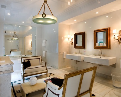
I featured this spa-like bathroom designed by senior architect Barney Maier of Feinmann Inc., a Boston area design/build firm, as a  Room to Love in the Address section of The Boston Globe this past fall. I love the simplicity of the design, and would happily spend hours in that tub, which happens to be in the same neighborhood as my own condo (which is glaringly devoid of such luxury).

The project combined two units into one, and transformed the original kitchen and bath of one unit into this new master bathroom. A wall across the middle of the room separates the tub and shower area from the sink and toilet side of the space. A new, elegantly curved wall allows for breathing room so people can pass by. It’s hard to explain, so scroll down to the diagram at the end.

Zen Bathroom Design By Feinmnann In Boston

Maier designed the clean-lined, floating  shelves, which were manufactured by Showplace Cabinetry out of cherry wood and stained dark brown. The pair of stacked, minimalist towel bars in satin-nickel are Cinu by Ginger. The wall is clad in matte white tile. Recycled-glass mosaic tile by Kamet, in a blend of light green, black, white, and taupe covers the curved accent wall.

Zen Bathroom Design By Feinmnann In Boston

The shower wall, back wall and backsplash are done in Ferro White by Sant’Agostino 12-inch-by-24-inch tiles . Instead of bull nose tiles, stainless steel was used on the tile edges and shelving trim for a sleek, contemporary look. Matte black-porcelain Ceramica Sant’Agostino Ferro 12-inch-by-24-inch tiles ground the airy space. A wooden bath mat adds warmth and reinforces the overall spa feel.

Zen Bathroom Design By Feinmnann In Boston

The floating custom-made vanity is on the flip side of the shower wall.

Zen Bathroom Design By Feinmnann In Boston


S H O P  the  L O O K 
from StyleCarrot affiliates. 

Contemporary Square White Porcelain Sink

Above Counter Lavatory Sink

Ginger Cinu Towel Bar

Kohler Choreograph Floating Shower Shelf

Gray Wood Effect Porcelain Floor Tile

Designer Spotlight: Architecture & Art Inspired Jewelry by Jessica Biales

My friend Jessica Biales, who is a Manhattan-based jewelry designer, has just debuted a brand new collection. True to form, these newest pieces are based on art and architecture, a common source of inspiration for Biales. (I typed at least one or two architecture papers for her in college. On my electric typewriter.)

Earlier this year she released her Scissors Collection inspired by Matisse’s work in last year’s MoMA exhibit “Henri Matisse: The Cut-Outs.” Her most popular earlier work includes  signet rings and slice rings. (I have a rose gold slice ring with tavorites, a green gem.)

The current collection offers modern rings, bracelets, and pendants in sterling silver and gold. Pieces echo artist Josef Albers’ colorblock square paintings, steel sheet metal sculptures by David Smith, and the inverted architecture of The Whitney Museum by Marcel Breuer, and Rothko’s meditative abstracts.

Jessica Biales Architectural Jewlry

Jessica Biales Architectural Jewlry

Jessica Biales Architectural Jewlry

Jessica Biales Architectural Jewlry

Jessica at work in her studio.

•            •           •