With the onslaught of new work, I’ve really fallen behind following up my published pieces with blog posts. Last night, as I was sorting through back issues of local mags and tear sheets, I realized I better get motivated. “A Study in Contrast,” a story about a newly married couple with unique challenges concerning color, ran in the The Boston Globe Magazine this past fall.
Chrissy and Mitch live in a decent size condo, but spent most of their time in the media room, so wanted to both brighten and warm it up. They asked their friend, Boston interior designer Fotene Demoulas to take on the project. But there was a catch: Mitch is color blind. He can’t really distinguish between browns and greens, and pale shades appear gray. So, they needed colors that were bright and bold, and of course, appealing to his lovely new wife too!
Jill Diamantis, the lead designer on the project, stayed away from drab, opting for a a scheme of highly saturated color-on-color. The walls are covered in Donghia’s “Maestro Walls” in Paprika, a linen-backed paper that provides good sound absorption. For the existing built in bookshelves Diamandis pulled a deep raspberry color (Benjamin Moore’s Cranberry Cocktail in high gloss) from the two unframed canvases of Brigitte Bardot and Marilyn Monroe that the couple purchased in Paris during the project The color is an unexpected pairing with the terra cotta-colored walls. The side chair and accent pillows are done in a pricey Clarence House silk velvet that sort of resembles a jewel-like animal print.
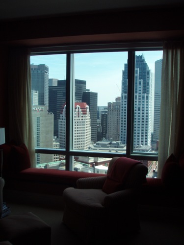 The view from the media room has changed over the years, from the shimmering water of Boston Harbor to a monochromatic, urban cityscape.
tktkt
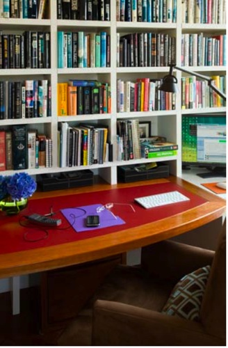
There was a desk in the media room originally, but the designers relocated their “office” to an unused sitting area off the kitchen. The new desk is custom built from pecan wood with a red leather insert. The chairs are brown ultrasuede. Chrissy and Mitch sit here side by side every day, since they both work from home. How cute is that?
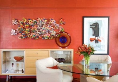
This wall in the living room was painted dark red. The designers upgraded the original painted surface with a hand painted Venetian plaster wall covering by Studio E. So many people wrote in to the Globe inquiring about the wall sculpture – a multi-colored ensemble of bikers purchased in Paris.
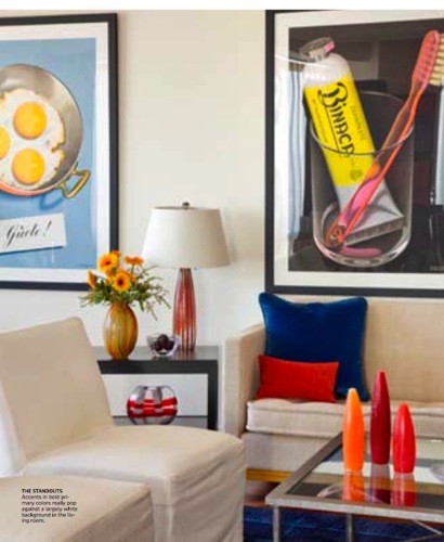
Th posters in the living room also garnered a great source of interest from our readers. They’re from International Poster Company, on Newbury Street in Boston. The vases and bowls are part of Mitch’s collection.
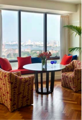
The windows in the living room look across Boston Common and Back Bay to the Charles River, all the way to the Blue Hills. The designers added deep red window seat cushions throughout the condo, done in 100% mohair by John Hutton called “Cocktails Anyone?” in Bloody Mary.
During my research trying to understand color blilndness, I came across this interesting post from the Colour Lovers blog: “As Seen By the Color Blind“



 Follow StyleCarrot on Twitter

Hay Marni Elyse Katz, In your article “the Italian Job” Boston Globe Magazine February 21, 2010, pg 38 Photo “getting the boot”. Where did he find that cool lamp and shade? Linda
Hi Linda – I believe all the lighting came from Casa Design in the South End – 460 Harrison