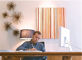
 Photo courtesy of Stuff Magazine
Last year, interior designer Frank Roop purchased a 725-square-foot condo on Newbury Street to serve as his studio and office. I popped in last spring to go over the details on the gorgeous Nantucket house that I wrote about for the Boston Globe Magazine (and this blog). While I was there, I also got the lowdown on how he transformed it into a perfect workspace; one that showcases his signature style without overwhelming the designs he puts forth for his clients. I wrote it up as a Q&A for Stuff Magazine called “Interior designer Frank Roop’s functional and fashionable studio”. And, I took extra notes and pictures to share here.
“I definitely went all out. My studio is simple and clean, with notes of exotica, pops of color, and a lot of texture. It communicates my aesthetic, but is neutral enough so that the design doesn’t overshadow my presentations to clients.”
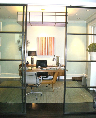
The space originally housed three separate offices. Roop kept a plan with three distinct spaces, but opened up the wall between two of them, adding large custom metal-and-glass doors. That’s where his desk and computer are. He presents design concepts and swatch boards in the adjoining room with the fireplace. The third room is a work area for making models, with doors he can shut if it gets messy.
Roop’s desk is vintage Danish from a dealer in Paris. The wall behind the desk is a high-gloss lacquer with “a million coats of paint” that were sanded between coats and then sprayed with a high-gloss finish. Roop adds, “It took about a week to do that one wall.” The stripey painting is by local artist David Moore, represented by the Kidder Smith Gallery.
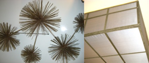 Left: Roop often uses vintage Curtis Jere wall sculptures. An array of sea anemones hang behind his desk. (He used similar sculptures above the desk in the Nantucket family room.)
Right: Detail of the overhead light fixture that he designed. About it Roop says, “It is essentially a light box made of silk with top-stitched suede tape.”
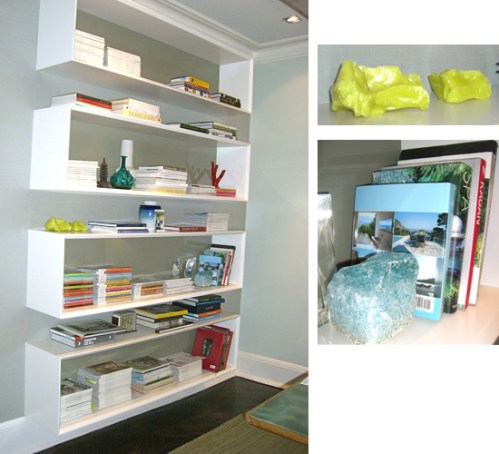 Left: These open rectangular bookshelves hang on the wall to the left of Roop’s desk. He used similar shelves in his home too.
Right: Roop favors fancy minerals as objets d’art. The hunks here are actually slag glass. (I scoured ebay for a hunk (of glass) of my own as soon as I got back to my computer.)
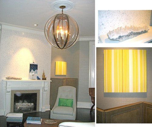
Right: The main room adjoins Roop’s office. The walls are covered with a superfine hemp cloth in a neutral color, which is important because he displays the design boards on the ledges here. The wall behind the fireplace is a micro-mosaic tile in a polished white Carrara marble that’s sort of sparkly. The Plexiglass globe chandelier is from an antique dealer in San Francisco.
Top right: A mesmerizing slab of rock with clear crystal formations, from China, sits on the mantle. Bottom right: Another painting by David Moore hangs above a decorative screen with nail head detailing.
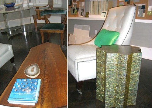
Left: “My super-duper high-end treasure is this ’60s-era George Nakashima coffee table.”
Right: Roop designs most of the upholstered pieces in his projects. This chair is one of his early prototypes. He also designed the star side table with a shimmery veneer that’s made from paua shell imported from Hawaii. When the Nantucket client saw it, she insisted on having one too. The star table in Nantucket has more of a bluish tinge.
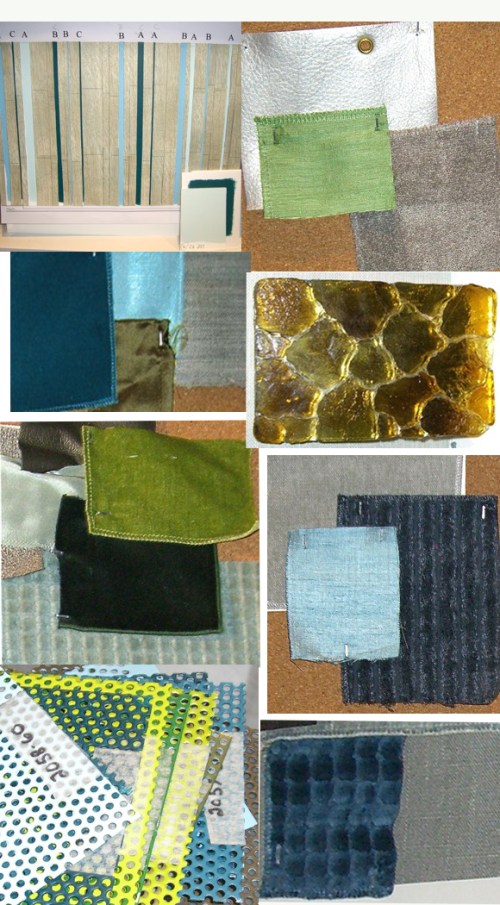
 The presentation ledges. These boards are for an over-the-top condo in Miami. I got a sneak peek of the photos, but sorry, can’t share them yet! They’ll be published in a national glossy soon.
Details from the inspiration boards. Shiny, velvety, nubby, geometric, metallic. Delicious. The colors and textures are pure Roop, but revved up to stand out in South Beach.
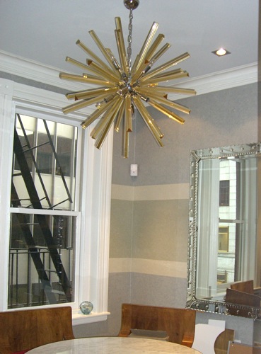
“I love light fixtures – I think of them as sculpture.”
[tweetmeme source=”StyleCarrot” only_single=false]


 Follow StyleCarrot on Twitter

hi! im really curious about the white rectangular bookshelves! where did you purchase them!