FINAL E N T R Y SCHEME
Jonathan Adler “Greek Key” wallpaper in gray/white
Jonathan Adler “Queen Anne” mirror in orange lacquer
Bungalow 5 “Odom” console in gray lacquer
George Nelson “Pear” lamp, YLighting
West Elm “Crescent” bench in whitewashed ash
Timorous Beasties “Butterflies” wallpaper in frost
* * *
THE P R O C E S S
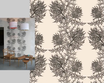
I started out by ordering swatches of about a dozen wallpapers. Some were great, others were unpleasant surprises. (Oversize metallic patterns on mylar—no thanks.) My favorite was Timorous Beasties “Thistle Superwide” in black on ivory; no surprise to those of you who read regularly.
Meredith wasn’t crazy about the more illustration-like choices, though eventually “Thistle” grew on her, and she asked about a less bold version.
I liked the idea of doing “Thistle Superwide” in gray on ivory, with Timorous Beasties “Birds’n’Bees” in the powder room. Neither one of us are huge bird fans, but the quality of the papers and the colors look beautiful together. Nevertheless, we decided to hold out for a swatch of the new “Butterflies” paper. We’re still waiting!
I stopped by Jonathan Adler on Newbury to take a look at some furniture and rugs. They had a wall with a console done in “George“. Fab!
Cole and Sons “Hicks Hexagon” | Jonathan Adler “George”
Then it hit me: David Hicks “Hexagon.” It’s fresh, but timeless. Daniel liked the blue colorway, but Meredith preferred a more subtle pattern, so I put this together:
S C H E M E 1
Lights: West Elm “Polyhedron” – Sonneman “Castelli” – George Nelson “Pear Criss Cross” – Z Gallerie “Glo” – IKEA “Knappa”
Wallpaper: Ferm Living “Ribbed” – Kreme “Chevron” – Jonathan Adler “Greek Key”
Consoles: West Elm “Source” – Bungalow 5 “Odom” – World’s Away “Noho”
(Meredith & Daniel’s own octagonal mirror)
* * *
S C H E M E 2
Meredith loved the chevron and the Greek key papers, along with the simple gray lacquer console. Many of the pendants I had chosen only used 60-watt bulbs, so we went with a George Nelson; they’re great functionally, aesthetically, and budget-wise. Then I added a couple of other consoles that look pretty with the chevron paper.
Wallpaper: Kreme “Chevrons”
Light: George Nelson “Pear Criss Cross”
Consoles: Bungalow 5 “Parsons” – Bungalow 5 “Marco” – Bungalow 5 “Odom”
* * *
I also suggested a bench for around the corner, since there was plenty of room, and with a toddler, quite useful. Here’s the “Butterflies” paper that we’re still waiting to see in real life. Love the green; perhaps for the powder room? Details for the consoles show the lacquered grasscloth finish and nailhead detailing.
* * *
S C H E M E 3
The nailhead console was too short, the white too white (plus, no drawer), so the glossy gray lacquer it is. With a pale gray paper and the console’s simple silhouette, I was afraid the finished look wouldn’t make enough of an impact. Although we never discussed orange for anywhere in the apartment, I couldn’t resist adding this mirror. She loved it! Yay! Now we need to find somewhere else to put the octagonal mirror.
* * *
S C H E M E 3
And finally . . .
Do you love it? We do!
I love the quirky silhouette of the mirror paired with the clean-lined console. Its curves, plus that of the classic modern pendant, provide contrast against the pale backdrop of the bold Greek Key pattern, while the shape of the console echoes it. And the orange and glossy gray colors really pop. Can’t wait to see it IRL!


