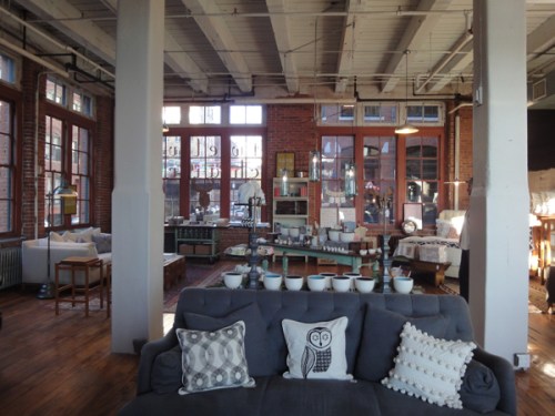
Today, one of the few days I’ve had any time recently, I ventured down to Boston’s Fort Point neighborhood to stop in at the new home furnishings shop and design studio, Twelve Chairs. The business is a collaborative effort from two 27-year-old interior designers who met at Cornell, Roisin and Miggy. Roisin, who’s from the area, worked at a commercial architecture firm and did a stint at Koo de Kir in Beacon Hill two learn the retail side of things. Miggy, who’s from New York, worked in operations for the Anthropologie in Rockefeller Center in New York City. The pair stock the sun-filled loft space with pieces from small artisans, with a focus on sustainable methods and materials. They also offer design services.
Tag Archives: Fort Point
Shopping Trip: Twelve Chairs
Filed under . REGULAR FEATURES, Home Accessories, Shopping, Shopping Trip
Tagged as 12 Chairs, Boston boutiques, Fort Point, home furnishings in Boston, Twelve Chairs
Design Diary: John Stefanon at FP3
I first came across the design studio of John Stefanon earlier this year at at SoWa Open Studios, when I wandered into JFS Design Studio amidst the galleries at 450 Harrison. I loved the spare, earthy look, and John was so welcoming. I’ve since had the opportunity to profile his work a couple of times. Most recently, I wrote about Studio 210, a model apartment at FP3 in Boston’s Fort Point neighborhood, for Stuff Magazine – “Designer John Stefanon redefines one-room living in Fort Point.”
Studio 210, FP3 Photo courtesy of FP3
This is the second model apartment Stefanon was asked to design at FP3, a sleek 92-unit loft building in Fort Point. While the first one (which I’ll do a post on too, at some point), has multiple rooms, over-sized windows, and lots of light, this is the most challenging unit in the building — a second-floor studio with no view.
The directive was to help would-be buyers conceptualize how to make the most of a studio. Stefanon needed to show how one can fashion a single room into a living space that functions well for both entertaining and private time, while remaining organized and, of course, stylish. No problem.
+ + +
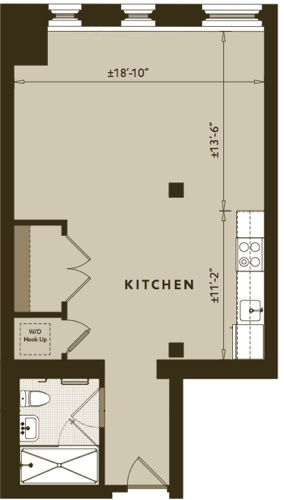
The 671-square-foot space is divided into four areas — entry, dining, living, and sleeping.
+ + +
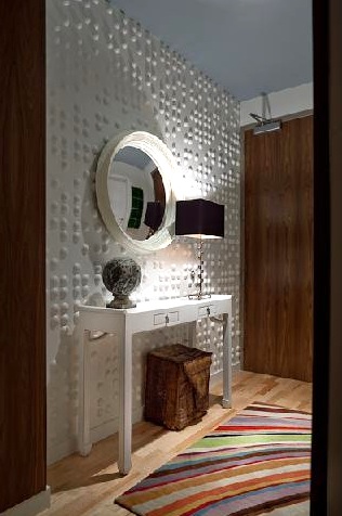 Photo courtesy of JFS Design Studio
Stefanon designed the vestibule to be the snazziest area. “In an unfinished unit, people go right to the window,” he says. “So we created an interesting entry in hopes they would stop, think, and take it all in.” And, formalizing the entry not only ensures that guests savor their first moments here, but defines the entry as its very own space.
The Tibetan wool Paul Smith “Swirl” rug by The Rug Company certainly made me stop in my tracks. Love, love, love. He covered the entry wall in Braille Wall Flats by Inhabit Living. The textured panels are both eco-friendly (they’re made from 100% molded bamboo paper pulp) and inexpensive($86/10 tiles that cover 22.5 square feet). To evoke a sense of outdoors, Stefanon painted the ceiling a moody, neutral blue (Benjamin Moore Wedgewood Gray HC-146). Above a clean-lined custom console table that’s perfect for mail and keys, he hung a convex mirror by Reflecting Design that reflects the space beyond.
Stefanon further differentiates the vestibule from the main living area by lining the interior frame of the portal with custom walnut panels stained to match the finish of the unit’s door. The detail is a nice touch — “It makes people feel like they’re about to walk into somewhere special,” he says.
+ + +
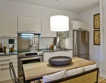 Photo courtesy of JFS Design Studio
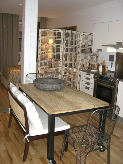
The kitchen is the standard kitchen for the units. Stefanon says, “By adding an interesting entertaining area in front of the kitchen, not just about the kitchen anymore.” The drum pendant, which hangs from a chrome rod is by Tango Lighting.
“The kitchen,” Stefanon says, “is not just about the kitchen. It’s also a place for entertaining.” The long, rectangular table by is on wheels, so it can function as a dining table, an island, or a buffet, or be pushed out of the way altogether. The rattan-backed mahogany bench by The Home Port adds a tailored touch to the utilitarian table, while the chain-mail chairs by infuse an industrial edge reminiscent of the building’s warehouse origins. The screen, also by Design Workshop, separates the kitchen from the sleeping space.
+ + +
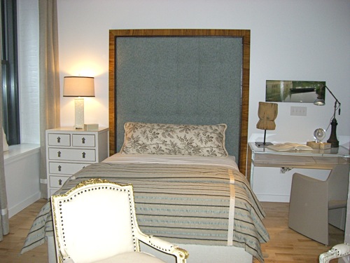
The development company had initially requested that Stefanon incorporate a Murphy bed into the design, but he felt the look was too typical. Instead he opted for a more artistic approach. Drawing on the neighborhood’s artsy identity, Stefanon designed an oversized headboard constructed with art frames around the perimeter of an upholstered inset of tufted outdoor chenille from Glant Fabrics‘ The Modern Collection. Stefanon considers the headboard an art piece, since there isn’t much room for actual artwork on the walls. The custom duvet is made from Calvin Fabrics. On the bed he used a single large pillow, in a leafy Schumacher print, for maximum impact and minimum fuss. (For Bostonians looking for a workroom you can trust – Stefanon uses Finelines in Peabody.)
The small dresser Stefanon uses as a nightstand is a custom design in an antique white crackle finish with stainless hardware (the same as the entry console). On the other side he thoughtfully incorporates a desk, another custom piece, fabricated in acrylic “so it doesn’t clutter the space.” The leather desk chair, which has an interesting silhouette, is from Italian company Arper. The lamp is a one-of-a-kind piece made from industrial parts and hand blown glass.
+ + +
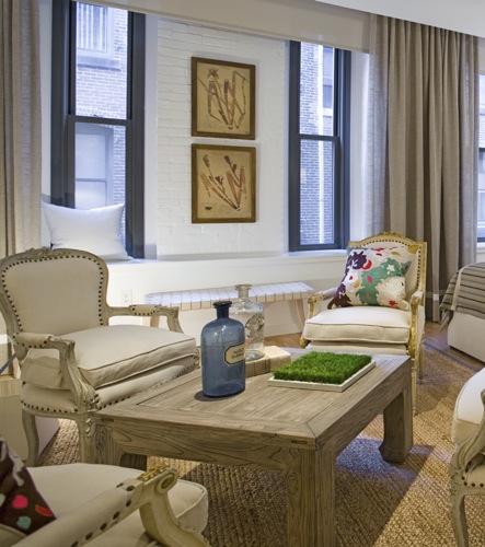 Photo courtesy of FP3 (detail)
Instead of a sofa, Stefanon outfitted the living area with four chairs. He points out, “A sofa seats three, but nobody wants to be in the middle. This way is more user-friendly.” The French Provincial–style chairs by Eloquence are upholstered in natural muslin. They are sophisticated, yet casual and comfy, and are adorned with colorful pillows by Megan Park, from Calypso Home. The table, a custom design in a cerused oak finish, is rustic enough to put your feet on. The jute rug, from Stark, is equally practical. For additional seating, the bench from the dining table can be pulled over.
Curtains in hung on either side of the space as if they are one big window, are neutral, and tie the space together. They go to the floor and have a cotton tape along the bottom, for interest. Stefanon hung art on brick even though it gets hidden when drapes are drawn.
+ + +
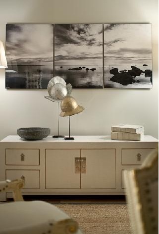 Photo courtesy of JFS Design Studio
Across from the bed is another custom crackle cabinet. Stefanon hung black & white beach photos by Roy Barloga above because “everyone knows that’s where you’d put the TV, so I did something more artistic.” The sculptures are old helmets on stands
“The goal,” he told me, “was to make every living area special, without overdoing it,” The key to achieving this balance? A lot of editing. Good advice for those confined to one-room living. Stefanon confided, “Somebody saw this the day after I finished it and bought the studio directly above.”
Want more?
Video tour of Studio 210 with John Stefanon: NECN/styleboston: A Hot Spot in Fort Point
Filed under . REGULAR FEATURES, Design Diary, Rooms
Tagged as Barloga Studios, Boston lofts, Braille Wall Flats by Inhabit Living, chairs by design workshop, convex mirror, Eloquence furniture, Finelines workroom, Fort Point, Fort Point Channel, FP3, JFS Design, John Stefanon, Megan Park pillows, one-room living, Paul Smith Swirl rug, reflecting design, Roy Barloga, studio 210, studio apartment, styleboston, The Home Port bench, The Rug Company Swirl




 Follow StyleCarrot on Twitter
