Design Diary: Colorful Cambridge Home Makeover by Heidi Pribell

Cambridge-based interior designer Heidi Pribell breathed a new and colorful life into a dated, dilapidated, and absolutely dreary multi-family home, transforming it into a thoroughly fantastic single family residence for a family that re-located from out-of-state. I wrote about this colorful makeover in the Boston Globe Magazine “Makeovers” issue in February 2014, shot by one of my favorite local interior photographers (and the first one I worked with in Boston) Eric Roth.

Pribell got her hands on the 3,600 square foot interior once  Oldenburg Architecture and contractors Dattilo & Reidy completed the structural work, which included opening up the main living space and improving the flow. Since the family preferred to stick to a tighter budget when it came to furnishings, Pribell knew most of the wow factor would come from color. Pribell says, “I am so passionate about color, I can nearly taste and hear it.”

pribell-main-living-room

Pribell’s rich and rosy palette was inspired by a trip she had recently taken to Mexico, most specifically by wildly blooming bougainvillea in its yellow, orange, red, and magenta glory. The trim in the living room is painted in a color Pribell describes as “a hot, cardinal red,” then toned down with an uneven application of glaze. Pribell transformed a closet into a light-filled home office with built-in desk, accessed by French doors.

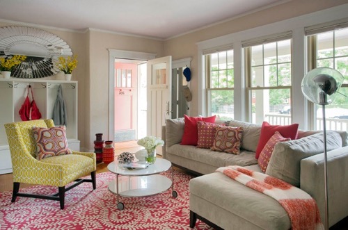
For furniture, Pribell paired a gray sectional sofa from Crate & Barrel (scattered with store bought pink and orange pillows) with yellow hexagonal side tables from West Elm. A stylized floral black rug grounds the space. All the furniture in the house was newly purchased, with the exception of the two armchairs, which the wife inherited from her great grandmother. Made from dark, polished wood with mustard upholstery, they hardly blended, so Pribell had them painted with several coats of that same hot red paint and glaze, and covered with a fun fabric by Romo.

pribell-view-to-living-room

The columns dividing the living and dining room were original to the house.

Colorful Cambridge Home Makeover By Heidi Pribell

For the dining room wall Pribell used sorbet shades of butterscotch and salmon, again inspired by bougainvillia. Pribell says, “As bougainvillia grows and ages, the petals transform from yellow orange to magenta.”

The indoor/outdoor striped rug is perfect for family living. The white dining extension table with curvy legs—the Regency by Calligaris—was purchased at local furniture store City Schemes. Pribell says, “I love the rococo nature of it.” Swirly orange chairs from Indonesia have ikat print cushions about which Pribell says, “I think they’re kind of soulful; and they relate to the Arts & Crafts nature of the home.”

Colorful Cambridge Home Makeover By Heidi Pribell

Pribell clustered six mirrors from Global Views above the Asian style sideboard to help bounce light around the room.

Colorful Cambridge Home Makeover By Heidi Pribell

Walls were removed for an open layout.  The orange Kartell barstools were a splurge, but they loved the color and flexibility they provided, since the kids were different sizes and growing.

Colorful Cambridge Home Makeover By Heidi Pribell

The white kitchen was already designed when Pribell came on board. She added funky red lacquer hardware.

Colorful Cambridge Home Makeover By Heidi Pribell

The master bedroom was originally two rooms, so they broke down the wall to enlarge it. The vintage light pendant, made from clear fishing line on Lucite, purchased at local modern design shop Abodeon, adds character. A persimmon door leads to a balcony.

Colorful Cambridge Home Makeover By Heidi Pribell

The master bathroom walls are covered in large format marble tiles from floor-to-ceiling, thanks to a major sale at Tile Showcase. They added a custom Silestone countertop to a store bought vanity. The floor is done in cotton candy-colored penny tile. Pribell says, “It’s extremely small for a master bathroom, but it has the graciousness of a 5-star hotel.”

Colorful Cambridge Home Makeover By Heidi Pribell

On, the first floor, which has essentially the same layout, the color scheme is repeated, providing a perfect atmosphere for the kids who use the space to watch television, do art projects, and practice piano.
Colorful Cambridge Home Makeover By Heidi Pribell

The downstairs living room provides the family with another, slightly more casual, hangout spot. The swirly vine rug is by Dash & Albert and the coffee table on casters is the Strind from Ikea. “The downstairs space really caters to the kids,” Pribell says.

Colorful Cambridge Home Makeover By Heidi Pribell

The exterior entry doors are persimmon and the porch ceiling is lilac.

Pribell says, “I wanted the home to seem fresh and crisp and have a modernism about it, but not be devoid of character. The homeowner is very theatrical and energetic; this house became an expression of her personality, and I think that’s what delights her most.”

•                     •

Recreate the style of this colorful makeover by Heidi Pribell with pieces from StyleCarrot partners.

S H O P  the P O S T

[show_shopthepost_widget id=”699510″]

Design Diary: Moody South End Condo by Evolve Residential

Almost two years ago Tom Egan of Evolve Residential introduced himself to me with photos of his business partner Josh Linder’s 609-square foot, parlor-level condominium in a 19th century Victorian townhouse in the South End. Since then I’ve gotten to know these guys (who are soooo nice and incredibly talented) and feature more of their work.

We included this project,photographed by Joe Keller, in the Makeover issue of Boston Globe Magazine, The similarly moody 900-square-foot two bedroom condo in the South End belongs to Linder’s friend. He steered him towards buying it, knowing it could be fab. Of course, now it is. Adding period trim, dark paint on the walls, and a mix of contemporary and traditional furnishings, Linder transformed the nondescript space into the perfect refined bachelor pad.

Linder describes it as “elegant but very masculine” saying, “We wanted to make sure when you walked in that it was obvious that a man lived here.”

evolve-living-room-2

Linder treated the whole space to Evolve Residential’s signature grey walls. The medium grey walls in the living room are done in Benjamin Moore Pale Smoke. The  ventless ethanol fireplace is entirely new. Linder chose a period mantle and painted it a glossy black—Benjamin Moore Twilight Zone.

The 13-and-a-half-foot ceilings easily accommodated the Flos 2097 chandelier, about which his friend was entirely skeptical until he saw it installed. But friends don’t doubt friends, and so he kept his mouth shut until the end, when he confessed. “He gets it now,” Linder says.

Linder and the homeowner poured through his collection of photography books to come up with a fun combination of images to use on the seat backs of the French bergere chairs. These portraits, which made them smile, are both by Richard Avedon. Linder says, “We like to have one piece in every living room that is conversational.”

evolve-living-room-1

Graced with tall windows, and even taller ceilings, the space is airy and the layout needed only minimal tweaking. Plus, there’s a fantastic view of the Hancock from the living room. The quilted black leather sofa on the left is a reproduction Joseph Hoffman Kubus sofa. The crushed gray velvet settee is by O. Henry House, the rug is grey sisal, and the grey lacquer coffee table is a custom piece.

evolve-kitchen-barstools

The existing cherry kitchen cabinetry needed replacing, but they kept the black granite countertops. The new black cabinets, which run all the way up to the ceiling were constructed by Kidder Blaisdell Woodworks and painted in Benjamin Moore Twilight Zone. The Moroccan inspired tile on the backsplash is from Tile Showcase and Calcutta marble tops the counter on either side of the range.

evolve-entry-2

The grey walls in the entry are painted in Benjamin Moore Hearthstone. The Empire chest is from Autrefois Antiques in Brookline and the pair of glass lamps are by Barbara Cosgrove. Hanging above is a charcoal drawing by New England artist Martha Lloyd.

evolve-library-1

The homeowner grew up in a house with a cozy, dark wood room that he really liked, plus he has tons of books, so they transformed the second bedroom into a library with black walls. It’s Benjamin Moore Twilight Zone, the same color as the trim in the living room. Kidder Blaisdell Woodworks also did the library bookshelves.

 They used the smallest sleeper sofa they could find in a queen. It’s a stock piece from local store Circle Furniture, but they had it reupholstered in heathered Ultrasuede.  The homeowner says, “My guests say the memory foam mattress is more comfortable than their bed at home.”

The abstract is another Martha Lloyd painting. Linder says, “We endearingly call it ‘the coffee stain.'”

evolve-library-2

There are real candles in the Rococo style gold sconces.

evolve-library-detail

The natural grass rug is from West Elm and the sleek glass desk was an online purchase.

evolve-bathroom-with-kilim

Linder describes the bathroom as “horrifying,” so they gutted it. They used a simple white mosaic tile on the floor with a beautiful Afghani war rug from Yayla Tribal Rugs in Cambridge, which is much more intimate and refined than bathmat.

Linder used gold sconces here too, and also added a gold leaf frame to the recessed medicine cabinet in order to bring the elegant French feel into the bathroom.

evolve-bathroom-shower

When they demo’d  the bathroom they discovered an extra 10-inches of space behind the tub which they took advantage of to create a large walk-in shower with a frameless glass enclosure. The large-format, horizontal shower tile from Tile Showcase looks like rustic wood and the bench and shower curb are honed black granite.

evolve-bedroom-gray

The master bedroom is a tailored and masculine cocoon done in lush fabrics, bold lighting, and elegant, unfussy furniture. The grey walls are Benjamin Moore Timber Wolf. The all metal Global Views Turned Pendant Chandelier replaced an ugly ceiling fan.

evolve-bedroom-with-church-view

The custom upholstered headboard has nailhead detailing. The gray bedding is Thomas Brien for Target but the throw pillows are custom. Linder says, “One pillow cost the same as the entire bedding set, but as a mix it works beautifully.” Linder found the black marble topped vintage chests at the Cambridge Antiques Market and repainted them an inky blue.

The homeowner requested total darkness for sleep so Linder mounted three thick, blackout-lined, floor-to-ceiling custom panels from Holly Hunt to the underside of the soffit. He loves it, saying, “It could be a brilliantly sunny day, and I’d never know it.”

Photos by Joe Keller

•            •            •

S H O P  the  P O S T
[show_shopthepost_widget id=”576208″]

Design Diary: Boys’ Bedroom Makeover by Robin M. Anderson

On Sunday Boston Globe Magazine published a boys’ bedroom makeover I wrote called “Let’s Hear It For the Boys.”  The column features the home and work of local lifestyle blogger Robin M. Anderson, with photos by local Boston photographer Sarah Winchester of Sarah Winchester Studios, who also deserves a big thank you for pitching me this fun project.

Robin M. Anderson (she used to blog under Diary of a Yummy Mummy) lives in three bedroom condo in a converted school in Cambridge with her husband, two sons, and a guinea pig. became interested in design. When they first moved in, she hadn’t yet become interested in design, picking finishes she came to hate, and mundane furnishings, like the living room’s brown microfiber sofa. Eventually she picked up a paint brush, and since then, there’s been no stopping her.

Last September, they decided to move their 3-year-old son out of the nursery into a bedroom with his 7-year-old brother, so Anderson took the opportunity to execute a full-on boys’ bedroom makeover. She started from scratch, doing everything herself with help from the boys. The room is adorable and everything in it is affordable. Anderson says, “It’s their room, so I really wanted them to feel comfortable.” That says, she has a strict no sticker policy. “They’re allowed to put them on the back of the door, but nowhere else!”

Let’s tour Robin M. Anderson’s boys’ bedroom makeover:

boys-bedroom-makeover-robin-m-anderson-2

Step number one for the boys’ bedroom makeover was to paint. Anderson describes the walls’ original color as “ light Kermit green.” When they had a flood and had to repair and repaint anyway, she chose Farrow & Ball Parma Gray. The boys helped with the first coat.

She says, “Paint is my first thing because it doesn’t cost much, as long as you’re willing to put the time into it. The original paint in the condo was not well done. I realized I was repainting a color I don’t even like. Paint is amazing. Our bathroom has been like nine different colors. And the kids get into it.”

The teepee, a birthday gift when her youngest turned one, was originally set up in the nursery. Now it’s a cozy place for the boys to read. Anderson’s father won the surfboard that’s propped up in the corner in a raffle. It belonged to a well-known surfer, and he had it signed before gifting it to his first grandson.

There are five large, tall windows that needed draperies. Ten custom curtain  panels would have been really pricey, so Anderson purchased 10 white curtain panels and a few navy ones, and asked her dry cleaner to sew a strip of navy panel to the bottom of the white ones to create cost-effective, extra long colorblock draperies. “All my friends are doing this now too,” she says.

boys-bedroom-reading-nook-teepee

Anderson strung the teepee with owl lights from ModCloth that once adorned the family’s Christmas tree. The dinosaurs in residence are usually found in the bathtub.

boys-bedroom-makeover-robin-m-anderson-1

It was important to Robin that the boys’ bedroom makeover reflect the family’s heritage and interests. A Swiss flag, framed at the Central Square Blick in Cambridge, her go-to spot for affordable framing, hangs to honor her husband’s birthplace. “He’d love to move back someday,” Anderson says.  Authentic Swiss army blankets are another nod to his heritage. She says,”You get the blankets when you join the army, which is obligatory there.”

Over the other bed, school pennant is clustered with a photo of the Matterhorn in the Swiss Alps, a call out to the family’s love of skiing, and an autographed surfer photo that was a gift to her son from her dad. On the other wall, a deceptively luxe-looking red faux snakeskin frame (also done at Blick) displays a print signed by Dr. Seuss that Anderson found on a trip to New Orleans. She hopes her son will pass on to his own kids. She says, “It was my first and only legitimate art purchase.”

The shelves, which are actually floating shelves, needed brackets to accommodate the slightly curved wall here. Anderson says, “The white metal brackets looked awful, so I spray painted them navy. I’ll spray paint anything; it’s my M.O.”  She and her son painted the lower half of the wall with chalkboard paint. She struggled with the trim that caps it, going back and forth to Home Depot for supplies and assistance. She says, “It was the first time I used a level.”

Robin_Anderson-3low

The mid-century modern style Ellipse beds from Land of Nod are layered with a mix of prints. Anderson loves pattern on her clothing and in her decor. She says, “I used as many patterns as possible without being obnoxious.” The star sheets are from Pottery Barn Kids and the whales from One King’s Lane. The pillowcase in the back, with monsters on skateboards, came from Target; her son is a big skateboarder.

Anderson was able to incorporate inexpensive second hand finds into the boys’ bedroom makeover. She bought the dresser from friends for $50, lacquered the scratched top in navy, and swapped the knobs.

boys-side-table-with-globe

All the boys’ toys are in their room, with the exception of some Legos. Big canvas storage bins on the other side (not pictured) hold the Nerf guns and stuff. She had a closet company build out closet with shelves to accommodate all the toys. As soon as they outgrow clothing or tire of toys, Anderson ships off the stuff to her sister.

boys-bookshelf-soldier-bookend

Her older son made this baseball in an acrylic box at school, when somebody from the Red Sox visited the classroom. She says, “They dirtied the balls, signed them, and put in a box. It’s his prized possession.” Soldier bookends hold up current reading material.

robin-m-anderson-at-home

Robin Anderson and Phineas the family guinea pig at her feet.

boston-globe-style-watch-robin-m-anderson

 Boston Globe Magazine    Sunday, February 15, 2015 

Fine Print: Erin Gates’ Elements of Style Book

Erin Gates sent me an advance copy of her new, very first design book, Elements of Style: Designing A Home & A Life. I’ve been browsing through it for the last couple of weeks, thoroughly enjoying the photos of the rooms she decorated for herself and clients, studying her style charts, and catching up on her life. The tone is easy, breezy, much like her blog, with plenty of personal tidbits interwoven through her design adventures and accomplishments.

Erin’s come a long way since I first met her, on assignment for Boston Globe Magazine in early 2009 after she sent me scouting shots of  the place she and Andrew rented in J.P. It landed her on the cover, and it’s still one of my favorite stories, not just because Erin and her house looked amazing (thanks Eric Roth for the excellent photos), but because Erin was full of enthusiasm and money saving tips.

Her blog and business have exploded and her design skills honed, while her excellent attitude and work ethic prevail. Congratulations Erin Gates!

erin-gates-book-cover

Elements of Style: Designing a Home & a Life by Erin Gates
Available October 7, 2014 (Simon & Schuster) $22.14

•      •      •

erin-gates-book-bar-1

Photo by Michael Partenio

Erin’s used this buffet over and again. She bought it for $75 at an estate sale and painted the inside turquoise (you can see that iteration in Erin’s place in Jamaica Plain, which I wrote about for Boston Globe Magazine, March 2009.) She went orange for the South End. Now it’s lined with malachite wallpaper.

•      •      •

erin-gates-book-sputnik-dining-room

Photo by Michael J. Lee

This is my favorite room. I’ve long been a sucker for a library dining room with Saarinen table and a fireplace. The sheepskin rugs nestle perfectly into those acrylic chairs from IKEA. The client stuffed the fireplace with little logs, which add some rustic texture; plus the circles are an excellent contrast to the stripes on the rug.

•      •      •

erin-gates-book-buddha

Photo by Michael Partenio

A sunroom with violet ikat cushions on barley twist chairs and Buddha on custom made brass base.

•      •      •

erin-gates-book-dining-nook

Photo by Michael J. Lee

Love this cerulean blue wall behind the banquette upholstered in the ever popular Chiang Mai print by Schumacher. Those Cherner chairs work well with the fabric’s twisting design and earthy colors.

•      •      •

erin-gates-book-dining-room-chart

Erin provides some charts with formulas for achieving different styles.

•      •      •

erin-gates-book-paint-colors

Erin’s favorite paint colors. You’ll have to buy the book to get the exact names. Ok, I’ll give you one: Benjamin Moore Palladian Blue.

•      •      •

erin-gates-book-girls-bedroom

Photo by Michael Partenio

I love how despite the graphic black & white rug and bedding, Erin’s guest room is totally feminine. Pale pink walls (Benjamin Moore Blanched Coral), a starburst mirror, and mirrored side tables will do that. Swiss dots + a boho throw + Nordic rug + Hollywood Regency glam. And somehow it all works.

•      •      •

erin-gates-book-masculine-bedroom

Photo by Michael J. Lee

This bedroom is interesting too, with its tufted headboard, chocolate brown linens, Asian-themed toile wallpaper and fretwork bookshelves, plus a leopard print bench.

•      •      •

erin-gates-book-boys-nursery

Photo by Sean Litchfield

Nursery with a black accent wall went viral on Pinterest.

•      •      •

erin-gates-book-kitchen

Photo by Michael J. Lee

Oh, this Madeline Weinrib rug again, this time in brown. It seems to work everywhere! (Tip: IKEA makes a black & white version.) I generally don’t like tan stone (only contractors do!) but Erin makes it work in this space where they’re stuck with it.

•      •      •

erin-gates-book-garden-patio

 Photo by Sarah Winchester

Erin’s parents Connecticut home. I wrote all about her mom’s garden for Boston Globe Magazine, April 2013.

•      •      •

erin-gates-and-andrew

Photo by Michael J. Lee

Erin and Andrew Gates with the doggies.


Design Diary: Leather District Loft by Michael Ferzoco

Michael Ferzoco of Eleven Interiors has made a bit of a specialty sprucing up living spaces for single men. That’s not to say he doesn’t deal in couple, families, and women—he does—but recently I’ve written about a couple of so-called bachelor pads” that he’s designed.

This one, which appeared as “All That Glitters” in Boston Home (photography by Michael J. Lee) is owned by a doctor who moved to Boston from Richmond, Virginia, where he lived in a four-level Italianate row house. When he relocated, he decided to seriously downsize, purchasing a 994-square-foot loft in Boston’s Leather District for him and his two large dogs. He now lives there with one mix breed beagle named Daisy.

After living there 13 years, he consulted interior designer Michael Ferzoco about upgrading his furnishings and re-imagining his kitchen. While he still loved the “gritty” feel of the neighborhood, he wanted a more luxurious living experience once he stepped inside. He says, “I wanted a place that felt like a very comfortable—but chic—hotel suite.” Ferzoco infused grandeur into the small space.

michael-ferzoco-loft-living-room

Ferzoco left the four large windows bare, so the space is bright all day. He helped the homeowner “vigilantly edit” his belongings. They kept the pair of mid-century modern leather-and-wood armchairs that the homeowner purchased at a yard sale in Texas. They also kept the large mirrored Scandinavian armoire from the 1800s, which the homeowner had purchased from close friends. Ferzoco steered him to replace his sofa with two new Minoti “Hamilton” sofas from The Morson Collection in Boston, which the homeowner had been admiring for a while.

michael-ferzoco-loft-dining-room-

The mirrored console from Horchow pre-dates Ferzoco. The homeowner purchased years ago in what he calls “a two martini moment,” on the advice of a friend. He couldn’t believe how large it was when it showed up. It definitely adds a spot of glam.

Suspended track lighting by Bruch highlights artwork by local artist Sand T. Kalloch. Ferzoco says, “I’m not into recessed lighting; it makes the ceiling look like Swiss cheese.”

The homeowner says, “I  lean toward clean lines, but I also have an affinity for older things with classicism,” so they kept the clawfoot Baker dining table and chairs, which he purchased after finishing his residency. The chairs are upholstered in gray gabardine.

michael-ferzoco-loft-kitchen

The emerald green and gold Bisazza mosaic tile backsplash goes all the way up to the ceiling. Chilmark Architectural Millwork made the glossy white lacquer cabinetry. The countertops are Caesarstone in Arctic White. The LEM Piston stools are from DWR.

The homeowner found the mid-century Austrian J.T. Kalmar chandelier, made from thick panels of textural crystal, in a consignment shop in Germany on a side trip from Russia.

michael-ferzoco-loft-LR-bar

The homeowner already had the chartreuse Emma Gardner rug. The marble-topped Minotti cocktail table was purchased along with the Minotti sofas from The Morson Collection when they went on sale. The mobile-like  “Crescendo Chandelier” by Tech Lighting suffuses light across the room.

michael-ferzoco-loft-bar

The glass brick wall behind the sofa is pre-existing, dividing the entry from the living space. Contemporary artwork makes for a fun backdrop for the bottles.

michael-ferzoco-loft-bedroom

The homeowner purchased the cowhide when he lived in Texas. He bought the “L’Instant Tattinger” print on eBay. The wavy maple screen is by Knoll.

michael-ferzoco-loft-artwork

The framed red silk tapestry from the early 1900s is a family heirloom.

michael-ferzoco-loft-bathroom-vanity

Master bathroom.

michael-ferzoco-loft-bathtub

The homeowner had the leather tiles in oxblood from Ann Sacks installed shortly after purchasing the loft, to give the place some character. He says, “I figured the room has no light anyway, so why not embrace the dark richness?”

Photography by Michael J. Lee

•             •           •

Shop the Look

[show_shopthepost_widget id=”98924″]