Design Diary: Stephanie Sabbe’s (Big) Small Style

I’ve been acquainted with Boston interior designer Stephanie Sabbe for a while, but just recently got the chance to formally collaborate with her. (I did run into her outside my apartment one day—we recognized each other from our blogs!)  I wrote  “Made To Measure” about one of her projects, a 1,000-square-foot South End condo, in the newest issue of Boston Home magazine. Doesn’t she look great? Can you believe she was really, really pregnant in this photo? Stephanie had her baby last week. Congrats!

700 Harrison Ave, Boston, MA; Stephanie Sabbe Interiors

Stephanie Sabbe

Doctors Christine Liang and Andrew Bond, who purchased a1,000-square-foot South End condo in the summer of 2011 after considering a larger house in Jamaica Plain, knew that in order to make their urban choice work, they’d need to be efficient. That they’d also be frugal was a given. Interior designer Stephanie Sabbe, who spent seven years designing commercial office space, immediately understood the couple’s mindset. Sabbe points out, “Corporations pay rent by the square-foot, so efficient space planning is key. Similarly, city apartments are too expensive for people to not be utilizing every square foot to its maximum potential.” Working with a few pieces they already owned, including the living room sofa, Sabbe balanced thrifty buys and cost-saving, crafty solutions with custom designs and a few well-placed splurges to create a space with an effective floor plan and a look that’s anything but big box.

700 Harrison Ave, Boston, MA; Stephanie Sabbe Interiors

The main challenge was to create a formal dining area without overwhelming the space. After “a lot of studying with masking tape on the floor,” says Sabbe, they realized they’d need a dining table that was narrower than standard ones, but not as skinny (or high) as a console. Striking out on the retail front, Sabbe convinced the clients to spend a little more for a custom piece. Sabbe commissioned Jim Sears to weld a metal base and Cambridge-based Harvard Glass to cut a 30-inch wide by six-foot long glass top.

The couple requested a reclaimed barn wood table, but Sabbe convinced them that glass was the smarter choice, being less of a “visual space eater.” Bond says, “She was firm about the table, and totally right. We love its airiness.” Sabbe assembled an eclectic mix of seating options around the piece that all but disappear when not in use. A pair of chairs from IKEA stand at either end, while two ottomans, also from IKEA, and a handmade bench by Providence-based Darn Good Barn Wood, spotted at the SoWa Open Market, tuck under the long ends of the table. The low profiles keep the line of vision towards the city view free and clear.

In the kitchen,  Sabbe recommended just a few enhancements. She used magnetic blackboard paint on the side wall so things could be tacked up there rather than the fridge, which faces the main space. They added a pair of  Vintage Farmhouse Caged Pendants by  Junkyard Lighting, doing the work themselves. Also, a new industrial style faucet scored on Overstock.com. At the kitchen counter are machinist stools, which swivel down from bar to table height, and allow two more people to squeeze in when needed. The copper wall clock is from Pier 1.

Stephanie Sabbe Boston Interior Designer

Sabbe created semi-custom hybrid slipcovers for the IKEA armchairs in the dining area by attaching the long skirt from the company’s HENRIKSDAL slipcovers to its NILS seat covers. Excess fabric became lumbar pillows for each chair. The ottomans are SOLSTA PÄLLBO footstools (only $15!), with leg extensions added on, and slipcovered with IKEA curtain panels.

Stephanie Sabbe Boston Interior Designer


You’ll recognize the West Elm chevron rug, a steal on sale that Sabbe snapped up knowing the homeowners would be psyched, along with some throw pillows. They already owned the sofa, which works just fine. They added the trio of ceiling lights from Barn Light Electric, which cast pretty shadows on the ceiling. The concrete style Elements coffee table is  from CB2 and the table lamp is from local design shop Lekker.

700 Harrison Ave, Boston, MA; Stephanie Sabbe Interiors

Bond spent a month priming and painting a vintage Dansk credenza in their garage parking spot. “The BMW owners on either side of me were definitely nervous when they saw the chartreuse paint,” he jokes. The couple, who are huge Craigslist fans, found the piece on the site for just forty bucks. The floor lamp is from IKEA, the black leather armchair they already owned, the artwork around the TV is mainly from the SoWa Open Market, and the used books are from the Brattle Book Shop in Cambridge.

Stephanie Sabbe Boston Interior Designer

Sabbe is the first to admit that she used a number of mass-market retail pieces here, but her expertise lies in her ability to pair them with other budget-friendly finds to create a space that hums with personality. “We wanted a collected look,” she explains, “so it was important to set the tone right away, in the foyer.” Luckily, the grass cloth wall covering was already there, costing the clients nothing but supplying plenty of hearty texture. In need of a super skinny table to fit the narrow space, the homeowners tapped Darn Good Barn Wood for a reclaimed wood table. Above, Sabbe hung another piece of Americana, an eagle-topped convex mirror in order to break up the linearity of the hallway. A framed painting, a sketch from an antique shop, and the “I Love This Town” print from Etsy complete the tableau.

700 Harrison Ave, Boston, MA; Stephanie Sabbe Interiors

The couple purchased a new bed, a floor model from Crate & Barrel in Cambridge, but—and Sabbe agreed—saw no need to throw out a perfectly good, if not dull, plain white duvet. Sabbe asked a seamstress jazz it up with a solid chartreuse border, and also had her make matching drapes. Custom coordinating Schumacher pillows add extra polish. The sconces, which the homeowners installed themselves, are by Visual Comfort.

The black and white photos above the bed, which make a punchy, graphic statement and pick up on the gray tones in the striped West Elm bedding, are photos that Liang and Bond took on their travels. Sabbe used Photoshop to make them look like Polaroids, then spent $30 at Kinkos to have them printed and laminated. She used wooden trouser hangers to hang them on the wall. Crafty girl!

Photos 1, 2, 5, 6, 7  by Bob O’Connor

 carrot-currency-graphic

Does someone in your house often misplace the remotes? Think about getting extra replacement remote controls to have hand, just in case. Store them nearby in the credenza or bookshelf, with the DVD player and such.

Design Diary: Lisa Kreiling’s Gorgeous Townhouse

I first saw the work of Boston-based designer Lisa Kreiling of LTK Interiors almost two years ago at a South End Urban Showhouse organized by Ricardo Rodriguez. I was beyond thrilled when Rachel Slade, editor of Boston Home, assigned me a full feature (cover story, no less), about the four-story, 2,200-square-footSouth End townhouse Lisa shares with her husband and his two kids. Her former boss, Jeffrey Katz, did the architecture and Cheryl Katz and Kevin Musumano from the studio helped with some design choices. You can read the full piece, “City Slick”, but first, look my spread below. (Images, as indicated by Maine photographer Trent Bell. Others par moi.)

LISA KREILING BOSTON INTERIOR DESIGNER

 s u m m e r   2 0 1 2

RED VELVET SOFA LISA KREILING

photo by Trent Bell
The living room is an eclectic chic mix of old (sofa), vintage (chairs), inexpensive (coffee table), and treasured travel finds (rug). The wood floors were dark when they bought it, but they stained them another two or three coats, darker still.

ltk-nude-by-window

Nude watercolor by Marie Schlect, the mom of a stylist Lisa worked for in New York years ago. She had it framed at A Street in the South End. Lisa uses Boston-based Joaquim Schmidt to hang her artwork.

lisa-kreiling-boston-home-pendant

photo by Trent Bell
The chandelier, which is hung in the corner, super low, is from Charles Spada in the Boston Design Center.

RED VELVET SOFA BOSTON LIVING ROOM

photo by Trent Bell
The red velvet sofa was her husband’s “from forever ago.” Oddly, her parents had an identical one when she was growing up! The line drawing is by Cocteau, purchased in Paris. It took them forever to decide where to hang it.

lisa-kreiling-boston-home-urchin

photo by Trent Bell
A sea urchin lamp from Mohr & McPherson in the South End becomes a natural design object. She calls it her “pet.”

lisa-kreiling-boston-home-chest

photo by Trent Bell
The framed drawing, by architect Jeffrey Katz, was a wedding gift.

ltk-bar

A World’s Away bar cart, purchased at Hudson in the South End, is tucked in the corner. She jokes that the art over it is very manly—two boxers and a bullfighter.

lisa-kreiling-boston-home-DR

photo by Trent Bell
OK, design lovers, name that chandelier. Yup, from Workstead in Brooklyn. The table is Danish modern from her mom, and she bought the vintage chairs years ago from Abodeon in Cambridge.  The upholstery is vinyl, so she drapes sheepskin over them, and jokes that she buys a new one every time she goes to IKEA. The mirror was a street find from when she lived in NYC and the buddha is from Red River Trading in the South End. Look at the entry at the right. Love the bue walls!

ltk-dr-bench

The abstract artwork is by her husband’s friend, Gary Koepke.

ltk-skylight

One of the reasons Lisa fell in love with the house was the old cracked skylight with chicken wire glass. Sadly, the glass needed to be replaced.

lisa-kreiling-boston-home-picture-wall

photo by Trent Bell
Lisa arranged postcards, photos, and kids’ artwork on the second floor landing.

lisa-kreiling-boston-home-girls-br

photo by Trent Bell
Her stepdaughter’s bedroom has a bright Marimekko comforter and IKEA pendant.

ltk-girls-desk

A shot of the gir’s desk and Shepard Fairey poster. I didn’t take a photo of the boy’s room, since he was home sick from school that day.

ltk-kids-bath

The kids bath.

ltk-upstairs-landing-2

Another work by North Fork painter Marie Schlect hangs on the fourth floor landing.

lisa-kreiling-boston-home-closet

photo by Trent Bell
Two vintage dressers stand back to back in the closet/dressing room. She bought the mirror online from Wisteria. The linen Roman shades add a touch of softness.

ltk-mbr-bookshelf-corner

The master bedroom has bookshelves expertly tucked into the corner.

ltk-master-bath

The master bath is done in 12×24 Dolemite tile with a very milky honed finish. The floor tiles are slate, some honed, some not. They added a skylight to the space, which she says, “Changes your life.”

lisa-kreiling-boston-home-kitchen

photo by Trent Bell
The kitchen is on the ground level, which they gutted. She always knew she’d do her kitchen in white subway tile with black grout. The floor is painted with Farrow & Ball deck paint in “Arsenic.” The Kubus farm table is from Lekker, and the Thonet chairs are actually cheapie plastic.

ltk-kitchen-window-wall

The kitchen leads out to the garden area. They blew out the back wall, replacing it with windows, painted in black. Notice that the baseboards throughout the house are also black, on the recommendation of her former associate Kevin Musumano. (Sorry my computer is in the photo!)

ltk-courtyard

The outside space, covered in pea stone. Uplighting makes it feel like a room at night.

ltk-kitchen-back wall

The open floating shelves displays white pottery, inspired by Cheryl Katz’s collection of Astier de Villatte pieces. Peek around the corner and notice the wall with the clock—it’s painted with blackboard paint (also Kevin’s rec) to give the space a defined end point. The Rohle faucet was a splurge.

ltk-portraits

Portraits of Lisa’s two stepchildren.

ltk-powder

The walls of the downstairs powder room are lined with walnut flooring. The ceiling is gold and the sconces from Urban Electric.

ltk-fr

Local carpenter Andrew Trainer built the shelving into the exposed brick wall. The window seat is topped with a custom linen covered French mattress, another splurge. She covered the ottoman with a piece of Madeline Weinrib carpet that was left over from a client. The leather chair is from Anthropologie and the sconces from Restoration Hardware. The rug was purchased in Morocco on their honeymoon.

Design Diary: Ladder District Loft by Duncan Hughes

I thought I knew most of the designers in Boston, until I encountered Duncan Hughes. Talented, inventive, and sensitive to clients’ lifestyles and tastes, I met Hughes when I was assigned to write a story about a young couple’s downtown Boston loft, “Unpolished Perfection,” for Boston Home’s Spring 2012 issue. Hughes’ work, as you can see here, is fresh and functional, with a sense of humor, a bit of drama, and more than a touch of the practical. (Unrelated tidbit: Hughes recently re-designed a home for Katherine Heigl in L.A.)

Photography by Eric Roth

A wall of faux boxwood greets visitors when they step off the elevator. It’s a surprise of the after being on the busy city street. The ceiling is painted black to suggest a night sky. The sliding barn-style doors are mahogany doors salvaged from a school in Milton, Mass., painted electric blue. The contractor wasn’t thrilled about painting the beautiful old wood, but Hughes convinced him. Hardware: Barndoorhardware.com; wallpaper: Cole & Sons; stools: Wisteria; coat stand: Abodeon, Cambridge.

The elevator doors are done in chalkboard paint; great for last minute grocery reminders. Hughes helped the couple organize the huge living room space. The homeowner told me, “I never lived anymore where we could fit more than one couch, and it was obvious where it would go. Here, not only is there 20 places to put a couch, you could have more than one!”

Roman shades: Kelly Wearstler ‘Trellis’ for Schumacher; artwork: Yes.Oui.Si, Boston; credenza: Abodeon; gray sofa: Room & Board; brown sofa: The Bright Group, upholstered in leather with mohair seat cushion.

Hughes custom designed the cocktail table, fabricated in Lucite by Altec Plastics in Boston. (Yes, the rug is different in this photo, which I took when I visited for the walk-through and interview.)

Next to the living room is another seating area, inspired by Hughes’ recent African safari. He says, “I was fresh off a safari in Botswana, where we’d gather around a fire with director chairs and a full bar. I wanted that effect here. I didn’t want any matching chairs; I wanted it to feel like people just grabbed what was there and pulled them up to talk.”

The trick to a mix and match chair ensemble? “Getting seat heights about the same height, so nobody feels out of place, and making sure everyone’s feet are on the carpet, even just one foot, so they feel like they’re in the group. “Coffee table and chair on left: vintage 1950s  from Reside, Boston; Womb chair from Addo Novo, Boston; wood chair by Blu Dot; artwork: Yes.Oui.Si, Boston.

The fireplace is gas from Sparks, with no hearth, for maximum simplicity. Hughes says, ” The theme is rustic meets modern with a little industrial sprinkled on top.” The surround is done in salvaged barn wood from Maine. Hughes started out wanting to line it with old railroad ties, for a log cabin feel, but ran into issues with toxicity. He chose each piece of wood very carefully, some with knots, some with old paint, and planned out exactly which sections of each board he would use. Later, the contractor picked them up and promptly sawed them right in half so they’d fit, nearly causing Hughes a heart attack. “I thought he was kidding, but we made it work.”

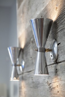
The sconces on the surround are vintage chrome pieces.

Hughes designed a faux window above the bar. It’s lit with fluorescent strips enhanced with gels purchased at a local performing arts hardware store, to get just the right quality of light that it resembles a window. The vintage chandelier has a bit of a deco feel. The long trestle table was handmade in California by the guy who originally had designed a similar table for Restoration Hardware.

Hughes built in a bar on the back of the entry wall, borrowing space from an oversize coat closet. The couple likes to entertain, so the bar was high on their priority list.

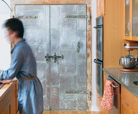
The kitchen was already intact when Hughes was hired, but he did spruce up the old fire doors, and added shelves behind them, creating a shallow space perfect for spice jar storage.

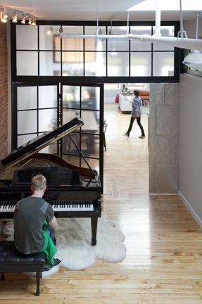
To separate the public and private spaces, Hugh designed the black room divider, fabricated from etched polycarbonate. The cloudy finish allows light through, but obscures the mess of toys and such behind it. The shiny tin panel on the right is a pocket door. The piano sits on an oversize sheepskin rug (six pelts sewn together) from Bowron Sheepskin in New Zealand.

Hughes designed an ingenious reading nook at the foot of the stairs, modeled on the outdoor lawn chairs of his youth. The adjustable back is woven with seat belt fabric. The cushion lifts up for storage. The bookcase is extra deep, and accessible from both sides.

Homeowners Darren and Colette Powell.

Designer Duncan Hughes.

For more about the space, design process, Hughes, and the homeowners, read the full story, “Unpolished Perfection” in Boston Home.

ARTmonday: Didier Massard

Today I interviewed interior designer Frank Roop at his studio. But more on that later. Since it’s ARTmonday, I thought I’d show you images by photographer Didier Massard, whose work I discovered hanging in Frank’s living room. (He hosted a Boston Home party there last spring to celebrate the cover story about his place, “Material Witness.”  I adore Frank’s work and was excited to see his sumptuous showpiece. And I had a small piece in the magazine too – my first for them – “Some Like It Hot.” ) Here is Frank Roop’s living room. Didier Massard’s photograph I fell in love with is hanging on the left.

roop-lr

Photo by Eric Roth

Today I finally had the opportunity to ask Frank about the work and the artist. Turns out Didier Massard’s work is shown in Boston right on Newbury Street, at the Robert Klein Gallery. I haven’t been in there in quite a while, (my husband tends to prefer painting over photographs) but Robert Klein Gallery represents a number of photographers I love, including Sally Gall, Sally Mann, and Tom Baril.

Didier Massard’s photographs are surreal, romantic, otherworldly landscapes. Contrived landscapes. He builds models in his Paris studio, which he then photographs.

Didier Massard Autumn Tree Photo

Autumn Tree, 2001

Didier Massard Spring Tree Photo

Spring Tree, 2002

Didier Massard Tree Top Photo

Tree Top, 2002

Photos courtesy of Robert Klein Gallery