Gardenias Vases by Hayon Studio for BD Barcelona
Saturday Say It: Will A Prince Rescue An Inebriated Lady?
Design Diary: Moody South End Condo by Evolve Residential
Almost two years ago Tom Egan of Evolve Residential introduced himself to me with photos of his business partner Josh Linder’s 609-square foot, parlor-level condominium in a 19th century Victorian townhouse in the South End. Since then I’ve gotten to know these guys (who are soooo nice and incredibly talented) and feature more of their work.
We included this project,photographed by Joe Keller, in the Makeover issue of Boston Globe Magazine, The similarly moody 900-square-foot two bedroom condo in the South End belongs to Linder’s friend. He steered him towards buying it, knowing it could be fab. Of course, now it is. Adding period trim, dark paint on the walls, and a mix of contemporary and traditional furnishings, Linder transformed the nondescript space into the perfect refined bachelor pad.
Linder describes it as “elegant but very masculine” saying, “We wanted to make sure when you walked in that it was obvious that a man lived here.”
Linder treated the whole space to Evolve Residential’s signature grey walls. The medium grey walls in the living room are done in Benjamin Moore Pale Smoke. The ventless ethanol fireplace is entirely new. Linder chose a period mantle and painted it a glossy black—Benjamin Moore Twilight Zone.
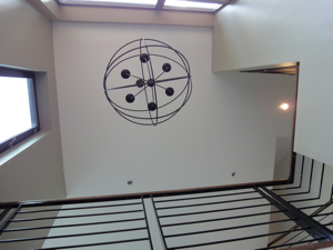
The 13-and-a-half-foot ceilings easily accommodated the Flos 2097 chandelier, about which his friend was entirely skeptical until he saw it installed. But friends don’t doubt friends, and so he kept his mouth shut until the end, when he confessed. “He gets it now,” Linder says.
Linder and the homeowner poured through his collection of photography books to come up with a fun combination of images to use on the seat backs of the French bergere chairs. These portraits, which made them smile, are both by Richard Avedon. Linder says, “We like to have one piece in every living room that is conversational.”
Graced with tall windows, and even taller ceilings, the space is airy and the layout needed only minimal tweaking. Plus, there’s a fantastic view of the Hancock from the living room. The quilted black leather sofa on the left is a reproduction Joseph Hoffman Kubus sofa. The crushed gray velvet settee is by O. Henry House, the rug is grey sisal, and the grey lacquer coffee table is a custom piece.
The existing cherry kitchen cabinetry needed replacing, but they kept the black granite countertops. The new black cabinets, which run all the way up to the ceiling were constructed by Kidder Blaisdell Woodworks and painted in Benjamin Moore Twilight Zone. The Moroccan inspired tile on the backsplash is from Tile Showcase and Calcutta marble tops the counter on either side of the range.
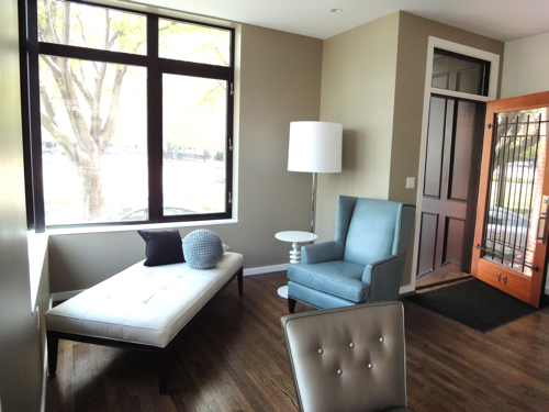
The grey walls in the entry are painted in Benjamin Moore Hearthstone. The Empire chest is from Autrefois Antiques in Brookline and the pair of glass lamps are by Barbara Cosgrove. Hanging above is a charcoal drawing by New England artist Martha Lloyd.
The homeowner grew up in a house with a cozy, dark wood room that he really liked, plus he has tons of books, so they transformed the second bedroom into a library with black walls. It’s Benjamin Moore Twilight Zone, the same color as the trim in the living room. Kidder Blaisdell Woodworks also did the library bookshelves.
They used the smallest sleeper sofa they could find in a queen. It’s a stock piece from local store Circle Furniture, but they had it reupholstered in heathered Ultrasuede. The homeowner says, “My guests say the memory foam mattress is more comfortable than their bed at home.”
The abstract is another Martha Lloyd painting. Linder says, “We endearingly call it ‘the coffee stain.'”
There are real candles in the Rococo style gold sconces.
The natural grass rug is from West Elm and the sleek glass desk was an online purchase.
Linder describes the bathroom as “horrifying,” so they gutted it. They used a simple white mosaic tile on the floor with a beautiful Afghani war rug from Yayla Tribal Rugs in Cambridge, which is much more intimate and refined than bathmat.
Linder used gold sconces here too, and also added a gold leaf frame to the recessed medicine cabinet in order to bring the elegant French feel into the bathroom.
When they demo’d the bathroom they discovered an extra 10-inches of space behind the tub which they took advantage of to create a large walk-in shower with a frameless glass enclosure. The large-format, horizontal shower tile from Tile Showcase looks like rustic wood and the bench and shower curb are honed black granite.
The master bedroom is a tailored and masculine cocoon done in lush fabrics, bold lighting, and elegant, unfussy furniture. The grey walls are Benjamin Moore Timber Wolf. The all metal Global Views Turned Pendant Chandelier replaced an ugly ceiling fan.
The custom upholstered headboard has nailhead detailing. The gray bedding is Thomas Brien for Target but the throw pillows are custom. Linder says, “One pillow cost the same as the entire bedding set, but as a mix it works beautifully.” Linder found the black marble topped vintage chests at the Cambridge Antiques Market and repainted them an inky blue.
The homeowner requested total darkness for sleep so Linder mounted three thick, blackout-lined, floor-to-ceiling custom panels from Holly Hunt to the underside of the soffit. He loves it, saying, “It could be a brilliantly sunny day, and I’d never know it.”
Photos by Joe Keller
• • •
S H O P the P O S T
[show_shopthepost_widget id=”576208″]
Just In: Jessica Biales Jewelry Collection Inspired by Matisse Cut-Outs
This isn’t the first time I’ve written about Jessica Biales and it won’t be the last. (Check out Jessica Biales’ signet rings and slice rings, which have been featured in Harper’s Bazaar, Vogue, and the Wall Street Journal and were for a time sold at J.Crew). Jessica is a close friend of mine from college, where she was the most refined, urban girl I had ever met. So many years later and her style hasn’t waned.
Jessica’s latest collection is called “Scissors” and was inspired by the Matisse cut-outs in the exhibit at MoMA that ended earlier this month, Henri Matisse: The Cut-Outs. You can see examples of Matisse’s cut-outs that influenced her new jewelry collection below. As for Matisse, here is a description paraphrased from the MoMA site about the advent of the cut-outs:
Starting in the late 1940s, Henri Matisse turned to paper cut with scissors as his primary medium, which resulted in a new form of art that came to be called a cut-out. Matisse would cut painted sheets into forms of varying shapes and sizes—from the vegetal to the abstract—which he then arranged into lively compositions.
The Jessica Biales Scissors Collection, inspired by Matisse cut-outs, includes bracelets, rings, earrings, and necklaces in sterling silver and 18-karat gold.
Style Right Now: Maison Margiela
Maison Margiela Artisanal Collection
Paris Couture Collections Spring 2015
First collection designed by John Galliano
The crown, glitter-spackled eyelids, sheer illusion top,
deconstructed inverse shrug, and two-tone, mime-like tights.
Model Maartje Verhoef • Make Up by Pat McGrath • Eugene Souleiman
“A process of discovery, returning to one’s roots. Piece by piece, deconstructing and constructing a new story for Margiela. . . Approaching tailoring, techniques, craftsmanship like a new explorer, or painter. One who sees beauty in things that are often taken for granted, giving everything a newly enriched life. A powerful and fierce yet refined mix of fabrics and materials. Stripped down, or reborn together in startling and unexpected ways. . . New direction given with play on proportion and sartorial rules. Languid, sweeping. Precise tailoring. A new fuller, revealing silhouette. . . Looking through the glass, discovering an elusive, rare even arrestingly strange new beauty, of muses who nonchalantly arouse your senses.