Sneak Peek of Troy Boston Model Apartment In Progress

Last Friday I was granted entry into unit 1409 at Troy Boston, a new, “green,” luxury rental building in Boston’s artsy SoWa neighborhood. The apartment looks great; so sunny, with very appealing finishes, like cerused oak and lacquer cabinets, a white oak wood floor, and the best, a concrete ceiling. You might recall my post on creating the charcoal and blush color palette.

troy-apt-empty

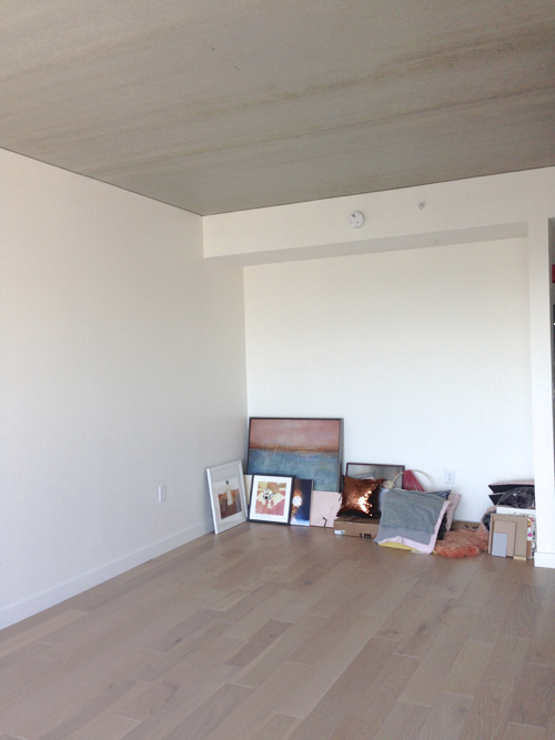
I thought I had so much stuff, but when I unpacked there was hardly anything. It didn’t even look like there’d be enough artwork.

troy-boston-weaving

I’m in love with the copper paillette pillow I found at H&M on sale for $7. Any thoughts on the dream catcher I made with fuzzy yarn and bamboo embroidery hoop?

troy-boston-beddingstack
A pile of textiles from H&M. The pillows are knockoff of a design by Hay. The pink throw is deliciously cozy.

troy-boston-self-portrait-artwork
Two coppery self portraits by Boston photographers Alicia Savage (left) and Laura Beth Reese (right).

troy-boston-copper-bin

Copper and black wire baskets also from H&M look pretty in the sunlight. Target sells similar wire baskets.

troy-boston-plywood-wall

Heather McGrath’s Icelandic landscape printed on metal looks fantastic on the plywood divider.

troy-boston-copper-tray

A hammered copper tray on the flip side of the console table will hold a little bar set up.

tory-boston-bar-fixings

Accessories: Canister with wood lid, wood trinket boxes with glass lids, copper sphere candle, fancy tonic water, and a print I made.

troy-boston-copper-accessories

More H&M accessories. Rose gold & glass trinket boxes ($5 octagonal knock-offs of those little glass boxes by Iittala) and copper colored candle holders (also on sale for $5) that remind me of a Tom Dixon design.

troy-boston-bedding-array

All my bedding options, laid out. Charcoal and blush linen sheets and cushion covers from H&M, textural charcoal throw, velvet throw pillow and lots of pillow inserts from Ikea and a sweater knit blanket, plus even more gray sheets from Target. Sofa and rug on loan from Mitchell Gold + Bob Williams in Boston.

troy-boston-door

More pictures soon.

Impressions: Creating a Color Palette of Charcoal & Dusty Rose

Last month a local publicist asked me if I’d be interested in decorating a model apartment in one of the new big and shiny buildings that are popping up in Boston like mad. I was incredibly flattered, of course, especially since I’m not actually an interior designers. In fact, that’s why she asked. The budgets are smaller and the directive more creative. Rather than perfectly turned out, pristine showcases, these units, since they’re rentals rather than condos, are to be on the funkier side. In addition to my non-decorator self, there will be an art gallery owner, a visual merchandiser, and another writer. We will create color schemes for furniture and accessories, but not actually alter any finishes.

I think I will get down and dirty with some DIY projects, and will likely enlist my handy husband to help (especially given his urging that I take this on). Although we live in a condo in the city, he has a few well-equipped tool boxes stuffed with a vast range of hand tools, from hammers, screwdrivers, wrenches, and pliers, to power drills, soldering irons, and saws. Can we build a bed? Put up shelving? Create inventive wall decorations? We shall see.

We visited the building yesterday, which is still very much a construction site. We got a peek at a few finished units on lower floors and they have a great look, with light oak floors, white walls, floor-to-ceiling windows that actually open, and two kitchen styles—one with cerused oak lower cabinets and glossy grey uppers, and the other with textured white wood lower cabinets and glossy white uppers. They are both great looks and have me thinking about the best color palette for studio apartments.

I prefer to work with white on white color schemes, since I love all white rooms. I have in mind the whole pure white with pastel or bright color pops and a smattering of plywood. That seems easiest given my abilities and budget, and the fun style would match up with a portion of the target demographic. However, I may be assigned a unit with the grey/cerused oak kitchen. The finishes are beautiful, but I’ll definitely have to re-think my design/color scheme. It will need to present as a little bit more sophisticated. I perused many of my Pinterest boards last night in search of inspiration, starting with searching for a color palette for studio apartments.

If I am to decorate a unit in which the centerpiece is cerused oak cabinetry, I am leaning towards a color palette of pale wood, charcoals, and blush with touches of copper.

lou-and-grey-natickPhoto by Marni Elyse Katz/StyleCarrot

ladies-and-gentleman-mobile

Wind Chime by Ladies & Gentlemen Studio  •  Sight Unseen