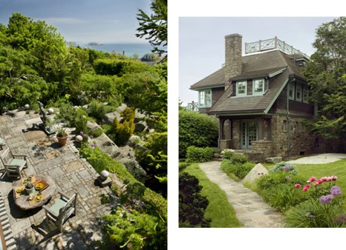
 Back in the fall I visited Andrew Spindler at his Cape Ann house. It is absolutely spectacular, inside and out. The assignment was for the the “Outdoor Living” issue of the Boston Globe Sunday Magazine, and the piece, “Magic Garden” ran yesterday. Spindler is an antiques dealer with a shop in Essex, Mass (you can also find him on 1st Dibs). The Globe story focused on the terrace and incredible garden, but the inside of the house is amazing too. (Above photos: Eric Roth)
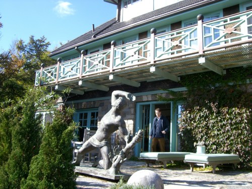
Can you believe that when they bought the place, which was built in 1937, it was wholly unimpressive, and a bit of a wreck? Spindler and his partner added the stone terrace at the back of the house, the second floor balcony, and the widow’s walk. There’s Spindler walking out one of the sets of French doors, which they also added. Originally there were just some dinky windows and an aluminum door that opened to a few concrete steps into a yard. They built up the land about seven feet to create the granite terrace. Spindler describes the building as one done with “old-fashioned brute strength.” I can imagine lounging there all afternoon.
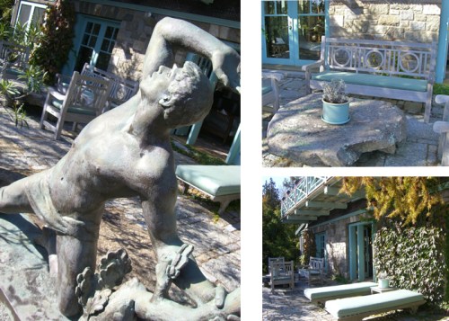
The teak furniture is by Henry Hall. The stone table is a found slab of stone. The sculpture; how I adore the sculpture. It was conceived in 1947 by Walker Hancock, who created Prometheus at Rockefeller Center. Spindler and his partner found the plaster cast Hancock had modeled, and then had it cast in bronze in upstate New York. It’s the only bronze cast of this work. They own the original model for this work as well; it sits on the mantle in the living room.
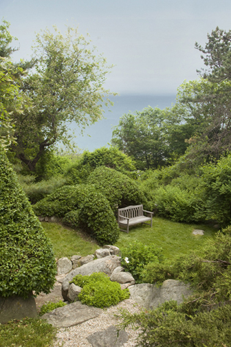
The original owners were avid gardeners, but by the time Spindler and his partner took up residence the grounds were pretty much in disarray. Now, the grounds and gardens are unique, with all sorts of rocky paths, water views, places to sit and lots of charming natural features.
Top left: Stone orb from an architectural salvage shop at the top of the stone steps that lead from the terrace to the garden (Photo: Eric Roth). Top right: Pyramid-shaped Euonymous bush is a very classical element in this otherwise wild wonderland. Middle left: A wall of granite with a bench fashioned from found slabs of stone. Middle right: Petra, an outbuilding that Spindler likens to a “little Hobbit house,” that was part of the original property, sold off, then reunited by a recent purchase. There’s an outdoor fire pit, perfect for “Survivor”-esque gatherings. Bottom left: A dramatic gnarled (and dead) Japanese white pint tree that has grown around the boulders, conforming to its shape. Bottom right: A fragrant juniper tunnel makes a lovely secret passageway.
 The garden tour ends with a Japanese garden that includes a bridge between two man-made ponds. Plantings include Japanese maples, Japanese umbrella pine, dwarf juniper, a pear tree, a crabapple and white azaleas and peonies that bloom in springtime. The owl, mounted outside the kitchen door, has eyes that light up.
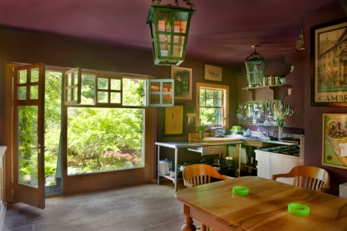
The kitchen opens onto the Japanese garden. It’s painted a deep aubergine. Spindler says this about the effect: “The dark color puts outside in high relief. It’s almost as though you are in a darkened theater looking out.” The light fixtures are outdoor lanterns from a property in Palm Beach.
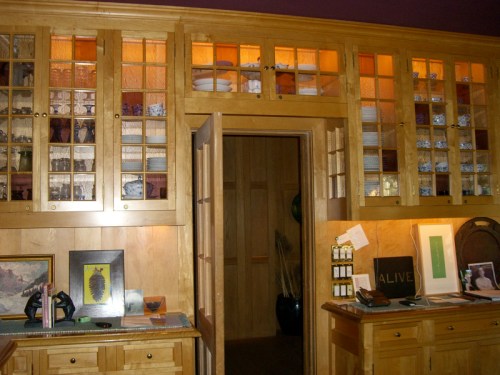 The stained glass panels of the kitchen cabinetry were found at an architectural salvage shop.
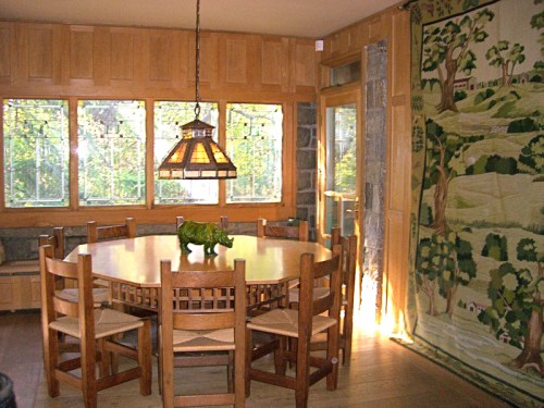 The dining room paneling is recycled chestnut church pew backs ; the floors are salvaged wide plank chestnut. The Prarie glass windows have a strong affinity with Japanese design and Frank Lloyd Wright, as do the Arts & Crafts style furniture. The tapestry is a petit point landscape made in 1972.
Photo: Eric Roth
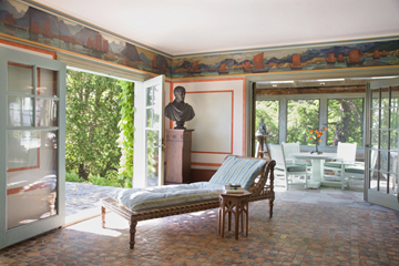
Isn’t the chaise longue in the living room divine? It’s an Anglo-Indian teak and inlaid ivory piece. Spindler says, “The house is about experiencing the nature the light, water, air.” This is indeed the perfect spot for such.
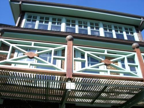
You can see the garden room in the background. They painted the furniture the same color as they painted the outdoor trim, a sort of sea foam green.
The tiles on the floor were made by the Moravian Pottery & Tile Works in Doylestown, PA. There are similar specimens in the European galleries at the MFA and at the Isabella Stewart Gardner Museum.
The frieze (c.1910) is by Jonas Lie, an artist with a strong Gloucester connection. It was originally made for a Viking-themed room in a lodge in the Adirondacks, which was apparently all the rage in the 19th century. Below is a photograph of this very frieze, in its original Adirondack installation.

I hope you enjoyed the tour!







 Follow StyleCarrot on Twitter
