Design Diary: Kids Room Spruce Up

It’s spring break again (I get three), so I’m in Florida. I’ve had little luck finding a contractor (we want to swap the wall-to-wall carpet for a plywood floor, paint everything white, and a few other fixes), so yesterday I decided to do some freshening up to tide us over, at least in the boys’ room. Between the blah walls and carpet, it was getting a tad depressing.

Spending a lot of money wasn’t an option, so I ran into Marshalls and T.J. Maxx (luckily they both happen to be in the same complex). I found great on-trend, brightly, patterned bedding. The aqua and turquoise cotton quilt looks like John Robshaw, with its Indienne pattern. Plus, its really soft. Considering the very reasonable price, I was thrilled with the high quality.  The charcoal grey and white trellis pattern sheets are amazing smooth; they’re all cotton but really satin-y. The “smile” pillow is done in an almost nautical canvas, very cheerful and preppy.
I also found a durable little area rug with a Moroccan-inspired pattern. For a toy storage solution, I got a cute charcoal gray nylon fiber basket that’s large enough for the balls, books, and other random toys that seem to magically materialize. (I may steal it to hold towels in the entry though.)  Lastly, I got him a glass water bottle with a silicone cap and grip to leave by the bedside.

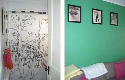
Plucking from other parts of the condo, I finally framed and hung the artwork. All three are prints by Cathy McMurray that I had purchased last year. I also moved in a better lamp and a stalk of bamboo. HUGE improvement, I think.

I might not keep the bed dressed like this ultimately, (I’m thinking it would also be perfect out on the Cape), but I love the look right now. What do you think? Scroll down for the “before” photos too.

full-bed

smile

rug

bamboo

B E F O R E 

before-2


before


Thanks to Marshalls & T.J. Maxx for the $150 gift card!

Design Diary: Davis Square Loft With Roof Garden

Five years ago (wow), I met Sharon Kitchens, she who now lives on the Great Cluck Egg Farm (blogged about here) and writes two blogs, The Root for the Portland Press Herald, and her own, called Delicious Musings, when I wrote about her Davis Square loft for Stuff Magazine. Going back through my archives, I see I never blogged about it. Crazy, because I totally, totally loved it. The photos aren’t perfect, but I hope you can see the loft’s general amazingness.

Kitchens, who had been on hiatus from Hollywood up in Maine (and yes, she’s back there again now), fell in love on the spot with this 850-square-foot, top-floor unit at the Davis Square Lofts in Somerville, Mass. It used to be the Comfort Pillow factory, and is adjacent to a renovated tin toy factory. The developer retained the industrial vibe, mixing in just the right amount of modern day luxe. There are bridge like walkways, garage doors accessing outdoor spaces, open floor plans, concrete floors, and interesting fixtures. Let’s go in.

sharon-kitchens-doggie

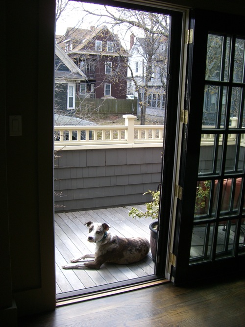
The entry door and her sweet, old dog.

sharon-kitchens-living-room-window

 The living room, which is what you face when you walk in. The piano artwork on the right is by the son of Portland, Maine gallery owner June Fitzpatrick.

sharon-kitchens-front-deck

The front deck, accessed by a garage door. Kitchens got her start planting vegetables here.

sharon-kitchens-living-room

Looking back, the study is on the right, and the kitchen on the left. Keep looking back through the kitchen and you’ll spot the garage door in the bedroom, on the other end of the loft.

sharon-kitchens-kitchen

Heading into the galley kitchen.

sharon-kitchens-granola-on-the-stove

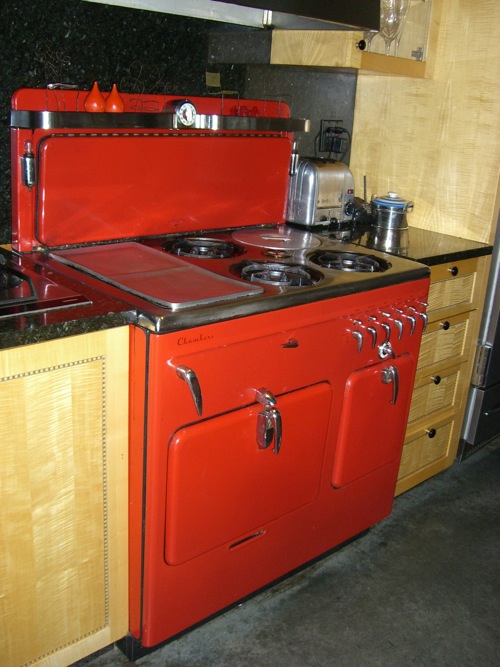
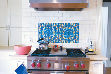
Sharon just finished baking granola. No surprise she ended up owning a farm in Maine! Truth is, growing up, she spent summers on her grandparents’ farm in Arkansas. Love the red knobs on the petit gas range.

sharon-kitchens-kitchen

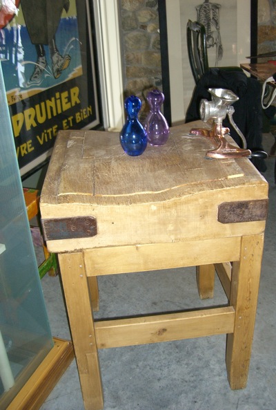
Open shelving and a butcher block countertop.

sharon-kitchens-kitchen-sink

Sharon tucks a black & white photograph, by Sabrina Krisky, behind the kitchen sink.

sharon-kitchens-industrial-bathroom-sink

Industrial sink in the bathroom.

sharon-kitchens-bathroom-shelf

And the metal shelf above, with indoor/outdoor industrial sconces, raw wood beams, and more art.

sharon-kitchens-bedroom

The airy bedroom. The fun chair is from the Rockland Antiques Marketplace in Rockland, Maine.

sharon-kitchens-br-chest

Vintage dressers and rugs in the bedroom.

sharon-kitchens-patchwork-skirt

Sharon shows off a family heirloom: her grandmother’s vintage ’70s patchwork skirt. Very Todd Oldham!

sharon-kitchens-outdoor-common-space

Outside, you can see the plank walkways with chicken wire-like fencing.

sharon-kitchens-vegetable-garden

sharon-kitchens-plantings

Sharon pursued her interest in gardening ou on the deck.

sharon-kitchens-pots-on-deck

She and her neighbors also shared a CSA and would cook dinner together on Sundays.

sharon-kitchens-deck-brick-building

Looking back toward her unit.

sharon-kitchens-davis-square-lofts

And back on the ground. Bye!

Art Basel Miami: Charlotte Perriand Beach House

In 1927, Le Corbusier invited French architect and designer Charlotte Perriand, when she was just 24, to join his studio. In 1931, Charlotte Perriand began to exhibit under her own name, designing buildings, interiors, furniture, and lighting. Even if you do not recognize her name, you know her work—among the most successful pieces she designed in collaboration with Le Corbusier and Pierre Jeanneret, are the the LC4 Chaise Longue and the LC3 Armchair, both produced by Cassina. She also co-designed the Prouvé Potence Lamp, a style that is incredibly popular right now.

I went to Art Basel Miami for the first time yesterday, with my friend Deb, who is an architect with a minimalist, modernist aesthetic. Unsurprisingly,  Charlotte Perriand’s beach house topped her list. Designed in 1934 as a competition entry for the French magazine Architecture Today, the modernist house was intended as a prefabricated, budget-conscious vacation home suitable for mass production. Perriand won second prize; the homes were never put into production.

Fashion design house Louis Vuitton worked with Perriand’s daughter, Pernette Perriand-Barsac, to construct a prototype according to the original plans, complete with furnishings. It is erected behind The Raleigh Hotel (a quintessential Miami Deco boutique hotel), so we made our way through the lobby, out past the pool, and through a little opening in the back hedge, where a media garden party was in progress. (And yes, we helped ourselves to grilled lobster.) The little structure was just beyond that, almost on the edge of the beach.

The design is so minimal, yet thoroughly functional. The wood is so satisfying to the touch and to the eye, very smooth. We glided around in awe. Here are my photos. The first one is an official image, courtesy of Louis Vuitton, which provides a good overall perspective.

Louis Vuitton Beach House Art Basel Miami

Looking at the house straight on. We entered from the back. The center is an open air, courtyard-like type of space, with a canvas awning overhead.

IMG_4873

We entered up this ramp, barefoot.

IMG_4878

A wood feature wall with simple shelves holds natural objects from the sea.

IMG_4889

When you first walk in, the kitchen is to the left, then the dining area and a sitting area. This is the view from the kitchen.

IMG_4890

A closer up shot of the built in table and banquette.

IMG_4891

The divider between the banquette and the sitting area.

IMG_4881

And a space to lounge, with a cowhide rug. And the coolest lighting. I also love the way the square window opens.

IMG_4880

 There’s sliding doors the lounge area side of the divider, for storage.

IMG_4911

Standing in the sitting area, looking back towards the kitchen.

IMG_4884

 The back wall of the structure.

IMG_4885

 The sink and counter are stainless steel. That taller divider is topped with slate. Love the plywood walls!

IMG_4888

 Open shelving for dishware; just enough for a weekend.

IMG_4908

Stepping back into the courtyard.

IMG_4900

There’s a low, Japanese-style table in the middle of the courtyard space. The stools are made from tree stumps.

IMG_4898

Towards the front of the courtyard, under the awning portion, are two low lounge chairs, overlooking a glass railing.

IMG_4907

 Looking onto the little party, towards the hotel.

IMG_4895

 This is the front room along the right side of the house. A little bedroom with a desk.

IMG_4901

Another little room, with storage and green pocket door, leads to the bathroom. The toilet is behind the red pocket door.

IMG_4905

The open wood slat floors in the bathroom gives it a very beachy feel.

IMG_4904

Clad completely in stainless steel. Mod red medicine chest.

IMG_4902

 All the greenery out the windows is great.

*          *          *

Learn more! Buy the books.

Charlotte Perriand

Charlotte_Perriand_by_Elisabeth_Vedrenne_design_by_Assouline_grande

Charlotte Perriand : Objects and Furniture Design

charlotte-perriand-objects-and-furniture-design-1

I’m headed back to Miami now. More on Monday!

+ + + + +

Design Diary: Stowe Mountain Resort

Last month I spent a night at Stowe Mountain Lodge to research a story for Boston Common’s holiday issue. It was SPECTACULAR. Of course, I have a major soft spot for Stowe. The leaves hadn’t much started to turn yet, but the lodge is a wonderful retreat. The lobby is large and cozy, the spa is superb, and the pool is super warm for four season swimming, with hot tubs and a fire pit. They also treated me to a wonderful dinner in the farm-to-table restaurant. During the day I toured the other features of the property, including the slopeside townhouses, performing arts theater, and country club. The whole setup is heavenly.

stowe-mtn-resort-covered-bridge

stowe-mtn-resort-view

stowe-mtn-resort-lobby

stowe-mtn-resort-table

stowe-mtn-resort-bed-2

stowe-mtn-resort-bed

stowe-mtn-resort-beds

stowe-mtn-resort-pool

stowe-mtn-resort-dining

stowe-mtn-resort-trail

stowe-mtn-resort-restaurant

stowe-mtn-resort-dinner

stowe-mtn-resort-fire-pit

stowe-mtn-resort-house-

stowe-mtn-resort-golf-course

*      *      *

Design Diary: Boston Magazine’s Design Home 2013

Over the summer I worked on a big project that is now up and running— Boston magazine’s Design Home 2013. No, I didn’t decorate any rooms; I wrote the copy for the accompanying brochure, describing the furnishings and decor throughout the space. This year’s home is an expansive condo in The Concordia, a newly developed building right on the water on the North Shore, in Swampscott, Mass.

Design Home is open through Oct. 7. I hope those of you who are local will consider taking drive to see it, since all ticket proceeds ($25/person) benefit Boston Children’s Hospital. (Click here to purchase tickets. 

The 3,600+ square foot unit, done in ocean hues, is furnished with pieces from local businesses, including Landry & Arcari, Lucia Lighting, Didrik’s, Surroundings, Zimman’s, and others. Here’s a taste of what you’ll see, photographed by the ever present (and talented!) Michael J. Lee.

boston-design-home-entry

Entry
Custom bench by 60nobscot; crystal fixture from Lucia Lighting.

boston-design-home-kitchen

Kitchen
Wood Mode cabinetry by Family Kitchens; backsplash by Tile by Design.

boston-design-home-tabletop

Dining Room
Place setting from Didriks.

boston-design-home-deck

Deck
Barlow Tyrie outdoor furniture from Didriks.

boston-design-home-mbr

Master Bedroom
Barley twist bed and custom paisley bedding from Zimman’s.
Hand-knotted Turkmen rug from Landry & Arcari.

boston-design-home-sitting-area

Sitting Area

boston-design-home-dressing-room

Ladies Dressing Room
Cabinetry by California Closets; clothing from Irresistibles.

boston-design-home-sleeping-nook

Sleeping Nook
Trundle bed by Family Kitchens.

boston-design-home-guest-suite

Guest Suite
Furnishings, bedding, and accessories from Surroundings.

boston-design-home-coast

Coastal View

All photographs by  Michael J. Lee

*          *          *