This is the weekend home of Jim Higgins, Boston architect, a principal with PH Partners. I found him through my hunt for dream homes. Although the house didn’t make that issue of the Boston Globe Sunday Magazine (Your Dream Homes), I was able to do a “Designing” column called “Modern, Naturally”, which ran this Sunday. It’s a prefab, designed by Missouri-based architect Rocio Romero. Higgins spotted the structure in Dwell, and it was love at first sight. He flew down to Missouri to check out Romero’s own home and decided he had to have one for himself. He ordered one for the plot of land he had recently purchased on Spinney Creek in Eliot, Maine. (The original plan had been to design and build a traditional New England house, but this is definitely much more fun.)
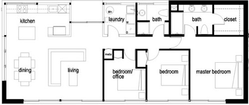
Th is an LVL Home from Romero’s LV Series kits. The houses are 1,453 square feet, with a kitchen, living room, dining room, three bedrooms and two baths, though he made some changes, such as flipping the plan to better fit the site and take advantage of views and rearranging some interior walls.
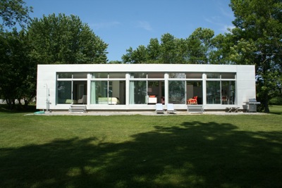
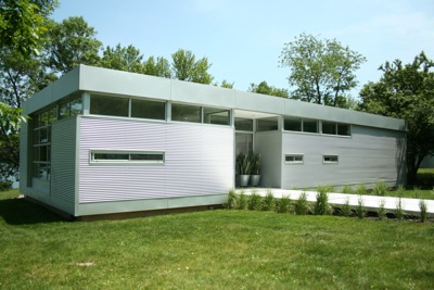
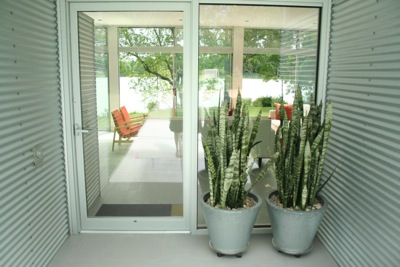
If you look at the top photo, which is the back of the house, the rooms are as follows, left to right: master bedroom, guest bedroom, living room, dining room/kitchen. The second photo is the front of the house. The narrow strip of windows on the left are the windows above the kitchen counter, and the little windows on the right are in the bathrooms. Let’s take a tour. . .
Entry
The exterior is corrugated panel siding called Galvaloom. The walkway (scroll back up to the second photo) is a docking system, so it’s actually a little bridge to the front door. He eventually plans to add a deck out back constructed from the same material.
Living Room
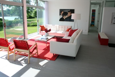
These are the scouting photos Jim sent me initially. (I visited in the dead of winter, on the first snowfall of the season.) The white Petrie sofas are from Crate & Barrel (there’s an outlet in nearby Kittery), as is the red nylon rug, which cost just $99. The floor lamp is CB2. The chairs are the real thing – the Risom Lounge Chair from Knoll, and the marble-topped coffee table is Florence Knoll. The painting is actually a portrait of Jim, done by a friend of his, Marblehead artist John Bonner.
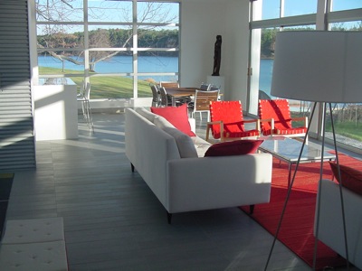
This shot shows you a better view of the Spinney Creek, which is used as an oyster and clam farm. It’s clean enough to swim in, and he has a dock, as well as a flotilla of kayaks. So pretty.
Kitchen
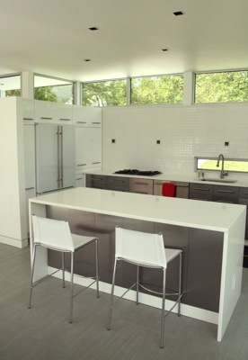
The stainless steel cabinetry is IKEA. The counters and island are white Caesarstone. The backsplash is a 2×2 white gloss tile. I love the fridge – it’s a white glass front Jenn Air – I’d never seen one before. The three little squares are $29 lights from Lightology, that match the little recessed ones in the ceiling.Stools from Crate & Barrel.
Dining Room
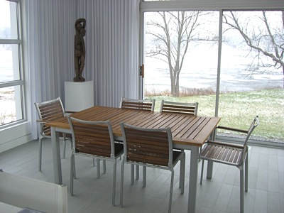 Jim has his eye on a pricey Florence Knoll dining table, but in the meantime uses this outdoor dining set he picked up at an end of season sale from Sears. He hung IKEA tracks for the curtains, which he had made from cheap white material he bought at JoAnn Fabric. The African sculpture in the corner was a gift from his partner’s parents.
The floor looks like planks of pickled oak, or weathered grey shingles, but is actually Italian ceramic tile with a wood grain texture, in a plank design. And it’s toasty – he did radiant heat underneath. (I took this photo – notice the grey day outdoors.)
Interior Entry
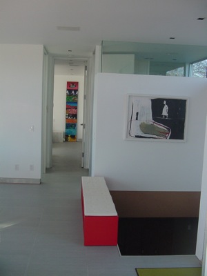
The stairs lead to a finished basement. The rail still needed to be built when this picture was taken, so they turned a glossy red IKEA bookcase on its side and topped it with a white cushion, to use as a bench and barrier. You’re looking down the hall, to the master bedroom. Notice the full height doorways, which, at $1,000 each, were a splurge.
Master Bedroom
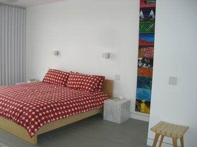
The bed is IKEA and the bedding from Dwell. The stool is Knoll, but he doesn’t remember where he purchased the marble cubes. In front of the bed there’s a patchwork cowhide rug from Paris. The painting is by Massachusetts artist Mark Allen. Sconces from Lightology.
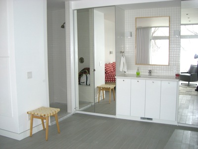
The sink is open to the room; the shower is to the left, the toilet to the right. The floor to ceiling mirrors are actually IKEA wardrobes that he built in. The sink, cabinetry, hardware, and plain wood-framed mirror are also from IKEA. The tile is the same as the tile in the kitchen.
Take a look at the recessed baseboard, which has a brushed aluminum reveal. It is a white melamine baseboard (durable and no painting required!) from IKEA. Easy and cost effective.
Guest Bedroom
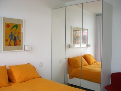
Love the tangerine bedding. Bed and mirrored storage from IKEA. Painting by a French artist, purchased from a furniture store that was going out of business. Sconces from Lightology. There’s a Florence Knoll side table and a Bertoia chair too.
Guest Bathroom
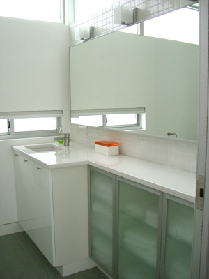
Bathroom cabinetry and hardware from IKEA.
Basement
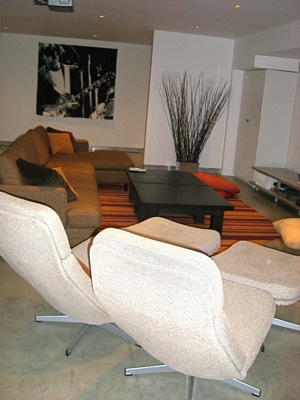 There’s a full basement, accessed by a custom metal staircase with custom stained ash treads. It’s a large space, great for parties, and movies. Jim hosts a Halloween party with dancing, and a white party in summertime.
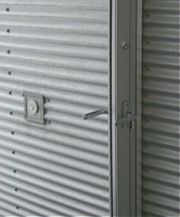
Doorbell
Come again soon!


 Follow StyleCarrot on Twitter

Interesting post. I love this pre-fab house. No wasted space and great design!
What a great post! I usually prefer more traditional architecture myself, but you drew out so many unusual details here. Especially fond of the plank-like tiling and their inventive use of high/low decor. Another thing I really like about this house is the well-thought out use of light and glass balanced with privacy. I’ve encountered situations where the architects went overboard without thinking out the impact on daily life – this seems to be very very livable (i.e. the bathroom doesn’t have floor to ceiling windows :). Really cool.
Since the owner is an architect he thought a lot about how they would live there, and customized the interior as such. and by turning the glass part around they were able to have privacy from the other houses and road.
Pingback: Spotlight: Pre-Fabulous House in Maine « | style carrot | | Maine | Just another weblog
I love these LV houses and have been following them a bit for the last few years. This one looks great. What wonderful photos and commentary – thanks