Get the Look: 23 Pastel Home Furnishings

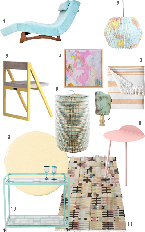
Did yesterday’s post Montage: 30 Pretty Pastel Interiors convince you to go soft? Some of those rooms weren’t sickeningly sorbet, there was a richness to them, I thought. Still, I understand if you have qualms. You could easily add a touch of pastel home furnishings here and there however. A sky blue chaise, peachy table linens, a mint fridge. Kidding on the mint fridge part; unless you’re going for a retro diner look. I wonder how many people have purchased that Smeg mint refrigerator from West Elm? I’m more inclined to go for a World’s Away turquoise bar cart myself. And I’m definitely eyeing the woven hamper. At least splurge on a fouta and some bamboo cutlery for a pastel picnic. Ok my pretties, here are your pastel picks for the day!

Pastel Furniture Home Accessories Decor

Pastel Furniture Home Accessories Decor

S H O P P I N G

1 Wave Chaise by Adrian Pearsall, $5,500 at Modern Drama, 1st Dibs.

2 Globe Paper Lantern, $29 at Urban Oufitters.

3 Fouta Beach Towel in Tangerine, $48 at Serena & Lily.

4 Ellen Levine Dodd “Blue Heron & Dancing Deer,” $675 at Serena & Lily.

5 Feast In the House of Simon Chair by Fiftytwothousand, $498 at Aha Life.

6 Handwoven Hamper, $119.99 at Dot & Bo.

7 Hillary Thomas I Am A Rock Lamp Finial, $65 at Layla Grayce.

8 Kaki Side Table by Kenyon Yeh.

9 Serena & Lily Signature Low VOC Paint in Sunshine, $45 at Serena & Lily.

10 World’s Away Hampton Bar Cart, $963 at Zinc Door.

11 Pastel Vintage Kilim, $800 at Furbish Studio.

12 Smeg Refrigerator in Mint, $1,999 at West Elm.

13 Overdyed Teri Chair, $198 at Anthropologie.

14 John Robshaw table linens, $100 & $45/set of 4 at Neiman Marcus.

15 Striped Taper Candles, $24 at Leifshop.

16 Cactus Verde Boho Candle, $33.50 at Illume Candles.

17 Bamboo Wood Cutlery by Core Bamboo, $36 at Aha Life.

18 Ashley Goldberg “The Castle” Oil Painting, $480 at Serena & Lily.

19 Linen Beach Towels by Frescobol Carioca, $160 at Aha Life.

20 Jonathan Adler Mrs. Godfrey Chair, $1,695.00 at Jonathan Adler.

21 Chevron Cocktail Napkins, $24/set of 4 at Furbish Studio.

22 Urbancase Alvo Stool, $375 at 2Modern.

23 Serena & Lily Signature Low VOC Paint in Juice, $45 at Serena & Lily.

* * * * *

Dress the part!
Tons of great pastels at Shopbop.
Designer Spotlight: Boston Designers’ Favorite Paint Colors

When the editor of Stuff asked me to come up with a theme for a home design-dedicated issue, I immediately said, “Color.” Unfortunately, the whole theme devoted to interiors idea was ditched, but I was able to salvage some of my work by putting together a page with local designers’ colors of the moment in “New Hues: Boston designers reveal their top color picks for fall“. If you decide to try one, I’d love to see it. Or, perhaps you can reveal specific paint colors you’ve had luck with. I’ll tell mine (tomorrow) if you tell yours. Meanwhile, here are the designers’ picks.

Annsley McAleer, Annsley Interiors, Boston

Her style: Traditional but fresh, using upbeat colors and patterns

Her color pick: Green Blue by Farrow & Ball

“I loved this color so much in my guest bedroom that I used it in my daughter’s bedroom, too. It is an intense color imbued with a sense of calm. It looks great with a strong white trim and other blue accents.”

Andrew Terrat, Terrat Elms Interior Design, Boston

His style: Tailored but not too serious

His color pick: Curry by C2 Paint

“This color is bold and vibrant, but also very warm and cozy, making it the perfect shade for a family room.”

Erin Gates, Element Interiors, Jamaica Plain

Her style: A mix of modern and traditional, new and old, high and low

Her color pick: Manchester Tan by Benjamin Moore Historical Colors

“A good neutral is hard to find. This one is fantastic and works anywhere. It is neither too deep nor too light. It reads cool if paired with cooler colors and warm if paired with warmer colors.”

Eric Roseff, Eric Roseff Designs, Boston

His style: Clean and crisp with a graphic sensibility

His color pick: Mahogany by Farrow & Ball

“I’ve used this in a small powder room in a high gloss. The color is rich and sumptuous. The lacquer finish opens up the small space by allowing for wonderful reflections.”
Julieann Covino, Jace Interiors, Cambridge

Her style: Affordable design that incorporates pieces you already own

Her color pick: Brilliant Sea by Behr

“This is my new favorite color. A little goes a long way. I would use this as a pop of color on the frame of a mirror (that I will hopefully find at Brimfield this week!)”

Rachel Reider, Rachel Reider Interiors, West Roxbury

Her style: Engaging interiors in a transitional style

Her color pick: Bordeaux Red by Benjamin Moore

“Try this eggplant shade in a dining room to infuse a cozy feeling. The warm tone would create the perfect atmosphere for a dinner party.”

Urit Chaimovitz, Urit Chaimovitz Design, Watertown

Her style: Classic but fun, with an eye towards the preppy

Her color pick: Bang! by C2 Paint

“Recently, I did a house in which we were able to hide a playhouse for the children under the basement stairs. I used this color for the door, which has a star cutout. It’s very ‘Nantucket red,’ inspired by the fact that that’s where this family spends their summers.”

Kathie Chrisicos, Chrisicos Interiors, Boston

Her style: A sophisticated mix of scales, colors, and styles

Her color pick: Flint by Benjamin Moore Affinity Colors

“I love this deep, dark, rich charcoal from Benjamin Moore’s new eco-friendly line. I’ve used it on a fireplace feature wall as well as at a kitchen desk alcove.”

Shellie Donovan, Shellie Donovan Interiors, Boston

Her style: Multi-textured with a whimsical punch of red, lime, or blue

Her color pick: Elephant’s Breath by Farrow & Ball

“I love Elephant’s Breath not only for its neutral color, but because I love clients’ reaction to its name. The gray really changes in each application, depending on the light. I’ve used it in powder rooms and back splashes, but would use it anywhere.”

Kristen Rivoli, Kristen Rivoli Interior Design, Winchester

Her style: Light, airy, and livable

Her color pick: Glazed Carrot by California Paints

“This is a very versatile color. It is sophisticated when paired with gray, playful when paired with pink or yellow, and vibrant when paired with white. When I use it on walls, I like to paint the doors and frames with it too, sometimes a shade darker or lighter than the wall color. It’s a trick that makes a small room look larger.”